Book Review- James Gurney's "Color and Light- A Guide for the Realist Painter"
This week I’m reviewing James Gurney’s book “Color and Light- A Guide for the Realist Painter”- available on his website, as well as on Amazon. I picked this book up a number of years ago when I was painting murals, and it’s one of the very few instructional art books I’ve come back to and re-read (along with some other books I’ve reviewed, such as Zbukvic’s “Atmosphere and Mood” or Karpinska’s “Wet-On-Wet Watercolor Painting"). Why do I come back to it? Because it’s a no nonsense treasure trove of situational, science-based information that applies to the kind of thinking and viewing and paint application an artist does.
Over the years, I've sometimes asked various teachers about certain effects of light and color in the natural world, but the response I've most often gotten is that we should simply "pay better attention and really look". I find that unhelpful. When you're a novice, you don't really know how to look. You let your psychological preconceptions of color and light direct you. You don't even know you're making mistakes. That's why you're a novice. Gurney's book shows you things you might not otherwise have paid attention to, but it also lays out the science behind how we see and make sense of things. Is it essential to know the science if you want to paint realistically? Nope. But I find it fascinating and thought provoking just the same, and I'm the sort of painter who wants to understand a concept before I apply it with conviction. Even if you don't paint, or don't paint "realistically," much of it can guide your own real life observations. It helps make you aware of what you are actually seeing and how light and color work. That's interesting stuff!
Basic Layout-
The book is set up in chapters, each with a variety of topical 2-page entries, but there are, as I see it, three broad sections. The first is about different kinds of light and how it wraps around different kinds of objects. The second section is about color- how local color is affected by light, and how pigments act. The third section is all about perception of different situations and atmospheric effects, and how those situations affect light and color. Each entry is short, to the point, and very image focused. The goal is to concisely apply the information to situations a painter would legitimately need to deal with.
What’s more, James not only talks about the science behind different atmospheric situations, lighting and surface effects, pigment issues, etc, but for each entry, he also provides a array of explanatory photos and paintings. This is really the heart of why the book is so valuable. He uses his own paintings as examples, and after introducing each one, he picks it apart- showing why this object was painted this way, or this background painted that way, or why this or that color was chosen for the distance, given the lighting of the subject. He also provides explanatory drawings and photos when there is a particular scientific concept that is complicated but particularly important to understand. I cannot overstate the value of this approach. As much as possible, the paintings and drawings make things very clear- all the science is applied to real paintings which he walks you through.
Lets Take a Look Inside-
I wanted to share some examples of just what I'm talking about. Below are four examples of how he approaches things.

In this first piece, he discusses the nature of contextual values- how the mind reads the value of an object based on its context, and can fool us in to thinking objects are lighter or darker than they actually are. He doesn't just tell us about the illusion though- he shares photos and images that illustrate the point. Then he goes a step further, and actually shows us a painting of his (on the next page), that applies this knowledge. This approach is repeated throughout the book, and is part of what makes it so functional.
In this next example, Gurney talks about the inherent values of different hues. The chart below is based on the Munsell system, a subject I've touched on before in the blog-
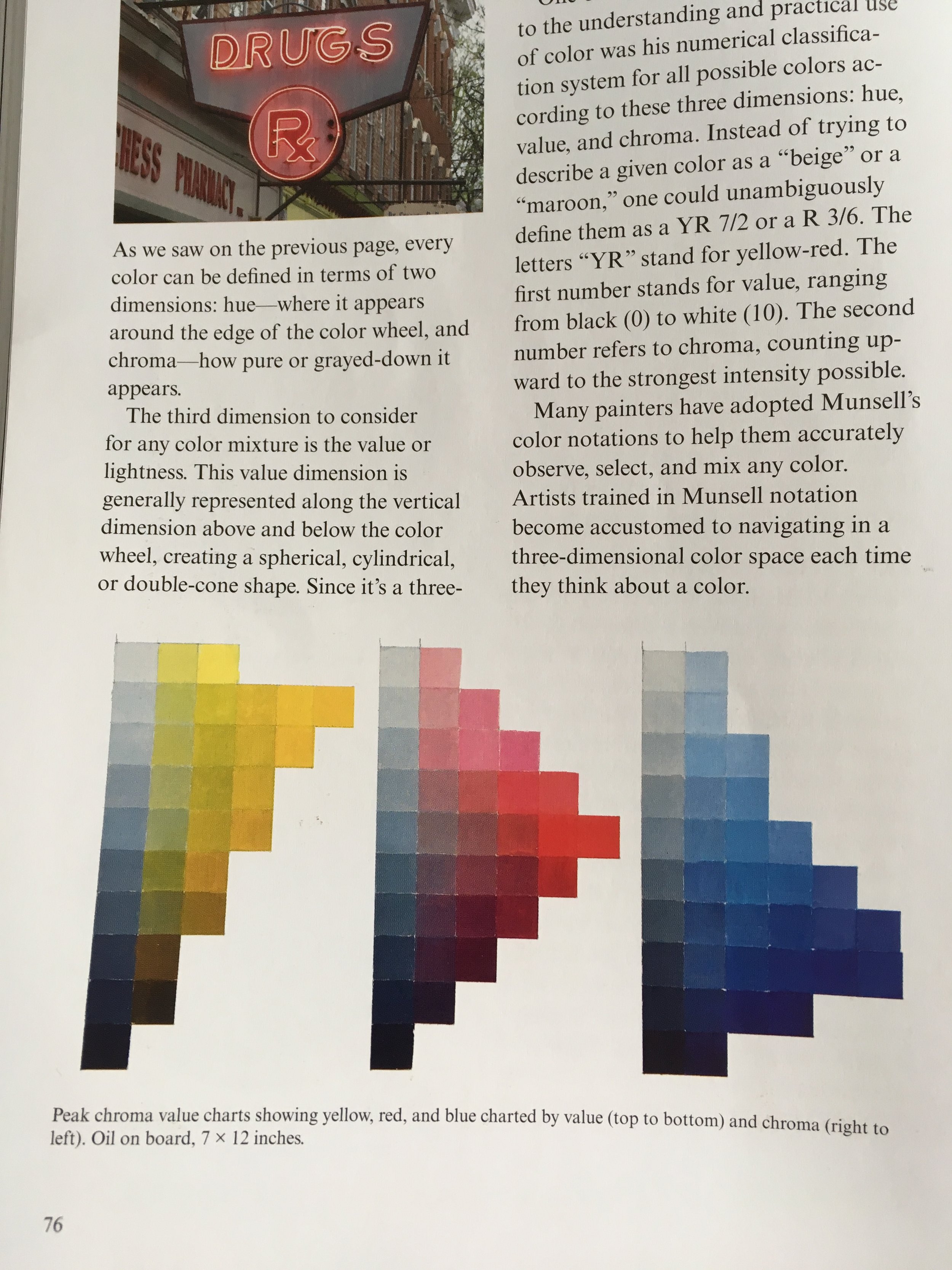
It visually demonstrates the idea that pure yellow is a lighter value than pure red, and likewise red compared to blue, etc. It also shows how, for some colors, you have to make tints to get certain colors to be brighter. What's particularly interesting is how he begins to apply some of this info to a painting that includes the neon sign featured in the first photo. So, he jumps in to a functional conversation about the limits of orange-red in terms of its value, and his solutions to this problem in his own painting. The point is to get beyond theory, which he does a good job of doing. Here's the painting. I'd say he's doing ok with his solution to the lighting problem! :P

This third example, below, discusses the idea of gamut mapping. This is very interesting! It's an idea I'd not heard of before reading the book, that James goes into more and more. He has follow up entries that explore the idea and show how it can be applied to different subjects to create different color schemes. This is actually something he does again and again, letting one entry sort of build into another, stacking knowledge and information, one on the next. This allows for some sophisticated ideas to be presented in bite-sized bits.

This final example is also really interesting to me. It's a section all about depth perception, and how our minds stack and layer objects, using the comparative blurriness of various edges as perceptual cues. Edges are such a powerful, subtle tool, but very important for watercolorists in particular. As always, his diagram is clear and educational, and his follow up painting drives the point home. It's hard not to focus on those sharp, in focus teeth! The blurred edges move our eyes around, and nudge them to the focal point.

I suppose that's it for now. Not much more to say. It's not a book that I use as a bible. It's got almost nothing on being a watercolor artist, or how to build interesting paintings, or how water works, etc. It's really more about how we see things, and how we turn that into color and light on a canvas. On that level, it's often actually outside of media. But read in conjunction with other books, such as Zbukvic's or Karpinska's, it offers an alternative block info that they don't cover at all. For that, it's well worth the purchase.
Happy reading!