The Joseph Zbukvic Workshop, pt. 4- Painting Plein Air

This post is about painting plein air with Joseph, during the second workshop. Every day, we all went out and painted around SF. Fun! ...if you're a sociable person. Everyone had their own set ups. A couple of people had the Plein Air Pro, which is a nice product for those who aren't particularly handy. Others had crafted their own, using camera tripods and whatnot. I get a kick out of that kind of handy work, and so have been slowly iterating on my designs (scroll down on this link to the section labelled "Materials", where I talk about it).
Here we are on site, with some different set ups. Joseph's is in the background on the right, being used by a student. Part of the Plein Air Pro can be seen in the background too.

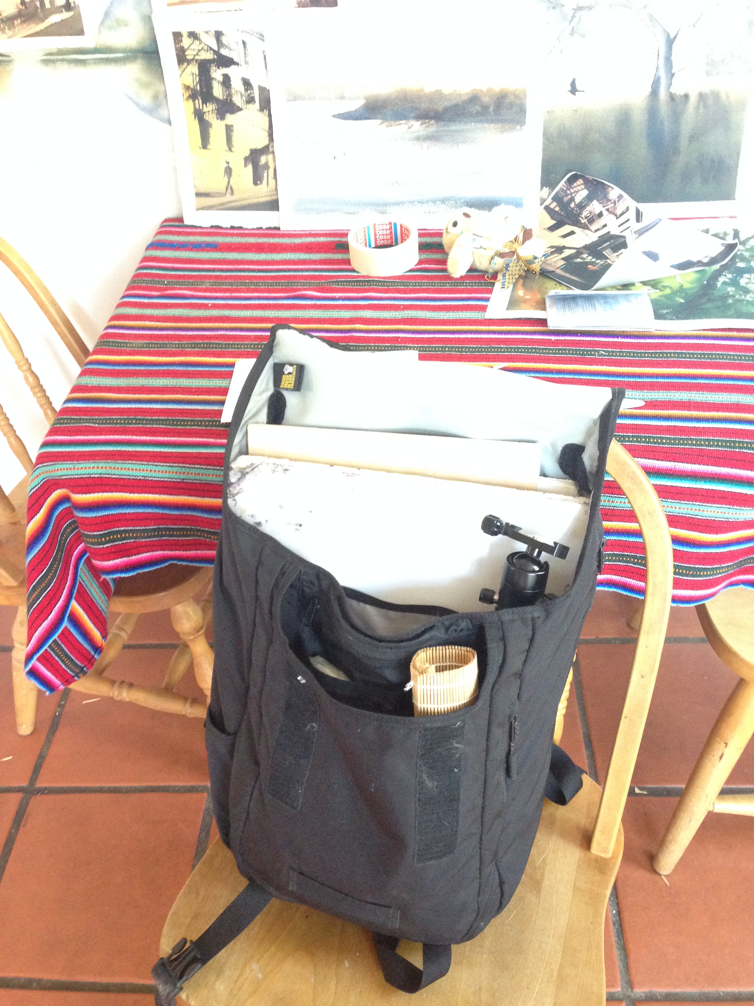
For basic comparison, here's my setup from August. I've been changing it some, but you get the idea. Everything fits into that backpack with a wide mouth, so portability is important. All in all, about 10 lbs in total. Pretty light! I'll be making a separate up to date post on my setup and tools later on.

Beyond things being light and portable, the next major effort was to always make sure we were in the shade. This allows you to read the values correctly on our paper, because the sun is too strong of a light. It blows everything out and makes it all too warm in hue. One day, while in Chinatown, the sun moved far enough that a number of us had to completely move our easels to keep in the shade- so it's good to pics a spot you know will stay shady, right from the get go. In the picture below, we're all over by Aquatic Park, with an amazingly shady location on the north face of a building. Very lucky that we found that spot out by the beach!

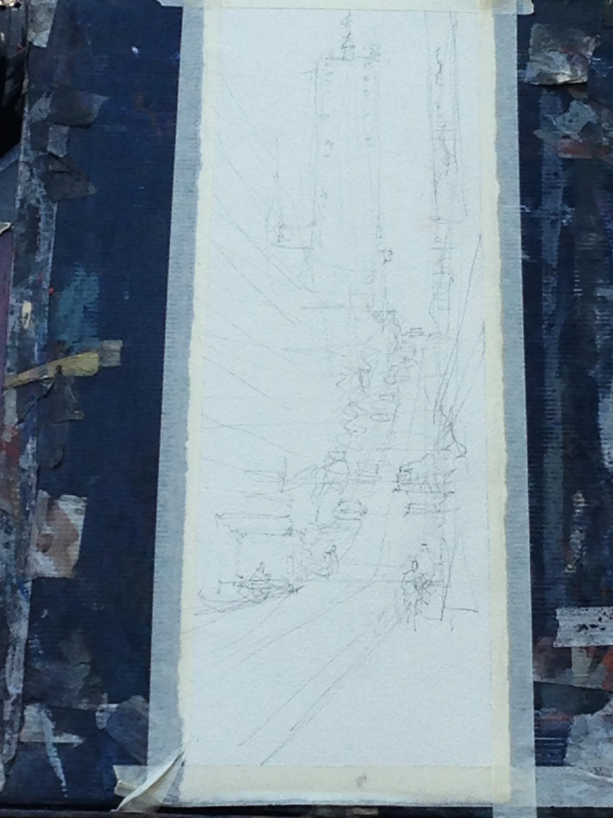
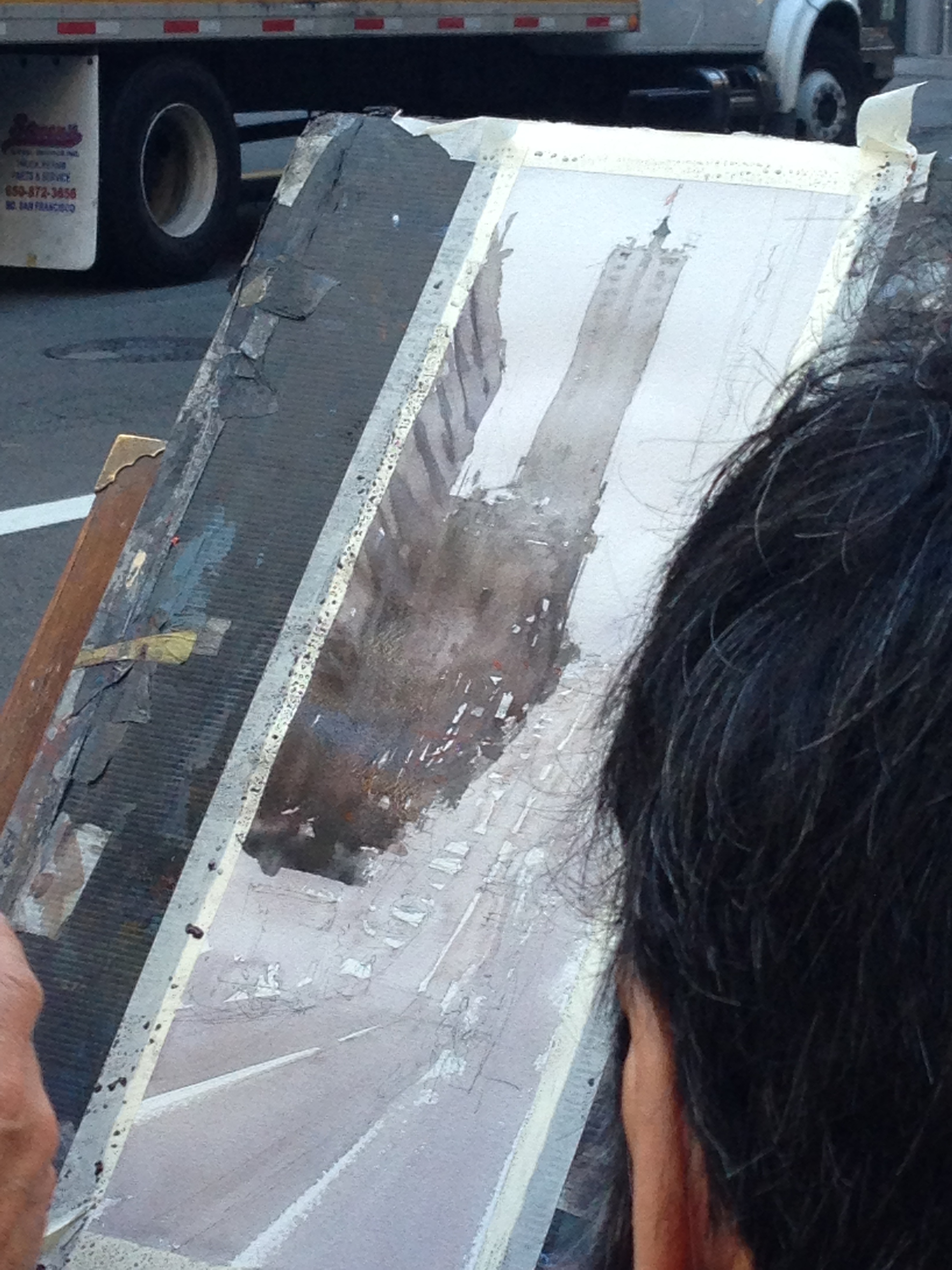
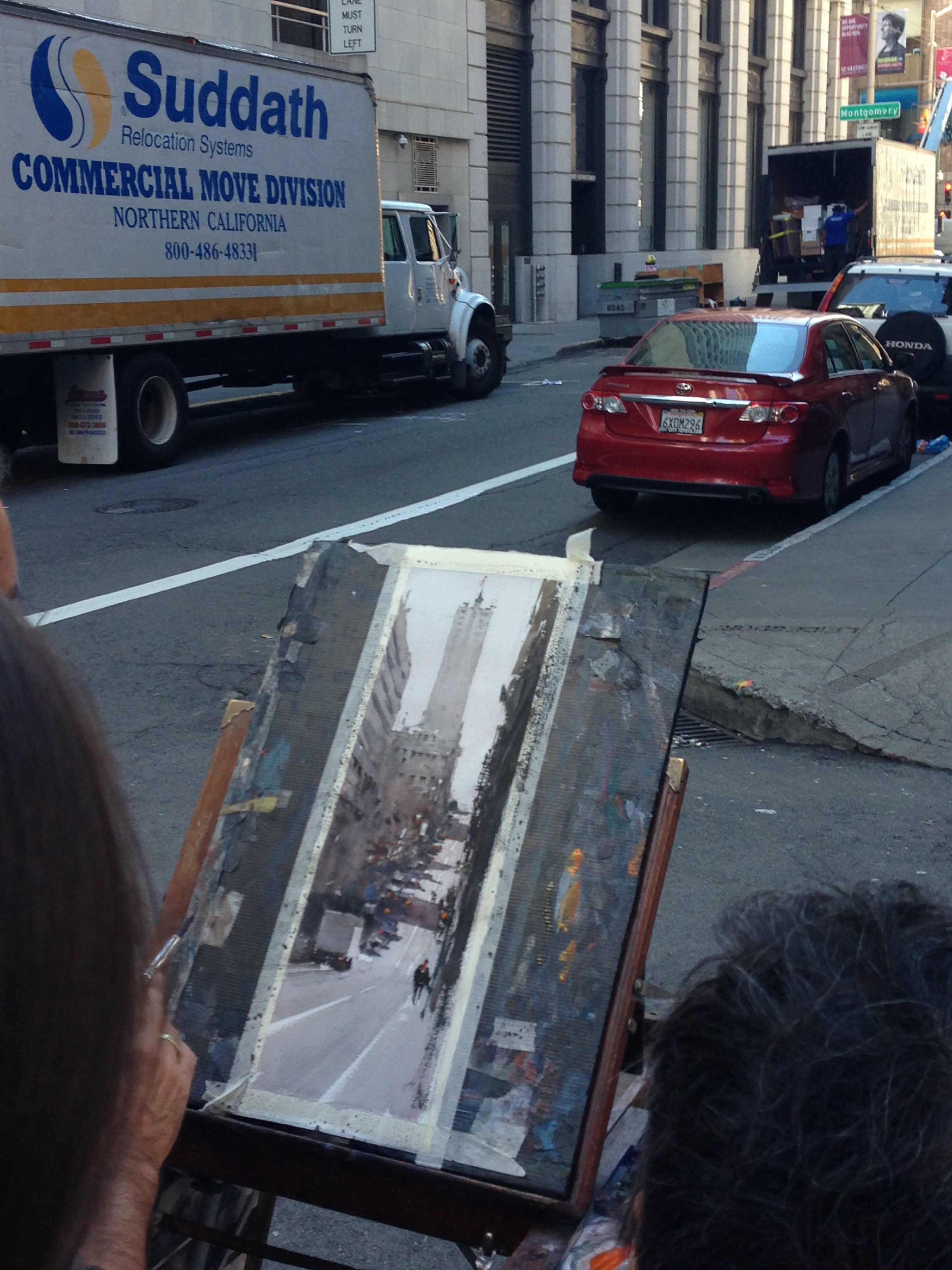
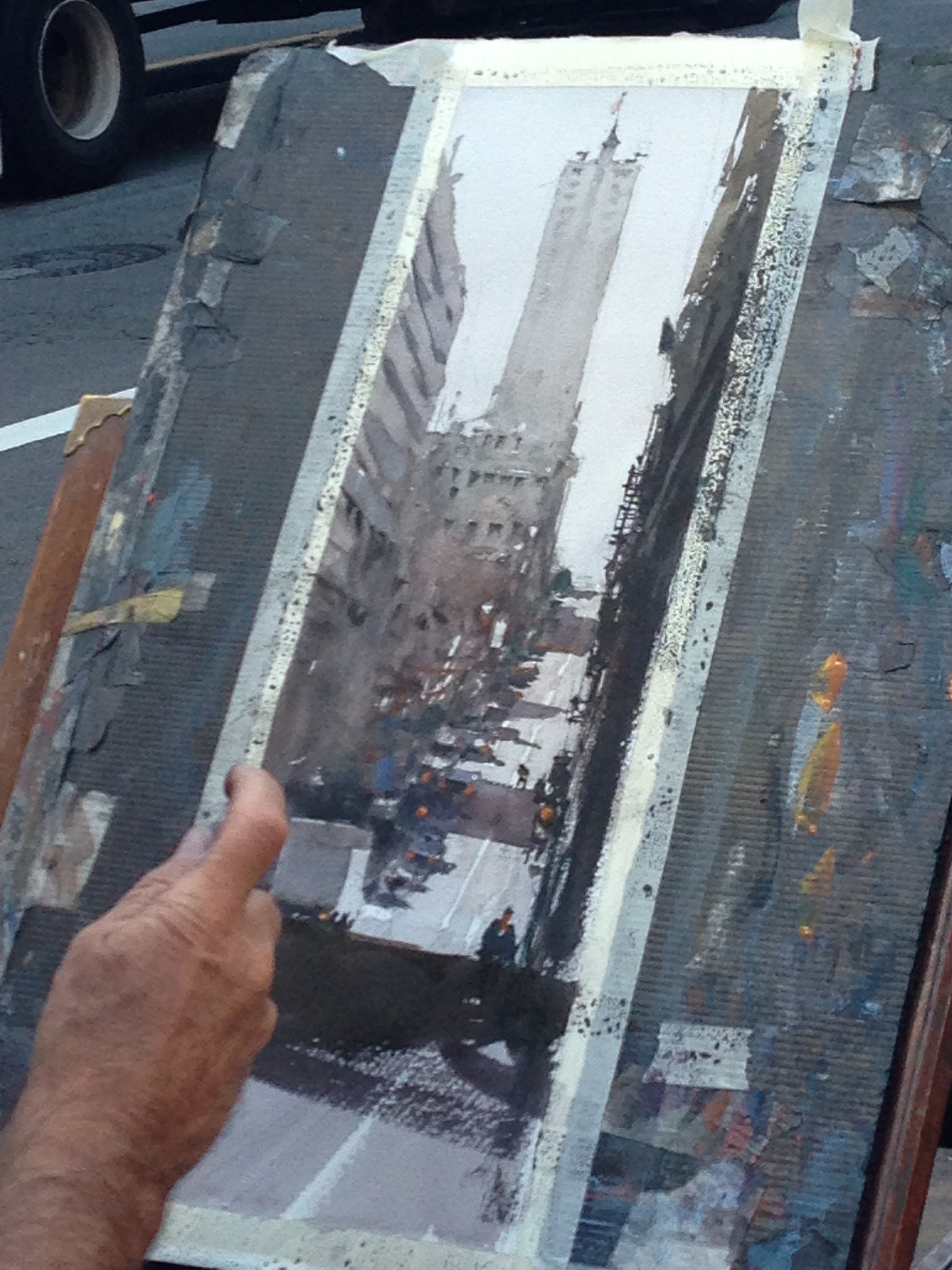
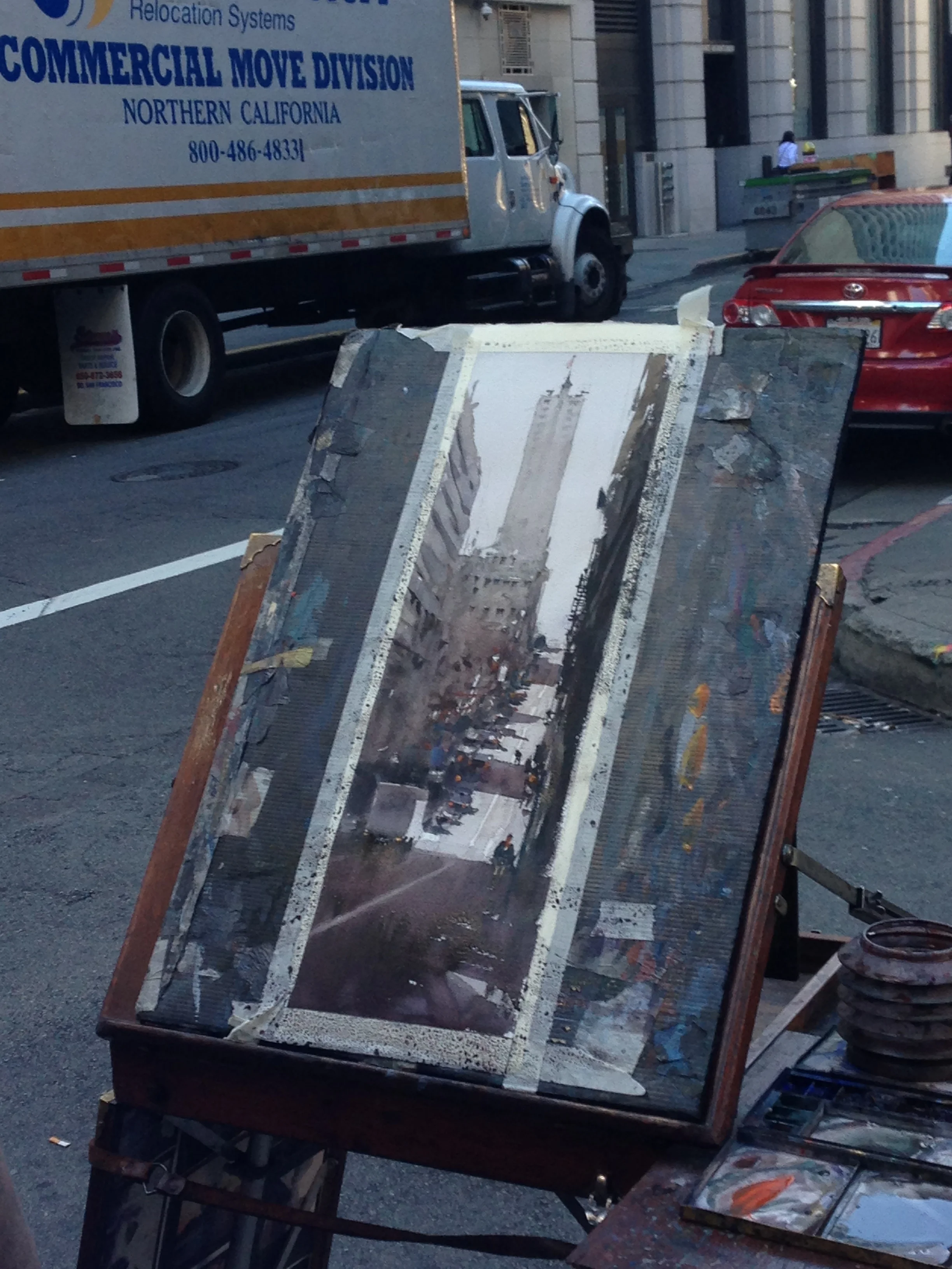
The first thing in this step-by-step that I wanted to show was the on-site photo. At some point, Joseph discussed the issues that occur when you only work from photos. Chief amongst them was that a) we read the relationship of values differently with our eyes than cameras do, and b) that smart phones make distant objects look REALLY far away. In the sketch below, it looks like we're incredibly zoomed in, but the truth is it felt very natural to draw things at that scale. It is the camera that is distorting the experience of distance, and the onsite photo should really be zoomed in a lot, to better reflect the human experience of viewing the space. Something to ponder!

#1
#2
As for the sketch, I particularly wanted to note how loose the windows are in the foreground on the left. He only really cares that the general sense of perspective is in order. He'll paint the experience of the windows with his brush, not his pencil. By the way, note how big his foreground is- Big Idea #1!

#3
#4
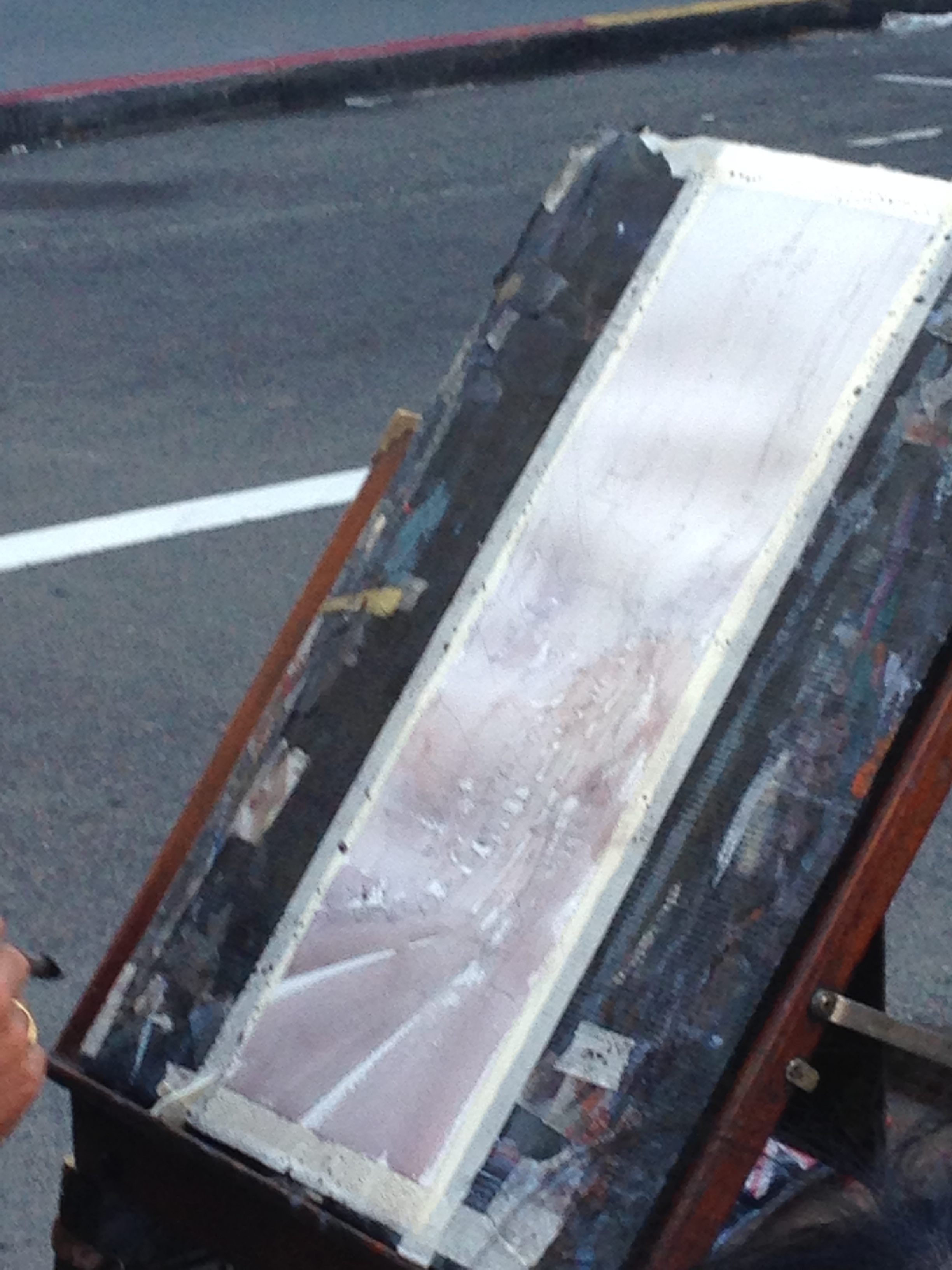
3 & 4) He starts his wash at the top and descends into the streets and buildings. This will be his lightest values. He cuts around the ideas of cars and what not, leaving a few abstract highlights here and there, but pays particular attention to the directional lines he'll use for the sidewalk's edge and the stripe down the middle of the road. Then he lets everything dry all the way. Big Idea #2!.
#5
#6

#7
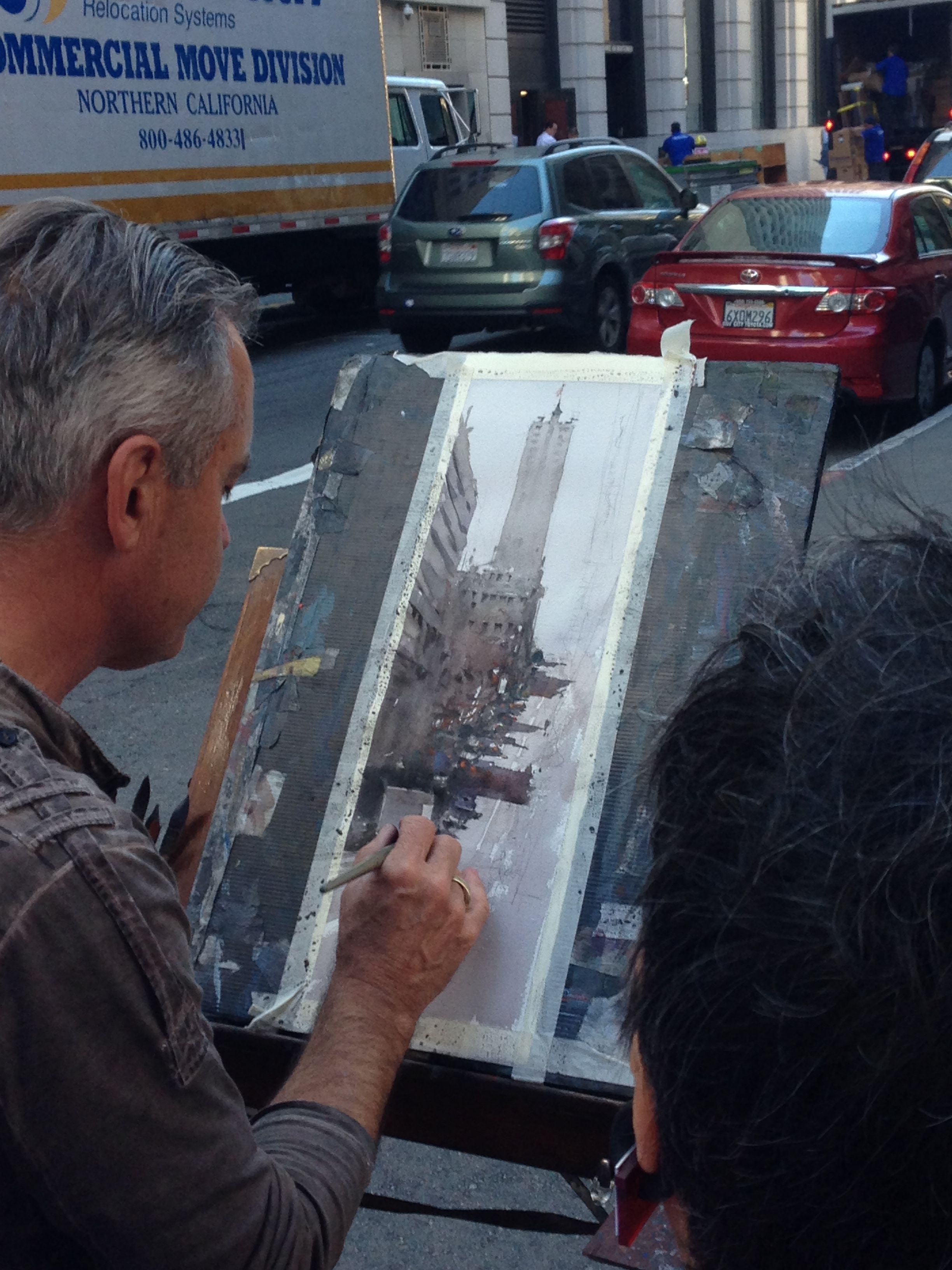
5, 6, & 7) He stars Phase 2, and paints in the silhouette of the primary building. He blends it in with the buildings on the left, in the foreground. When things get too tight, he spritzes the area with his mister. As the paint runs, he brushes in darker values for windows and ledges, etc. and lets it paint itself. Big Idea #3.
#8
#9
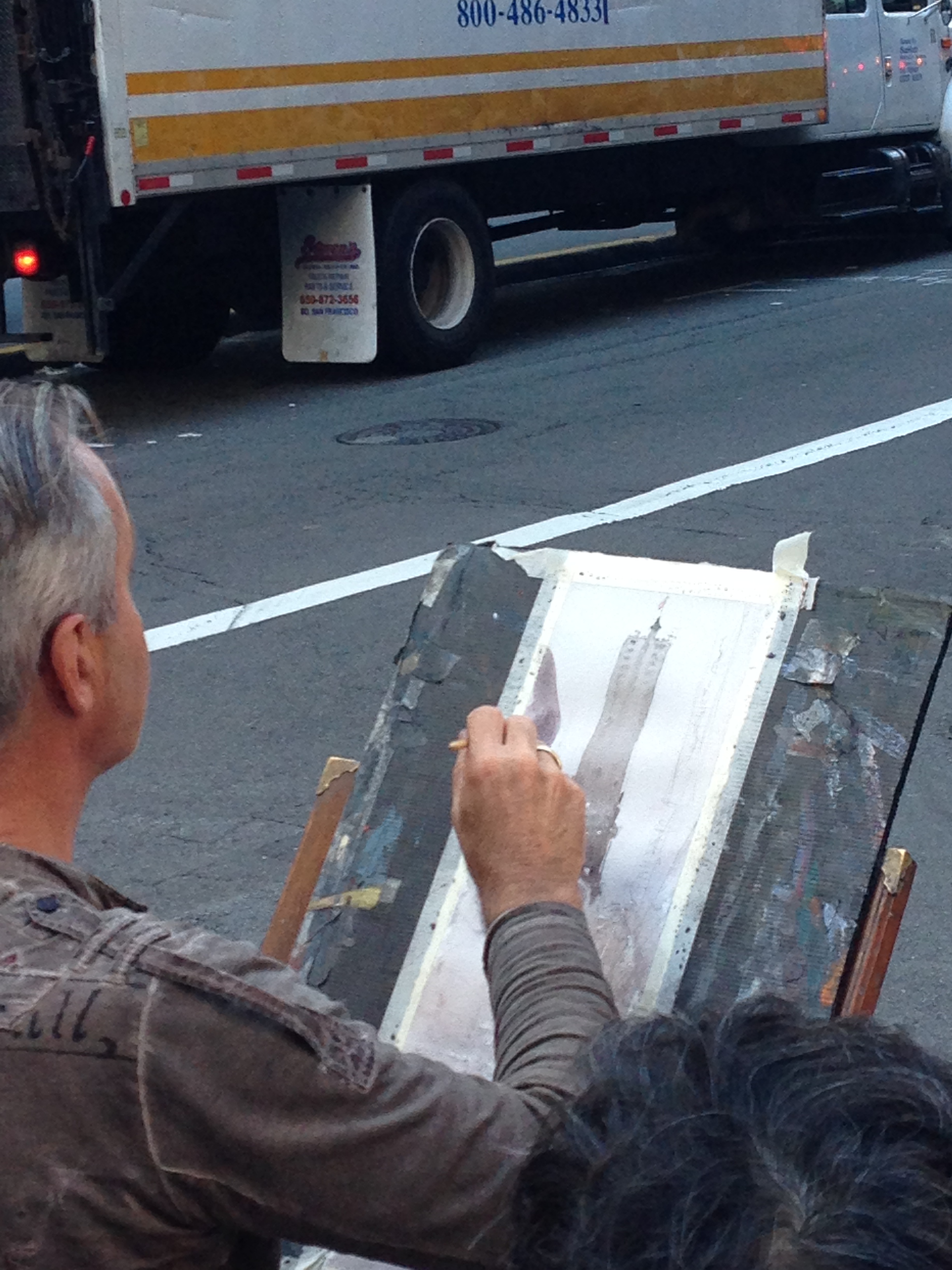
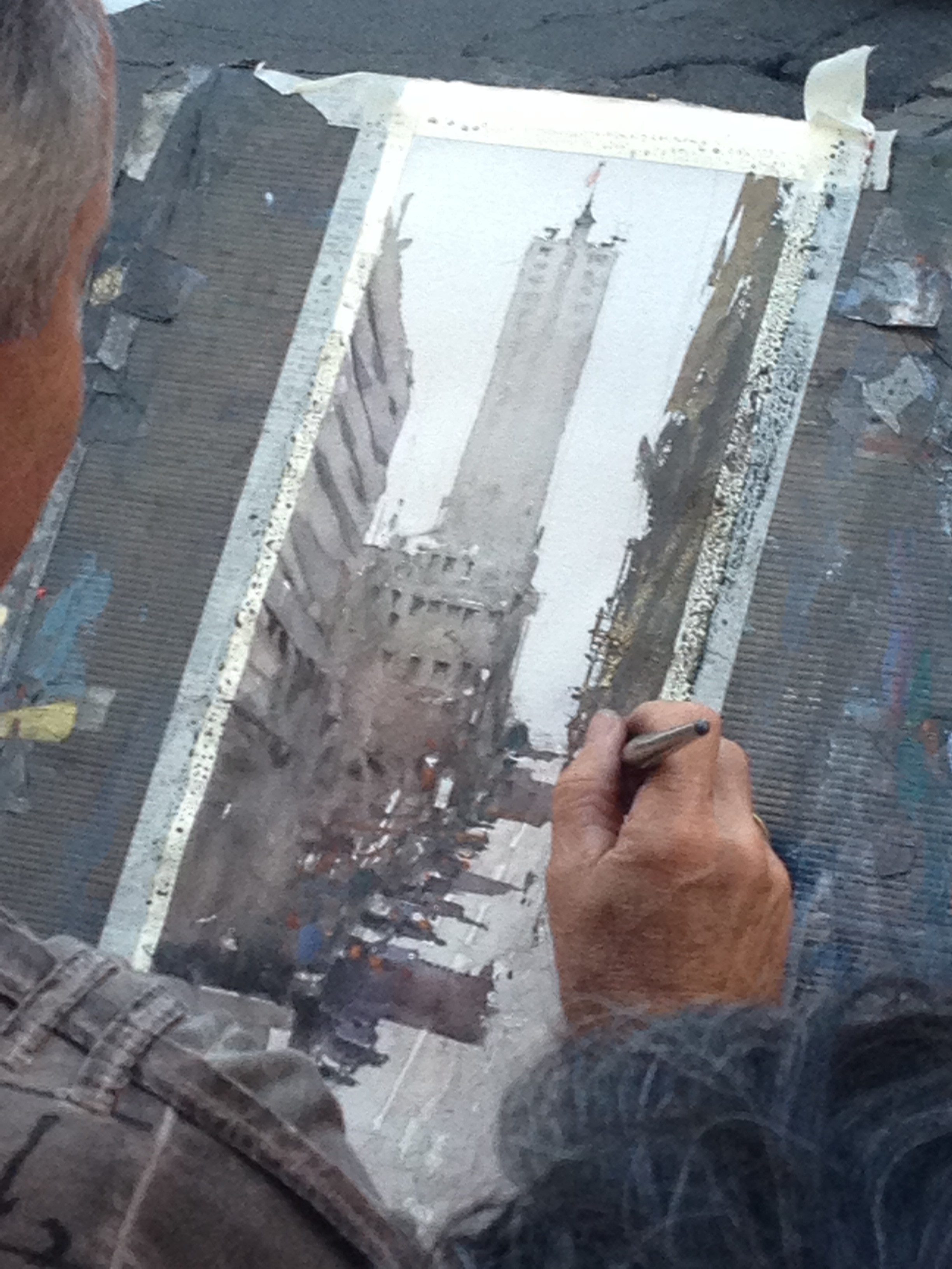
8 & 9) Here you can see him cut around the delivery truck in the foreground, where he preserves the original lighter value of his first wash. Then he pushes into the right side with big, strong, rough strokes to create that building. It's also worth nothing how much he removes from the onsite photo. No awnings and what not; he removes certain posts, etc. Anything that doesn't build a good composition. He's definitely not a slave to what he sees.
#10
#11
#12
10, 11,& 12) Only at the end, after the painting is basically done, does he add in the people and details. Finally, he brushes in a bold shadow in the foreground, trapping some light in the midground. The end!
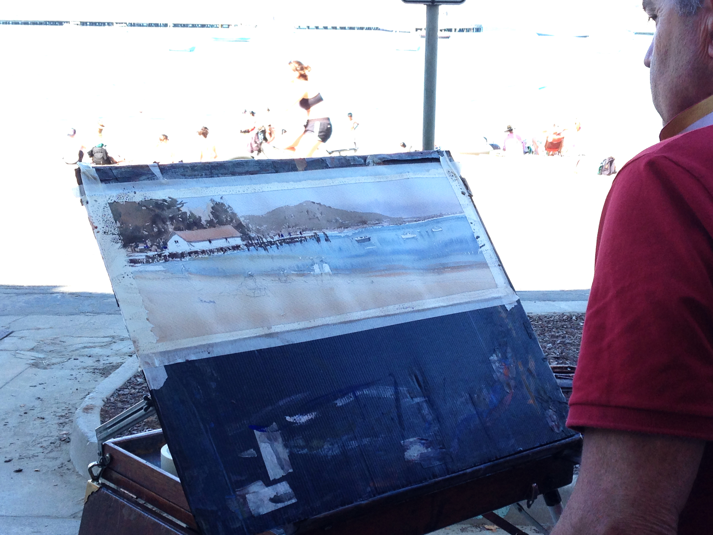
This next painting was done at Aquatic park. Look at what he changed- no lamp post right in the middle of everything and no crazy-ugly square shade umbrella on the bottom left. He "squishes" the composition to bring the beach closer to the house and dock too. Notice how small they are in the photo, compared to the sketch? Finally, he also shrunk the length of the very long dock, which was so long it actually extended out past the right of the picture, dividing the image too harshly for him.

#1

#2
So, in goes the initial wash, both top and bottom, but with a seam along the watery horizon. He divides the painting into Heaven and Earth, Foreground and Background. Big Idea #1. Look how he merges the water and sand- he puts the blue and dusty yellow down, they begin to merge, and then he adds a few strokes of orange along the shoreline (wet into wet with the water), so you get the sense that you're seeing areas where the water is shallower, and parts where its deeper. He drops it in and doesn't fuss with it- Big Idea #3.

#3

#4
Look how he does the roof- he actually paints it wet into wet and lets it disperse into what will be the area with the trees. Then he lets it dry. Big Idea #2. He's done with Step 1.

#5
#6
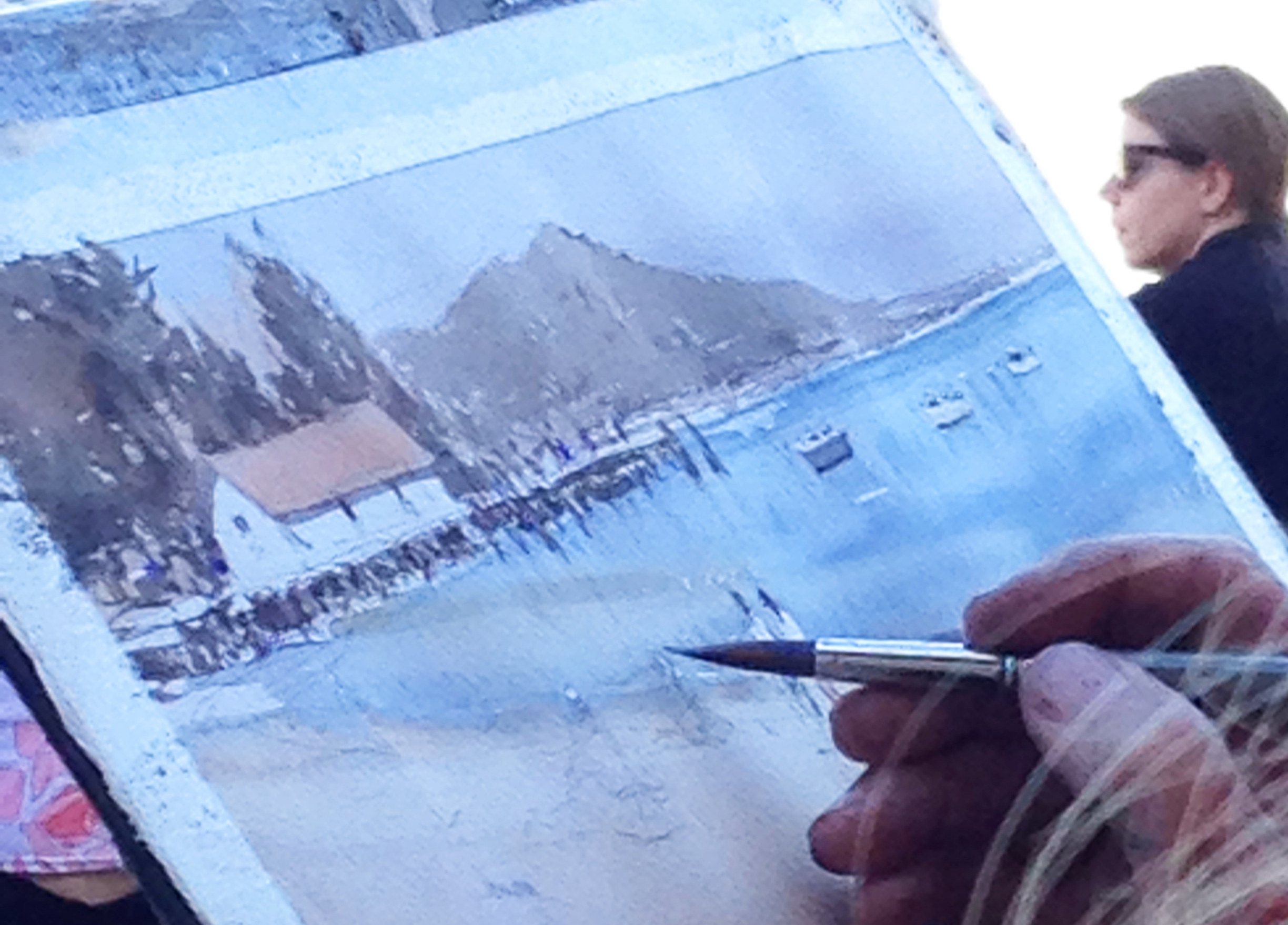
Next are the trees. Remember how loosely he sketched them? It was just to notate placement and a shift in value from the sky. They're free shapes that he builds with his brush, not his pencil. After that, he begins to paint the shadow under the overhang, a few windows, and the docks. The pylons and the docks are done very abstractly, and is a good representation of some of Chien's compositional ideas- Big/ Middle/ Small & No Sameness, in particular. The edges are sharp and dry because he let everything dry first.
Only in these last ones does he go about putting in the people and boats. The same mantra comes up- it's not the details that make the painting, its the shapes. It's a very Chien moment too, for what it's worth... though I've never seen him paint a scene like this. Also, back in the second post, I talked about Joseph's advice that watercolor paintings which are light valued but rely on pops of dark for interest, are easier to paint. This one falls right into that.
#7

#8
One interesting detail? There's a furry, organic value in the foreground of the beach in the final pic. It was all a bit flat for Joseph, so he used a technique very similar to what he did in the Bales of Hay demo (Pt. 1) to make the grass. He did a light wash of color in the foreground, on totally dry paper, and then swiped some dirty water over the top and "let it paint itself." As the water gently pushed into the wash, it created the textures and values you see. It's neat to think how he used the same technique to create textures for grass as he did for sand. It's very similar to how he used the same technique to make the clouds in the Bales of Hay demo (Pt. 1) as he did to make the windows we saw in the Red Awning demo from Pt. 2.
In the next and final post, I'll be sharing some of my paintings from the workshop, as well as what kind of critiques I got for them that were helpful.