The Joseph Zbukvic Workshop, pt. 5- My Work and Critiques
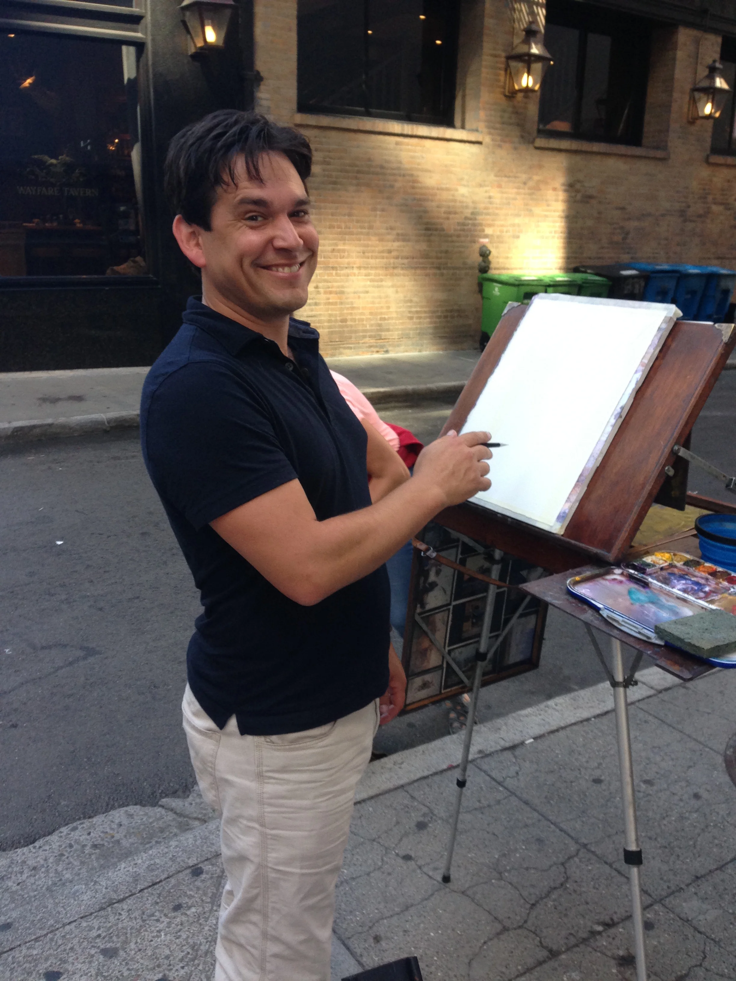
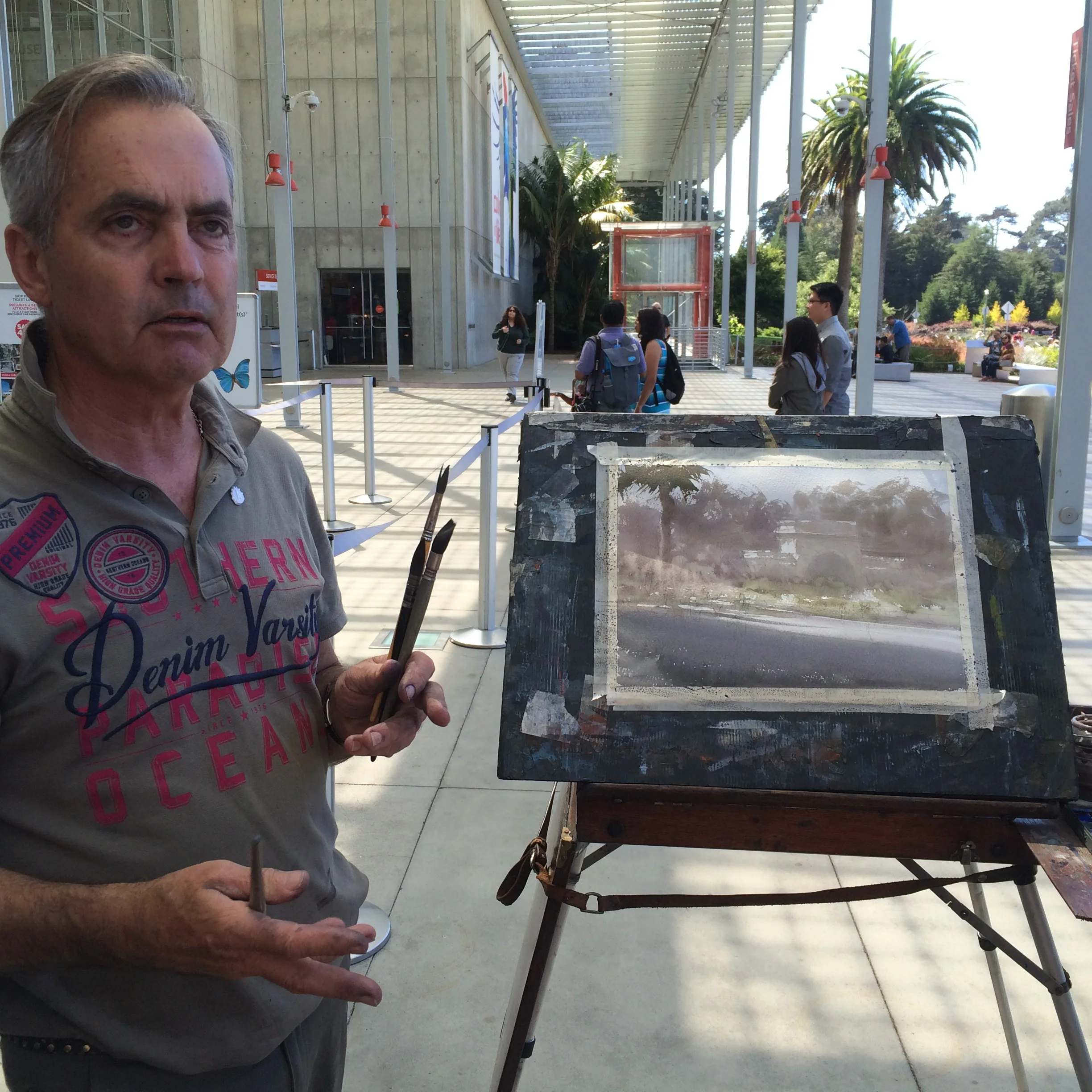
That's me, at Josephs Easel. He let some of us paint on it, now and then. ! A pretty ingenious design, btw.
Over the course of the week, I did 12 paintings. 2 a day. Quite a lot of work. I'll be showing my work side by side with Joseph's, as a learning tool. Some of my stuff came out ok, but the truth is that all the heavy lifting was really done by Joseph- namely, choosing a subject and creating a vigorous composition. It's much easier to just focus on technique and repaint something he's done, than it is to create your own image. Mine are all on the left (obviously! LOL!) and Joseph's are on the right.
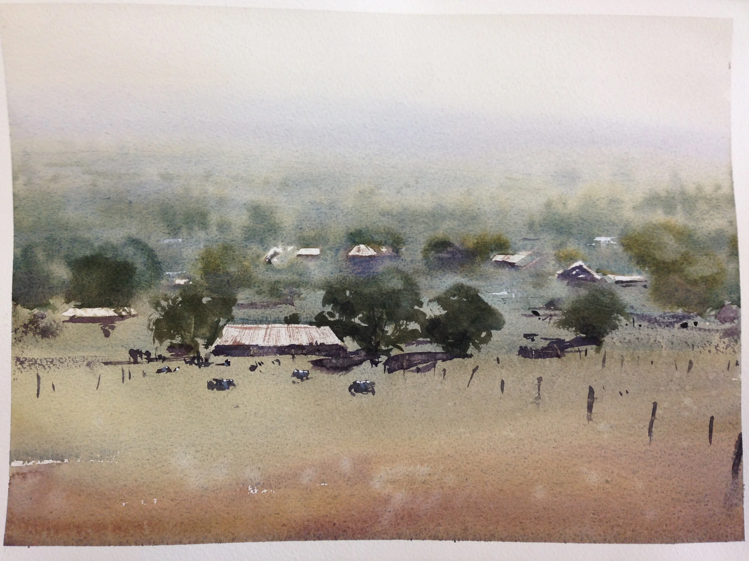
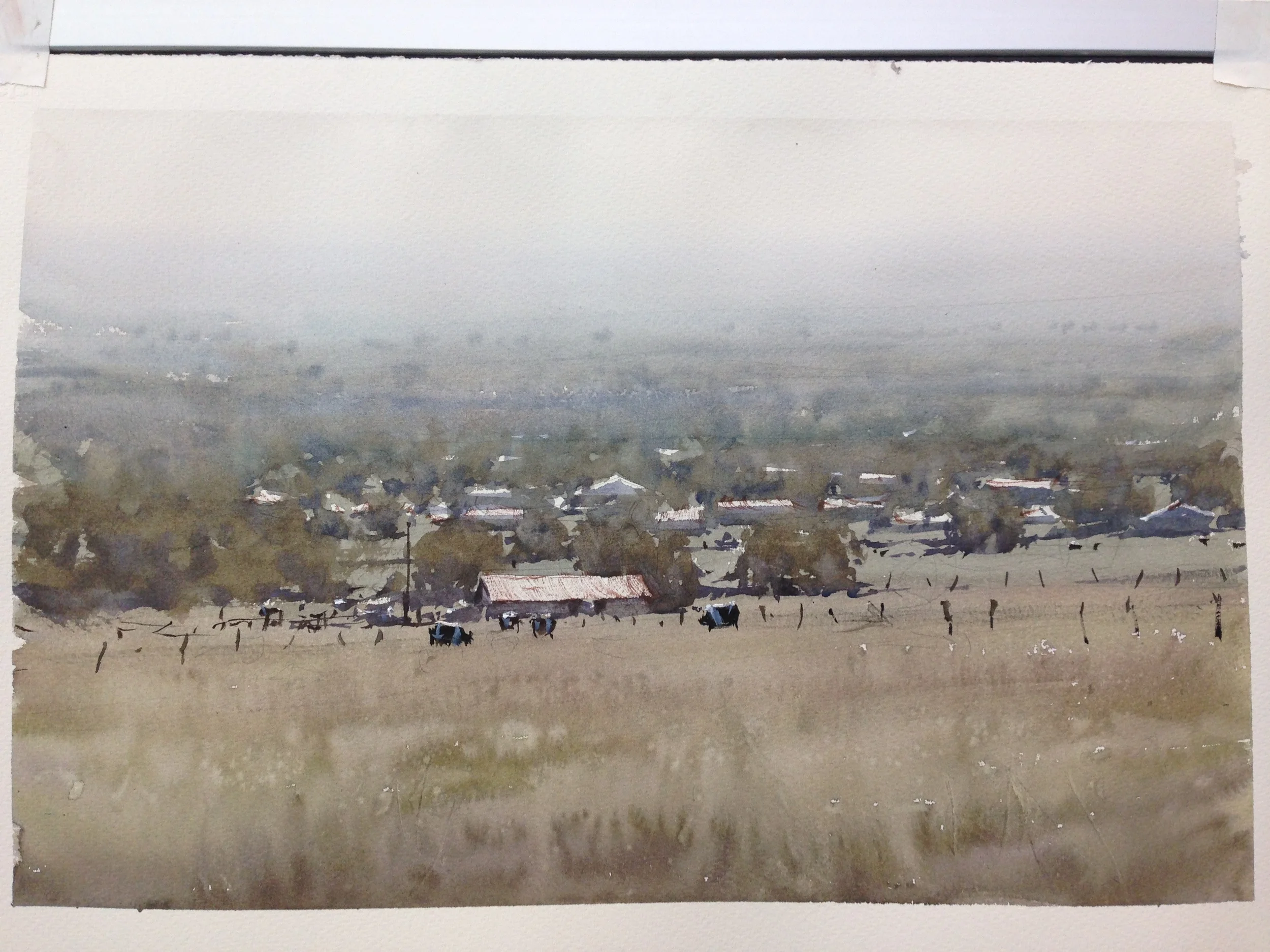
#1- Day 1-
The first of the bunch. A lot of wet into wet work up top. Joseph's distant trees have a bit more form to them- mine dissolved a bit, either because I went back in too early, or I had too much water on my brush. I'd never done cows before, but muddled my way through. Getting that magical foreground was the hardest part of it- it's more difficult than Joseph makes it look. Put in the water too early, and it all disperses (like me). Put it in too late, and you get blooms (others got those). He dropped in more fence posts towards the end, to pull you in to the midground.
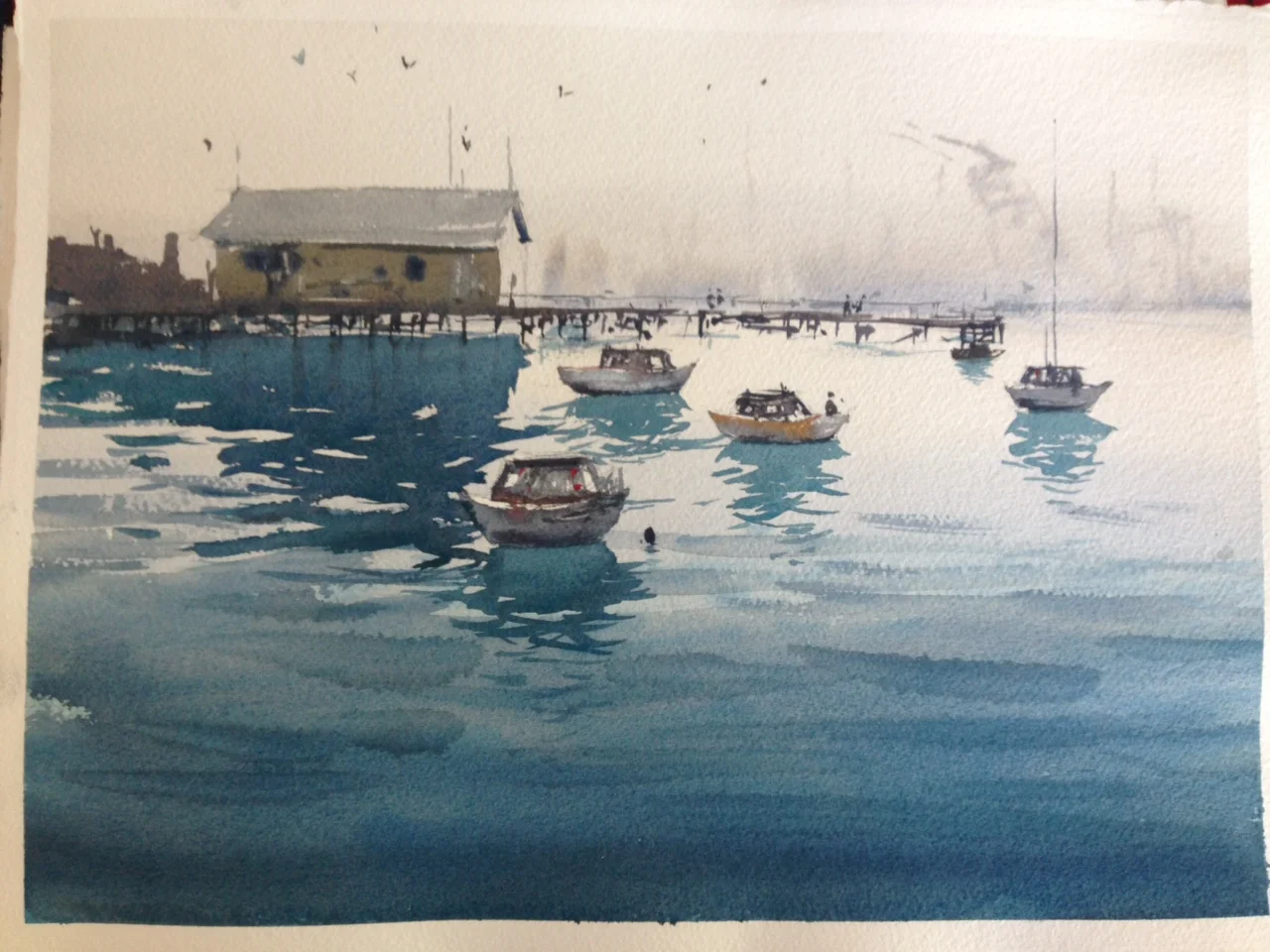
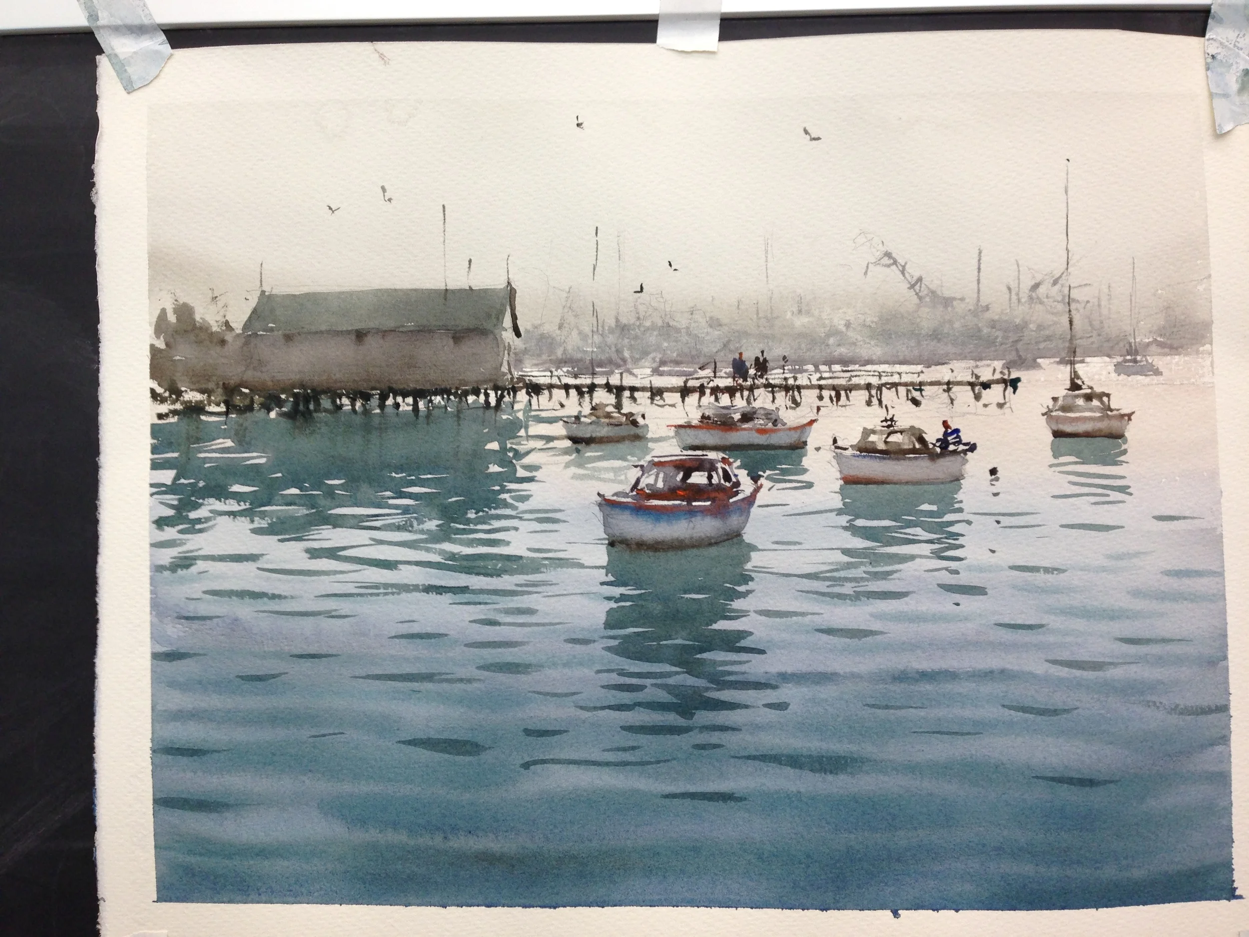
#2- Day 1-
The soft background wasn't too hard, but once again, I dove in a bit too early, and my marks dispersed a bit too much- it almost looks foggy in mine. The wet into wet in the foreground was easy to trip up on. My first go was too pale. Joseph came over the top of it for me, and pushed a richer darker value in. Alternately, he felt my reflections were too dark. I also had too many small, slashing lines for my rippled reflections. The building was easy enough, but the boats... eh. That's something I would need to get better acquainted with, if I were to paint more of them. Cows and boats the first day. Tough!
#3- Day 2-
This came out ok, IMO. There's something more dynamic in his building on the left. There's more shift in value, creating a sense of depth. I dropped my darker values in, wet into wet, a little too early (clearly a common problem for me!), and they dispersed. His people have a wonderful sense of motion t them, that I would like to get into mine as well. He commented about needing to get the shoulders uneven, to capture a sense of active balance.
#4- Day 2-
Over the course of the week, I began to see how Joseph was very picky about when he was loose and expressive with his brushwork, and when he was very tidy and slow. I actually like my windows and the foreground shadow, but looking at the awning, I can see how straight his is. This is important for it to read as an awning, because it's a manmade shape. Same goes for my tables and chairs. I feel like I got the idea right, but a bit more precision here and there would do wonders. It's not, IMO, the abstract work that is my issue, but that everything lists to the left (an ergonomic problem, being right handed) . He told me more than once that I should "be loose, and let watercolors play. But then you have to choose where you want some finesse, and pay attention to those areas. Those spaces will help the loose spaces have meaning." This is clearer as I look it over. Some people have issue with keeping things too tight, but I feel like I've got the opposite problem and need to learn to selectively reign it in a bit.
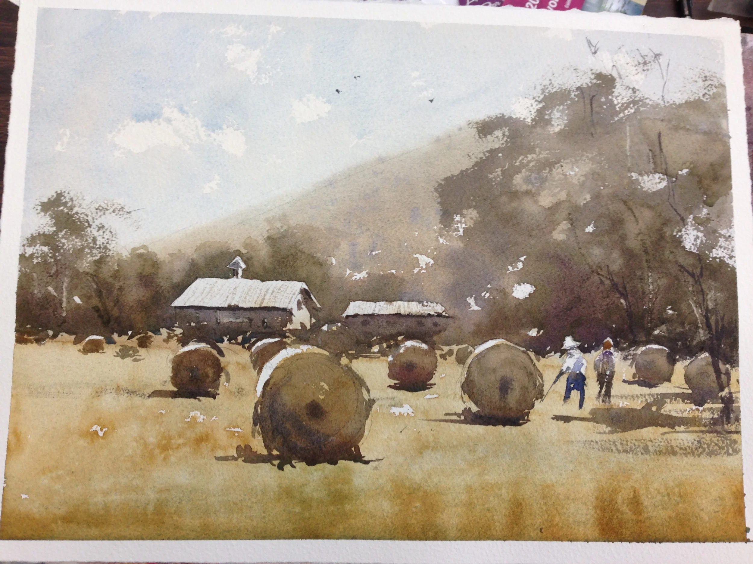
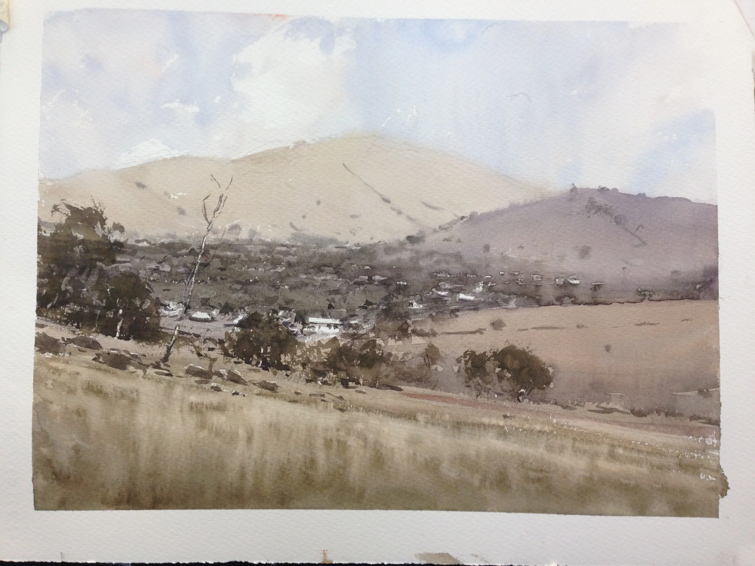
#5- Day 3-
I really LOVE the way he does the loose grass here, but was just not quite able to capture it. I suppose it's better than the grass I did on #1, but it's still too early. I'm ok with the background, and my buildings, all in all, but I now see how my bales of hay have encroached on the foreground. Joseph's has a sense of distance and expansiveness that stems from the more open foreground. Big Idea #1. Also, at first, my bales were very cleanly circular. He came over and scruffed up the edges some. He told me it's because that's how they look in real life, but I think it's also because it provides little "hooks" for the darker values to connect themselves to the foreground. Check out how his trees also "hook" onto the sky, and bond the mid and background together by doing so. A neat detail? The story he tells is that there were no workers there that day, but that instead he added them, to tell a story. As he did the demo, he pulled out a photo of some janitors he had taken, and used them in the painting.
#6- Day 3-
This was the only plein air piece Joseph did for the first workshop. My foreground is getting better! I waited longer, and got more rivulets. I'd like more chances to play and try out this technique. Joseph does a better job of modulating his values, so things are notably paler in the distance in his painting, compared to mine. Comparatively, my background and midground are a bit too dark, so I have to go a lot darker with the foreground trees because of it. It's a common problem that is hard to get past- the fear is that (early on) your distant objects won't read because they're too pale, but you have to trust your mid and foreground, and your "actors" in particular, to do the heavy lifting once you get there. If you do your background and/or sky is too dark, everything else has to push farther down the value scale. I've had many paintings accidentally end up "dusk" scenes because of it.
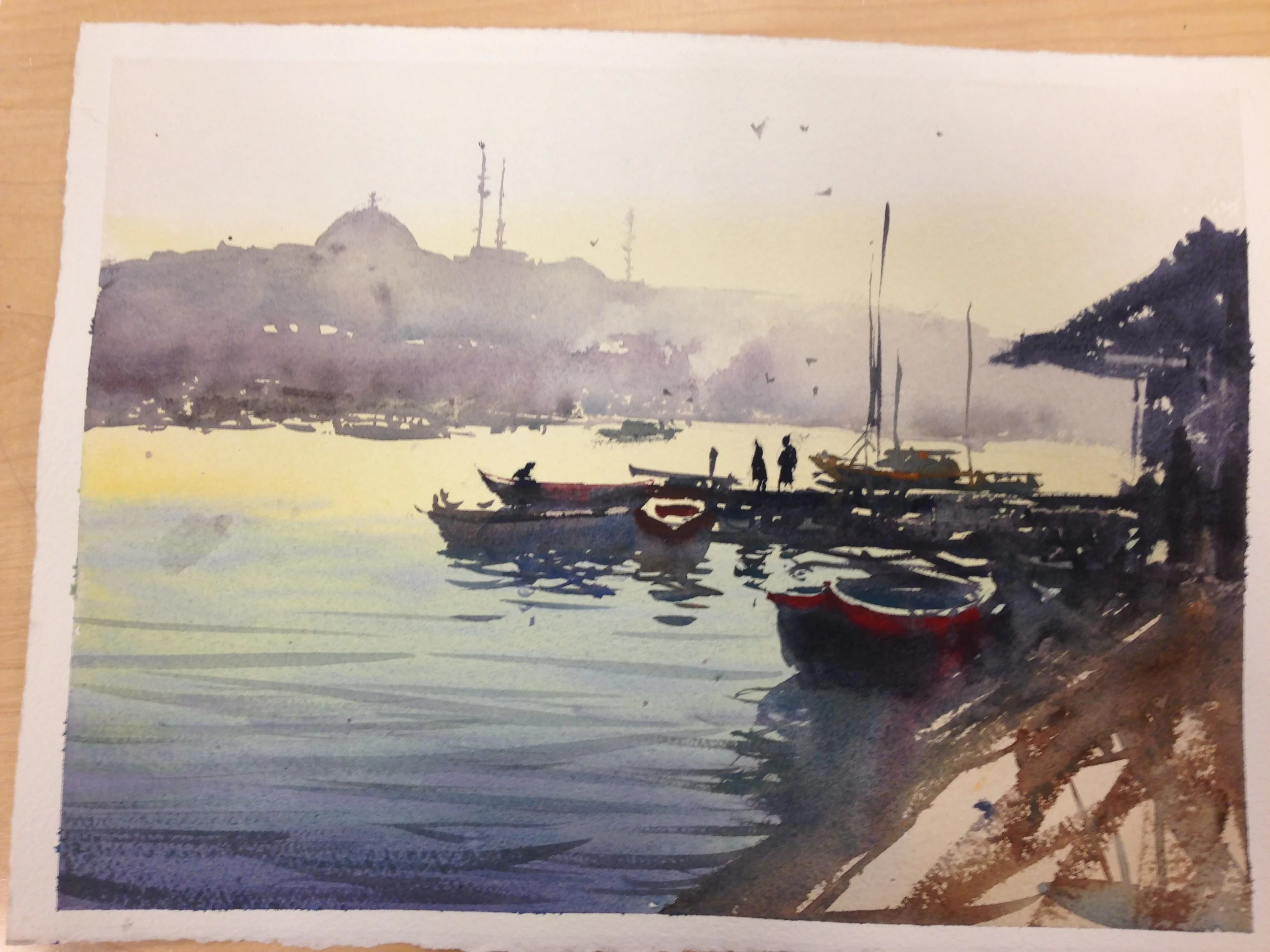
#7- Day 4-
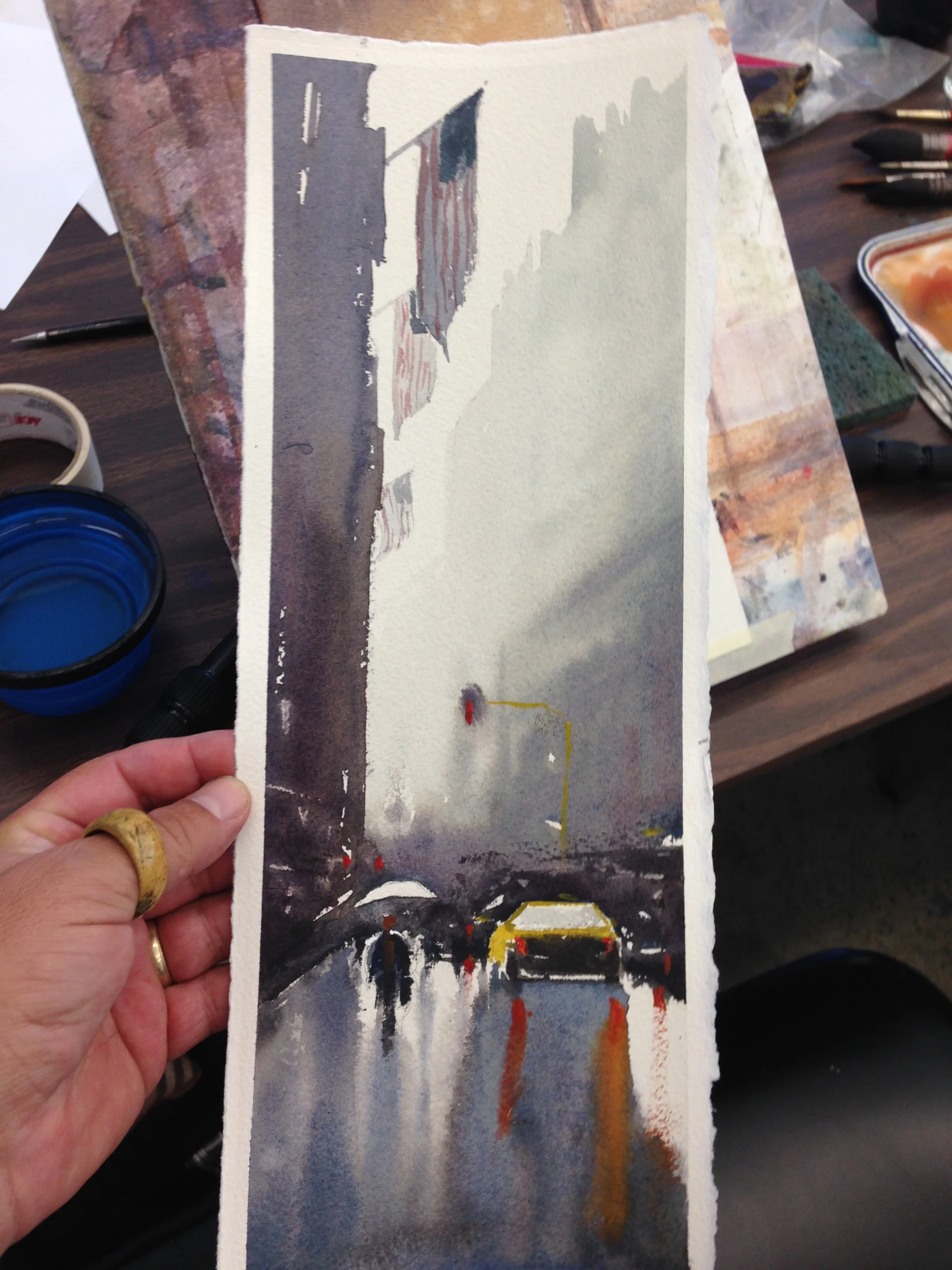
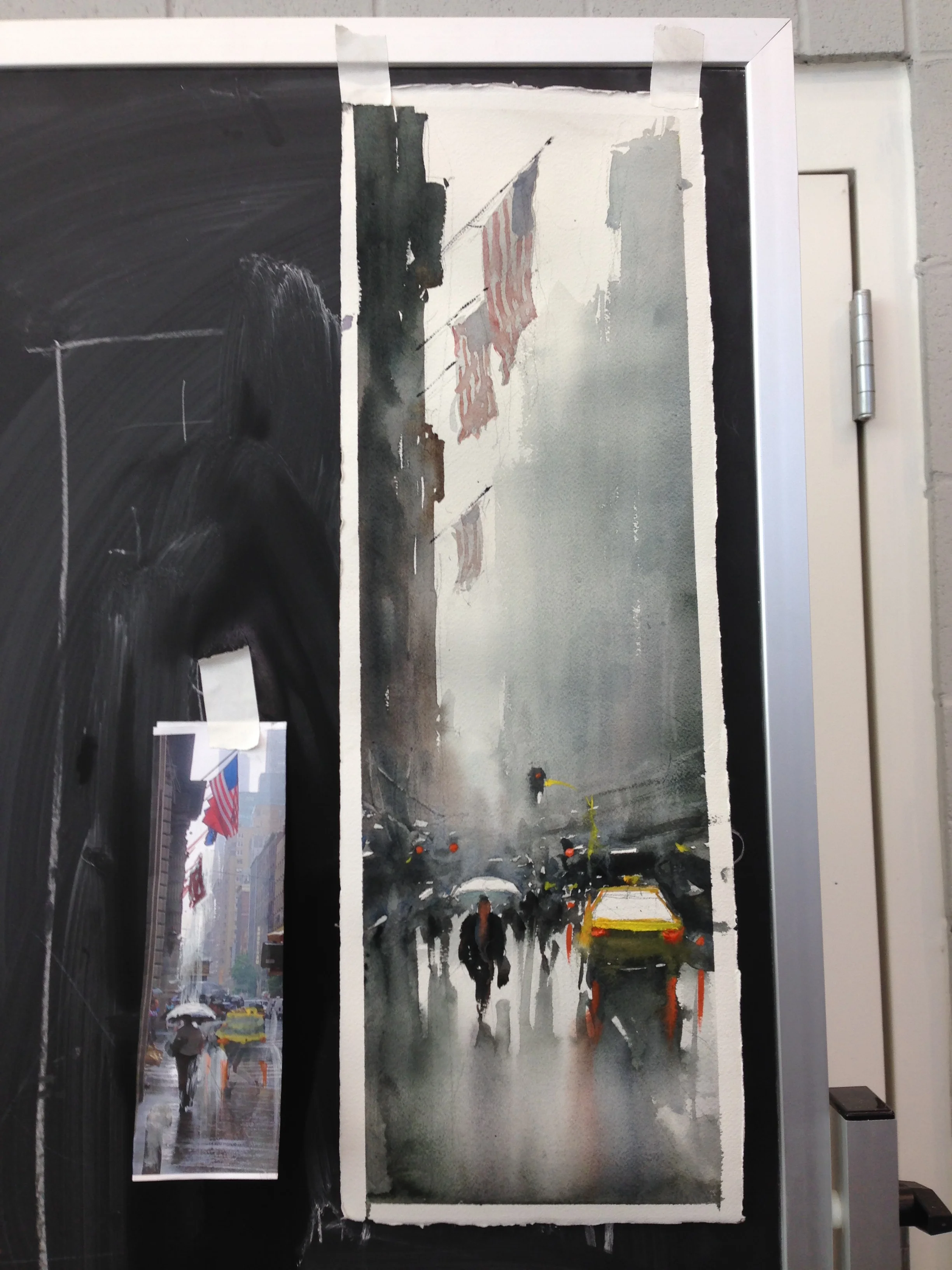
Our only in-class painting for the second workshop. I thought I did ok, all in all, though my yellows got away from me. After the fact, looking at Joseph's, I noticed that my horizon line is not quite level again. Ugh. Atleast my dock is level this timeThat little detail makes a lot of difference. Still, I liked my foreground boat. I had too many reflections again, so he "ate up" one set, by turning them into a second boat. Then the scale of the reflection looked appropriate to the size of the boat. Check out the vertical "hooks" going up into the sky (the masts and minarets), as well as the "funnels" coming down (the smoke, connecting the sky to the sea). Same goes for the reflections. Joseph calls the birds "space makers"- they "fill" the openness of the sky and give it volume, which is why he puts them in a lot of his paintings. I got to buy this demo from Joseph. Hanging in my living room- a great lesson full of reminders, every time I look at it. Plus it's beautiful. Oh yeah! :P
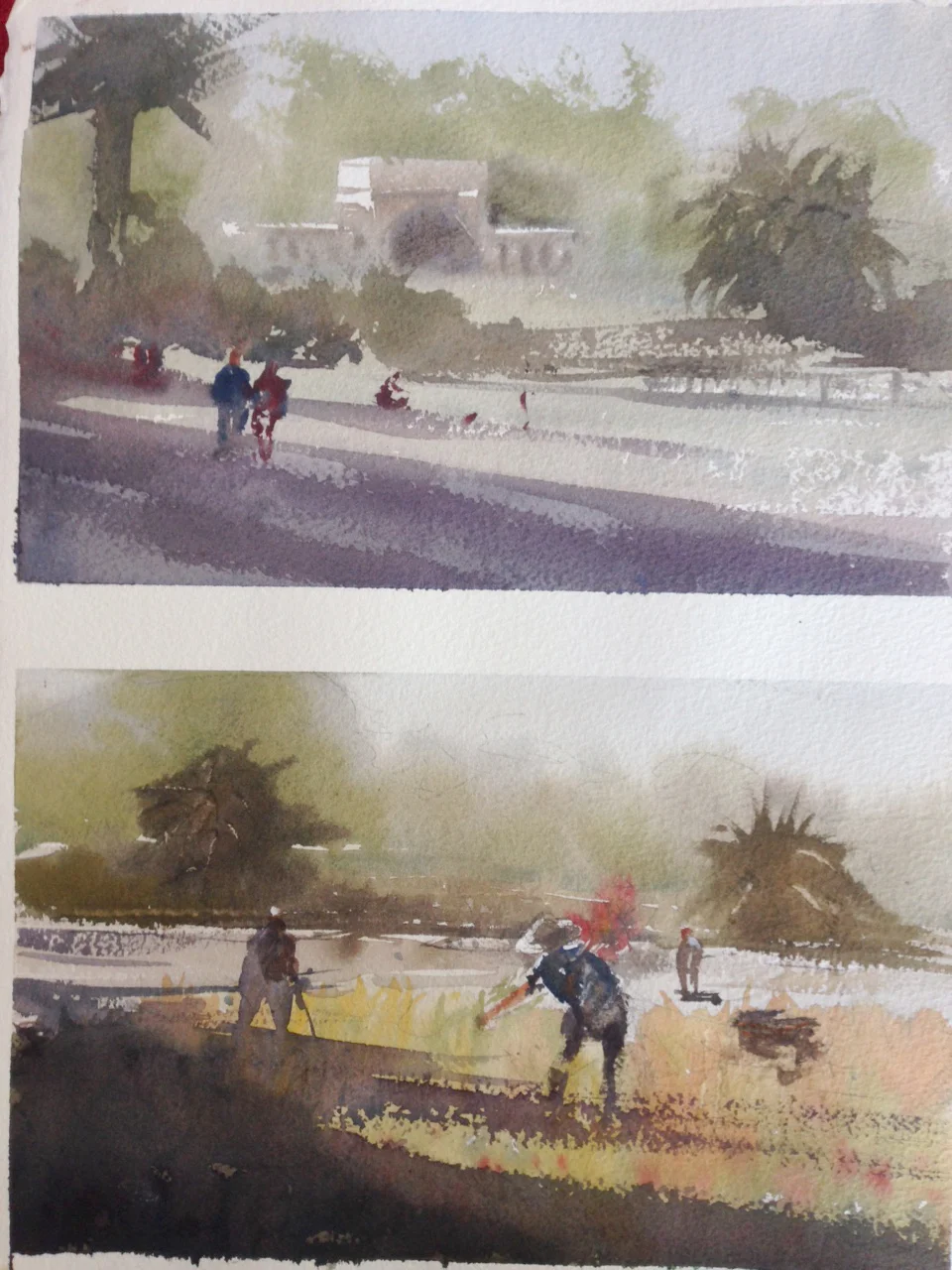
#8- Day 4-
Our first plein air. Tough! One of the things Joseph did on both of my paintings was bring a darker shadow in to the foreground, to bind areas together. There was actually no cast shadow on the location where the gardeners were, but he put it in anyways, and it helped "ground" the gardener, and tie the painting together. By attaching the gardener to the foreground, he helped create a hook between the fore and midground.
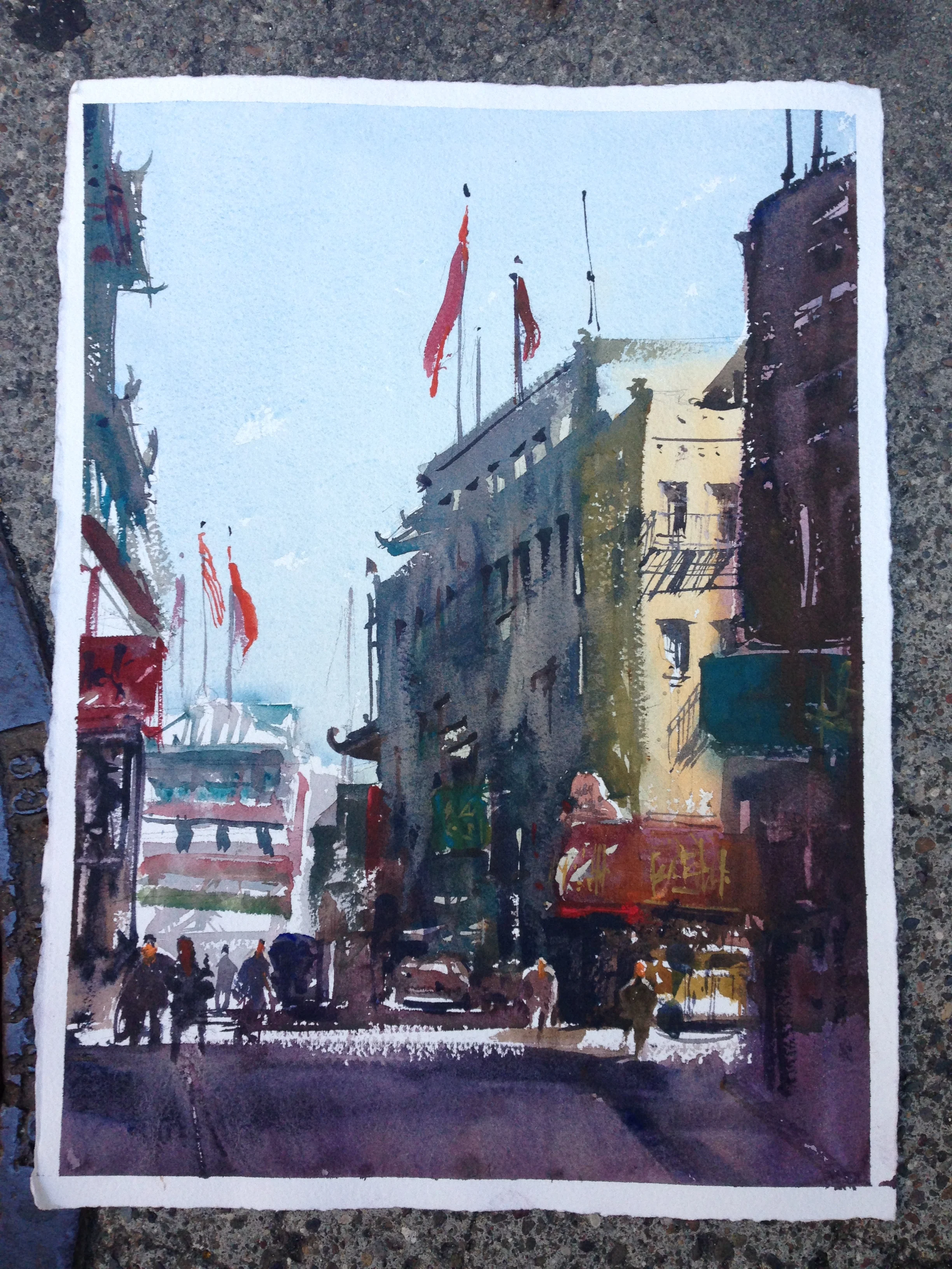
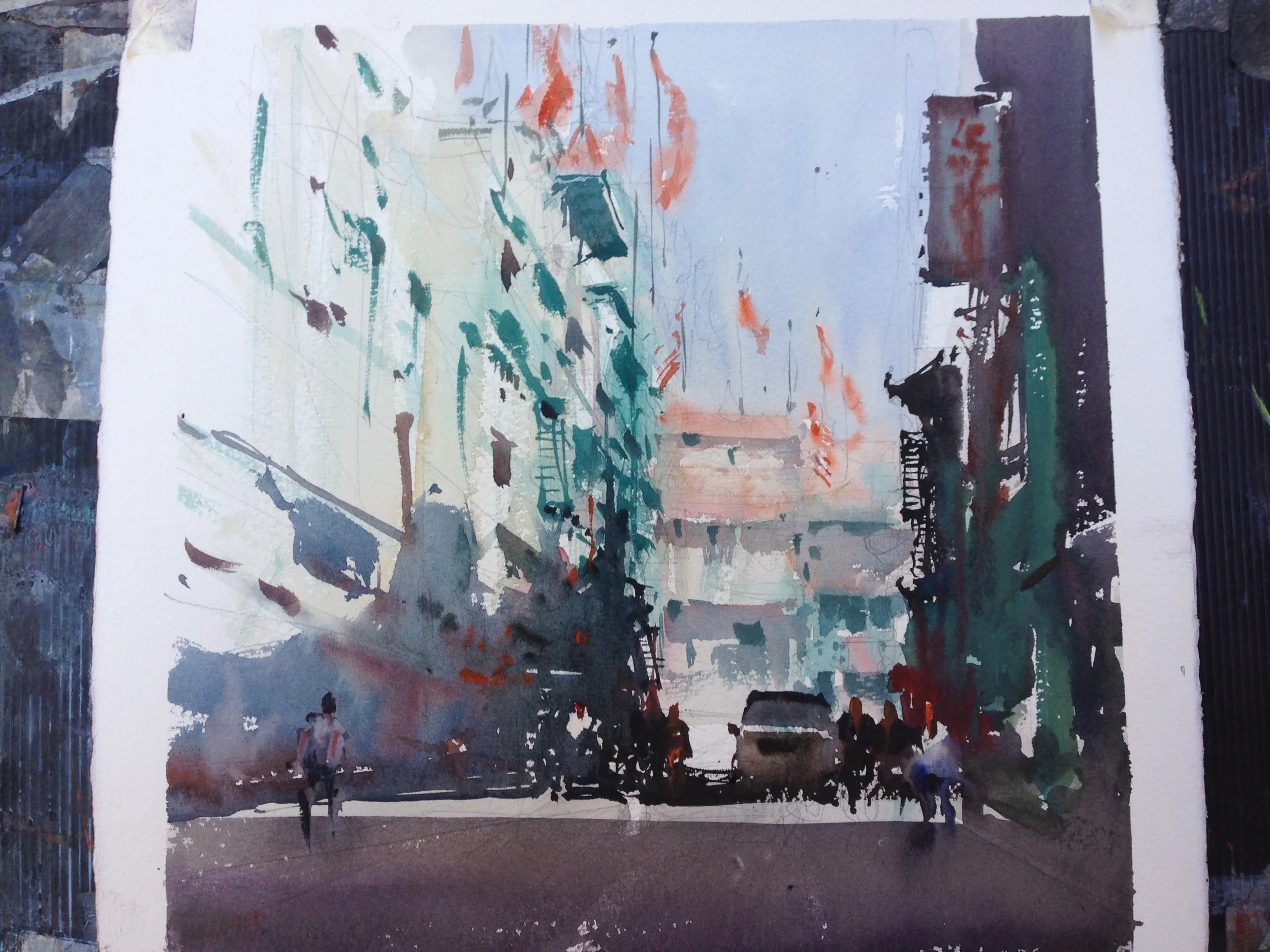
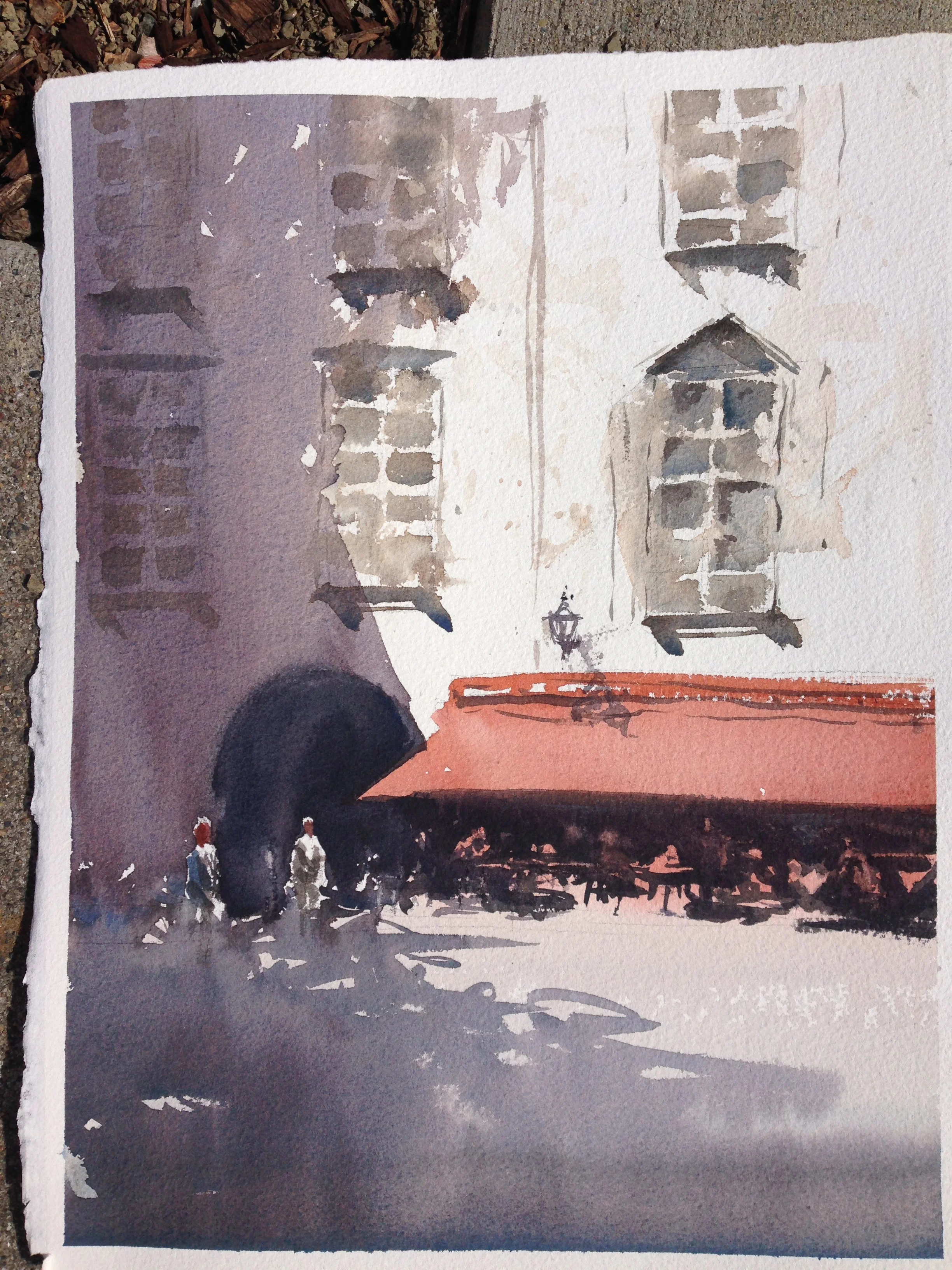
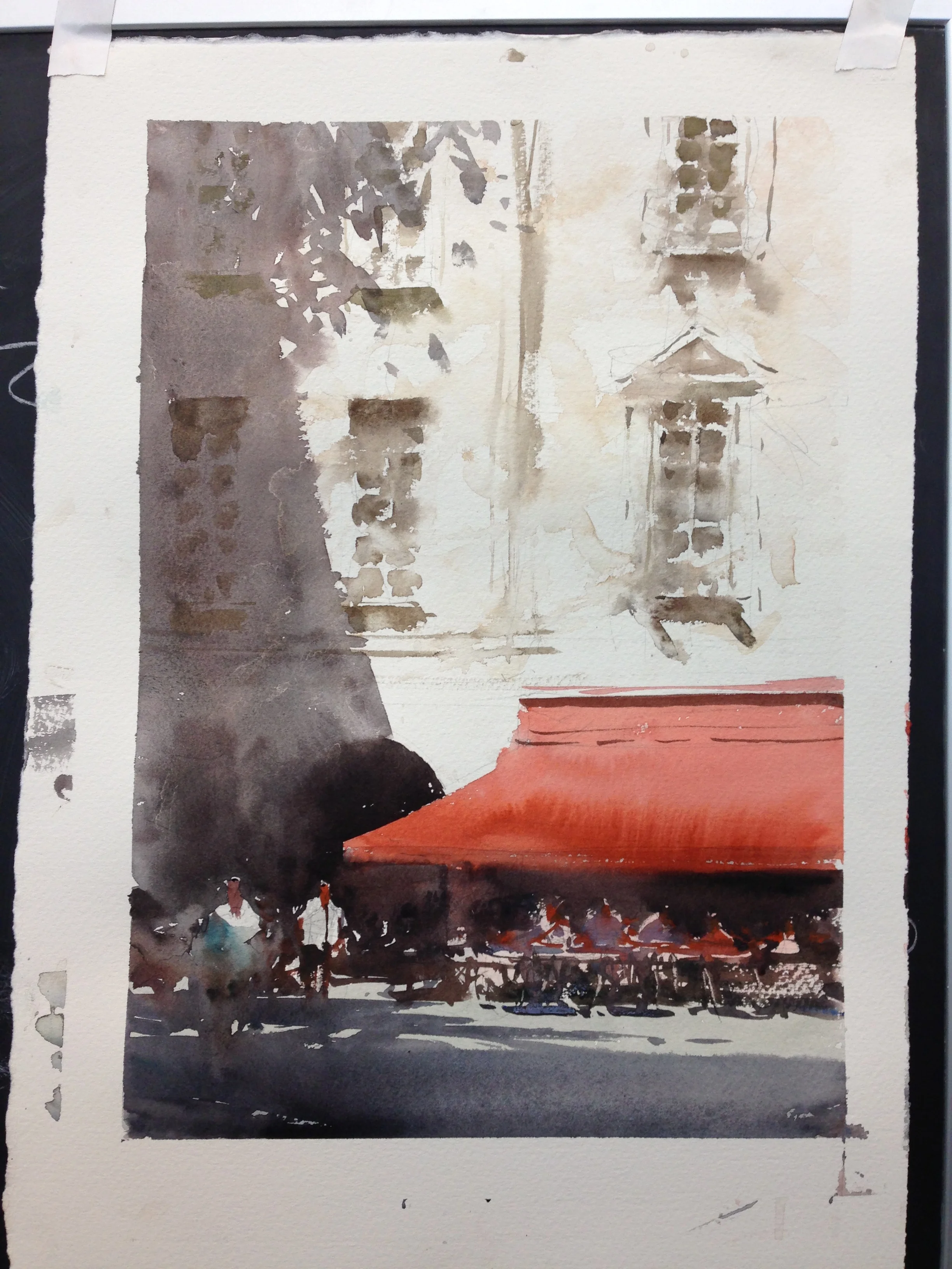
#9- Day 5-
This is in Chinatown. We actually painted slightly different compositions here. I wanted to capture the light on the building at the corner, that then snakes across the street. I did ok up top, but lost my lights on the red awning, which should clearly be paler. No real remedy for that, but to do it over. Sometimes, however, if I'm dissatisfied with a mistake like this, I'll make a mixture (Chinese White and the local color I want) and map in the right values to "see" it. It ruins the painting, but makes it easier to paint it better the second time. Joseph did give me input on the shaded buildings. The primary building on the right, with the flags on it, was a bit flat and warm. He suggested going over it with a pale wash of green, to cool it off and make it feel more in shadow. I did so, loosely, dropping values into the wet wash and was happy with the choice.
He then suggested that I choose an area, like the sunlit section of the building, and to keep it tight and clean, as a contrast to the loose sections. Good advice! I come back to the same earlier quote, that "you have to choose where you want some finesse, and pay attention to those areas. Those spaces will help the loose spaces have meaning." Finally, in that vein, he came in and said I needed just a bit of detail on the shaded building. He knocked in those shadows just above the windows up above and "Pow!" I saw the building come together. I carried the theme around elsewhere. I might have learned more (or atleast more sunk in!) from Joseph while painting this painting than almost anything else.
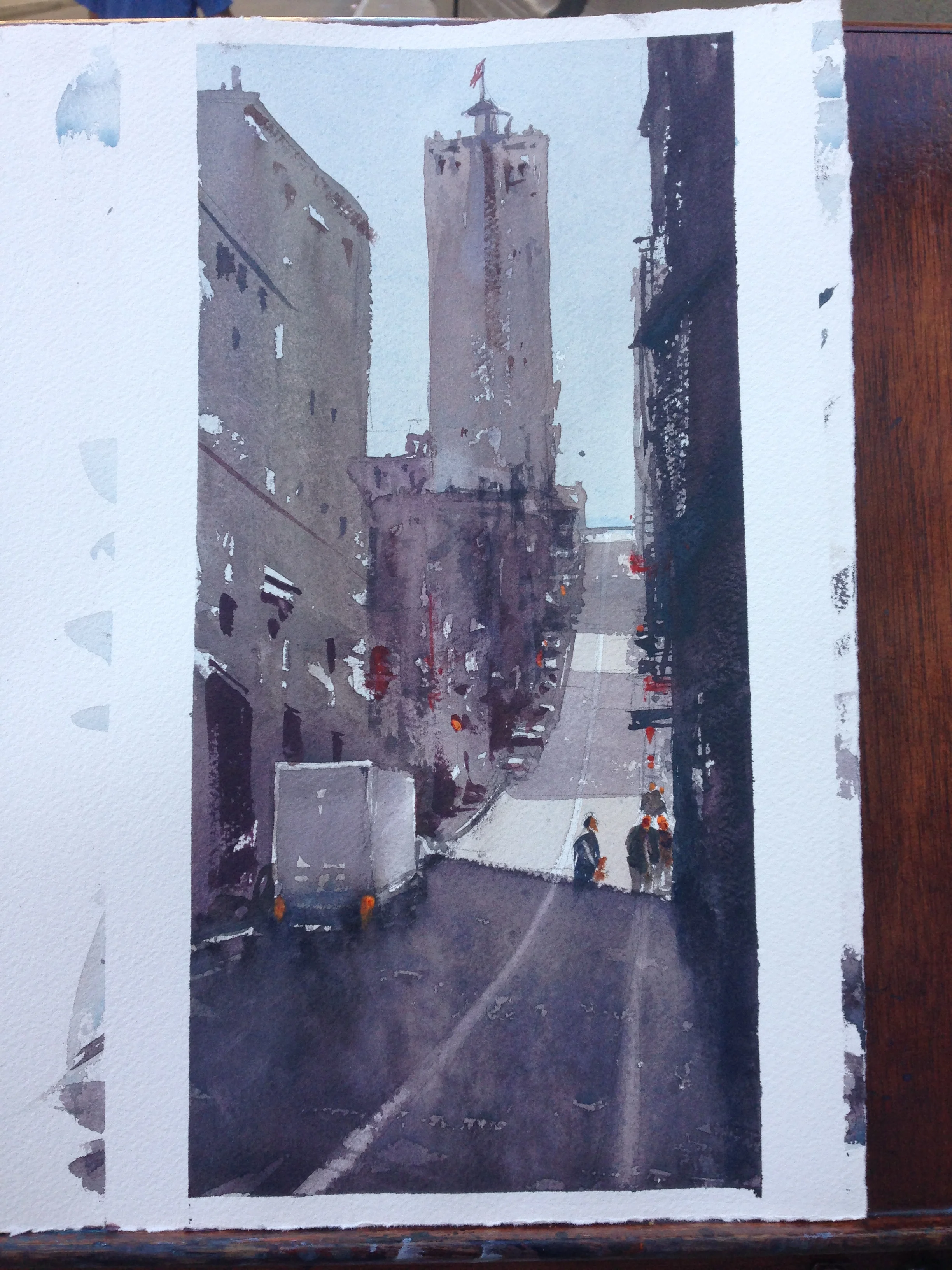
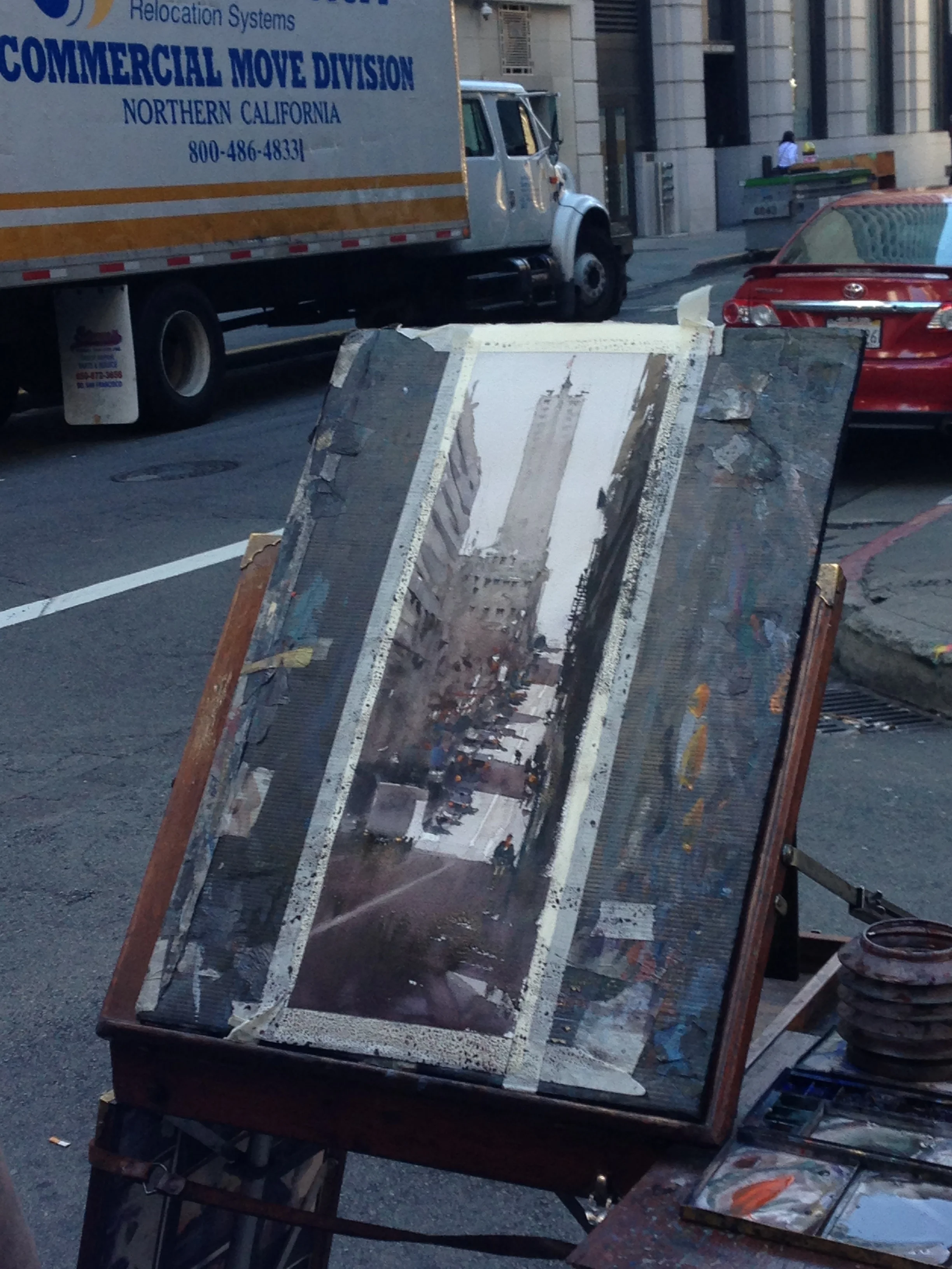
#10- Day 6-
This is in the Financial District. The perspective was very dramatic. Something that bothered me about my piece, after I was done, was that I sort of "chopped off" the tall building to the left of the street. At an earlier point in the painting, the building below it did not jut out all the way to the right edge of its silhouette, but in the process of working on values and shapes, I split the large "block" of buildings into two distinct shapes. This was a mistake that Joseph pointed out to me, and I agree wholeheartedly. The goal would be to better integrate the shapes, like a game of Tetris, using "hooks" and "funnels" to create that visual velcro Joseph was talking about. Also, notice how "clean" the street is on my hill, versus Joseph's. There's just enough abstract business to make it read on his. Something to work on!
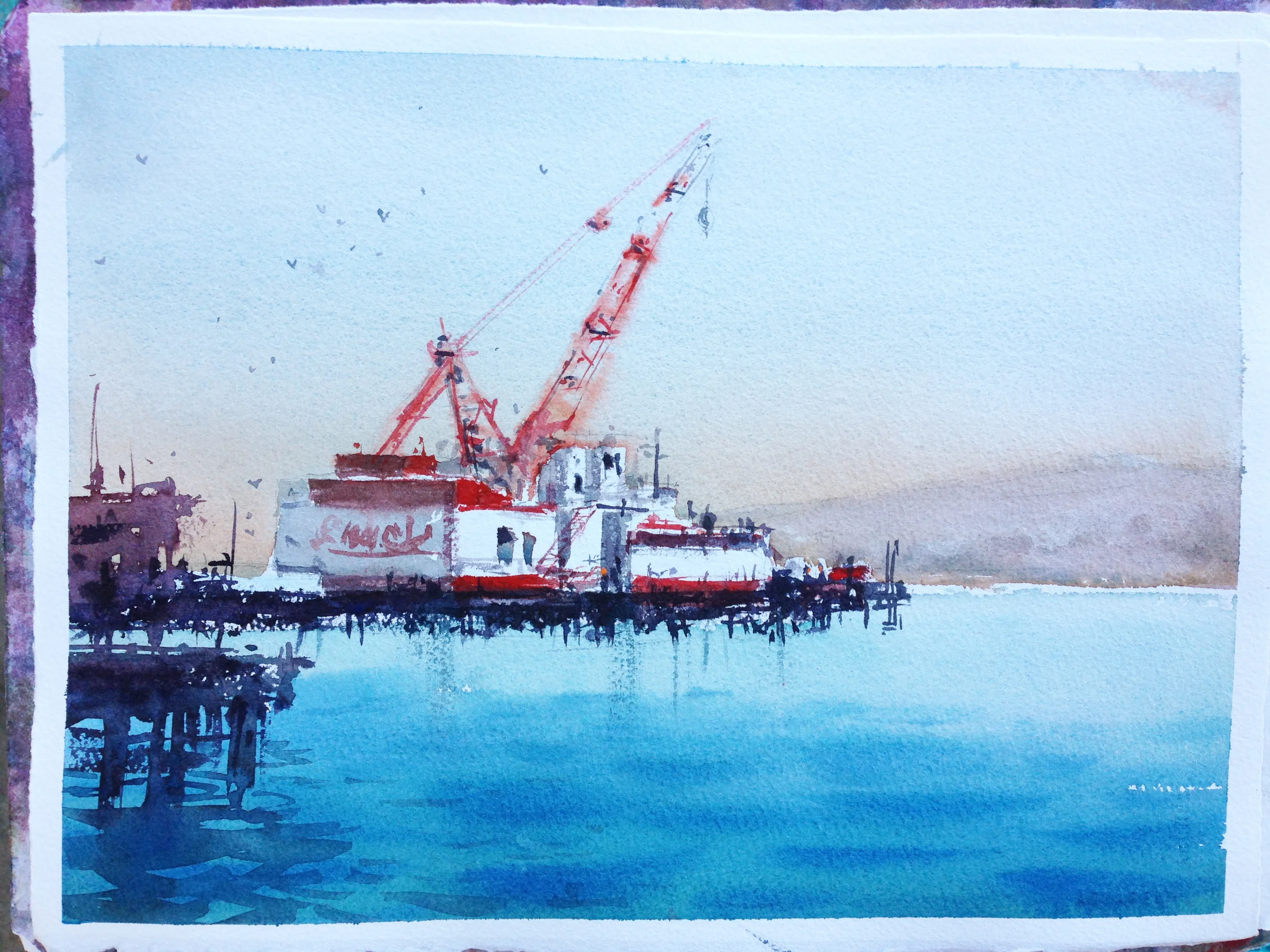
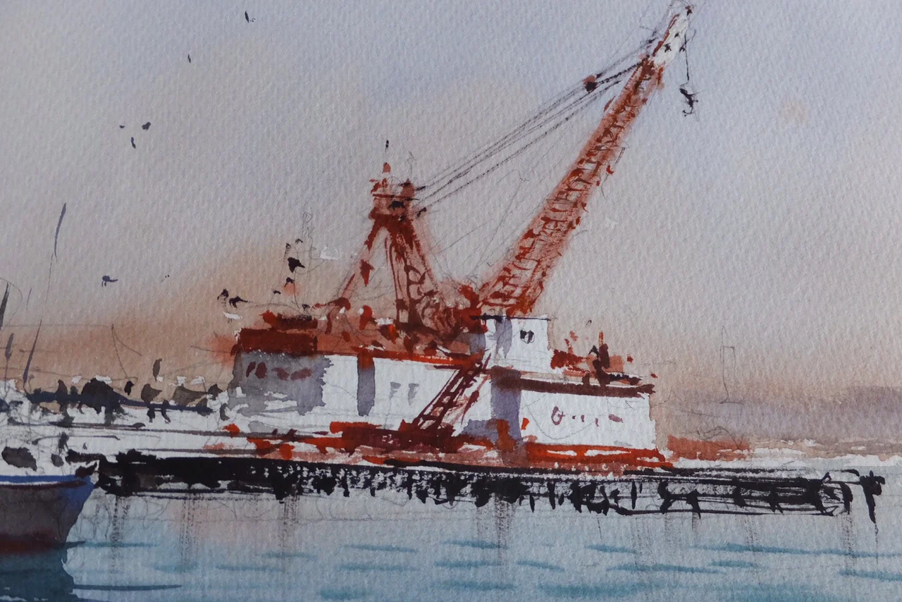
#11- Day 6-
This was down by the Embarcadero. Joseph pondered painting the bridge, but he has an affinity for odd, unexpected subjects, and so went for this one. Something I particularly like is that Joseph kept just enough of a horizontal lighter value to make the dock read better. It's a small detail, but it's important for making the abstract work under the boat read better.
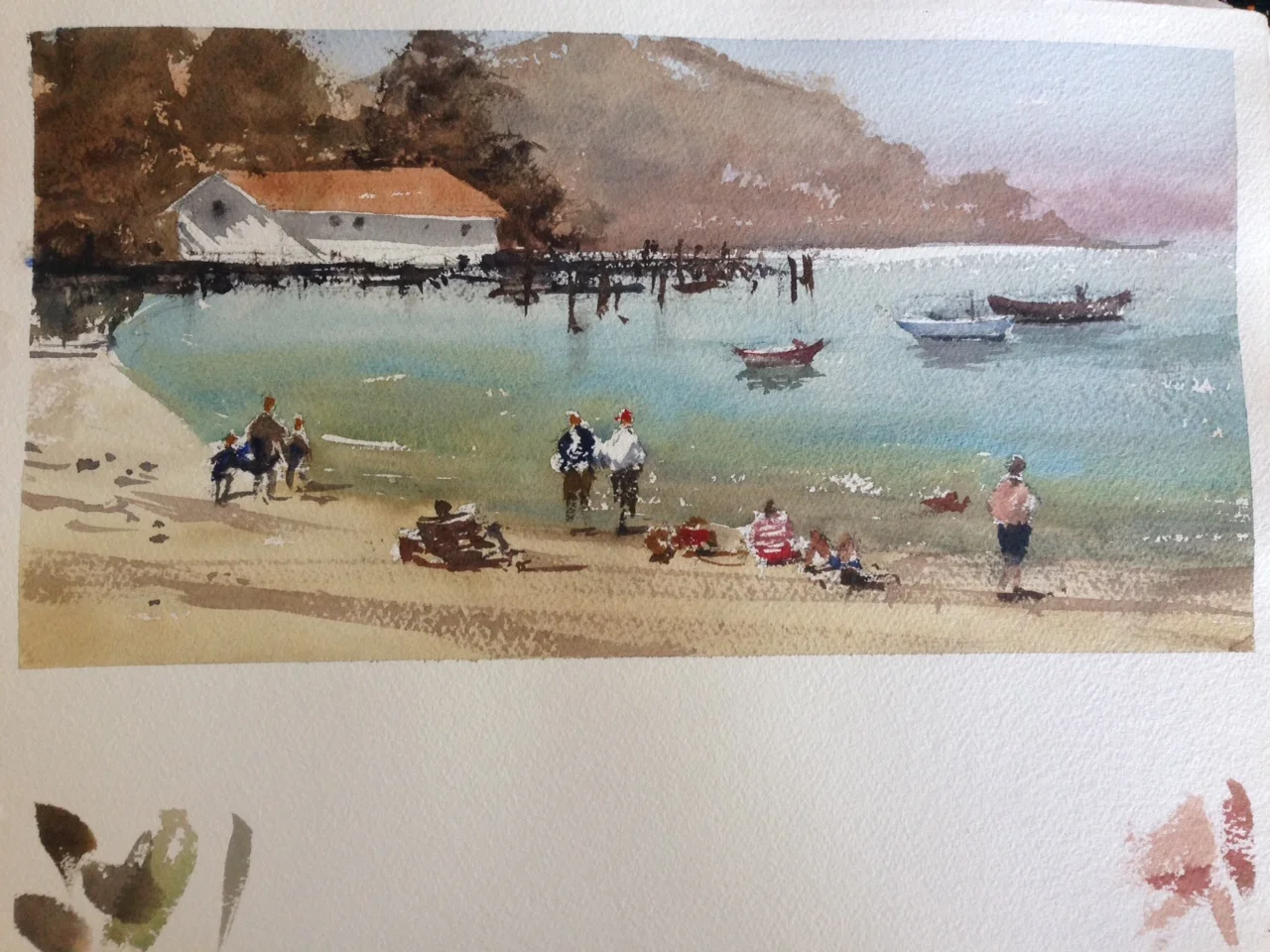
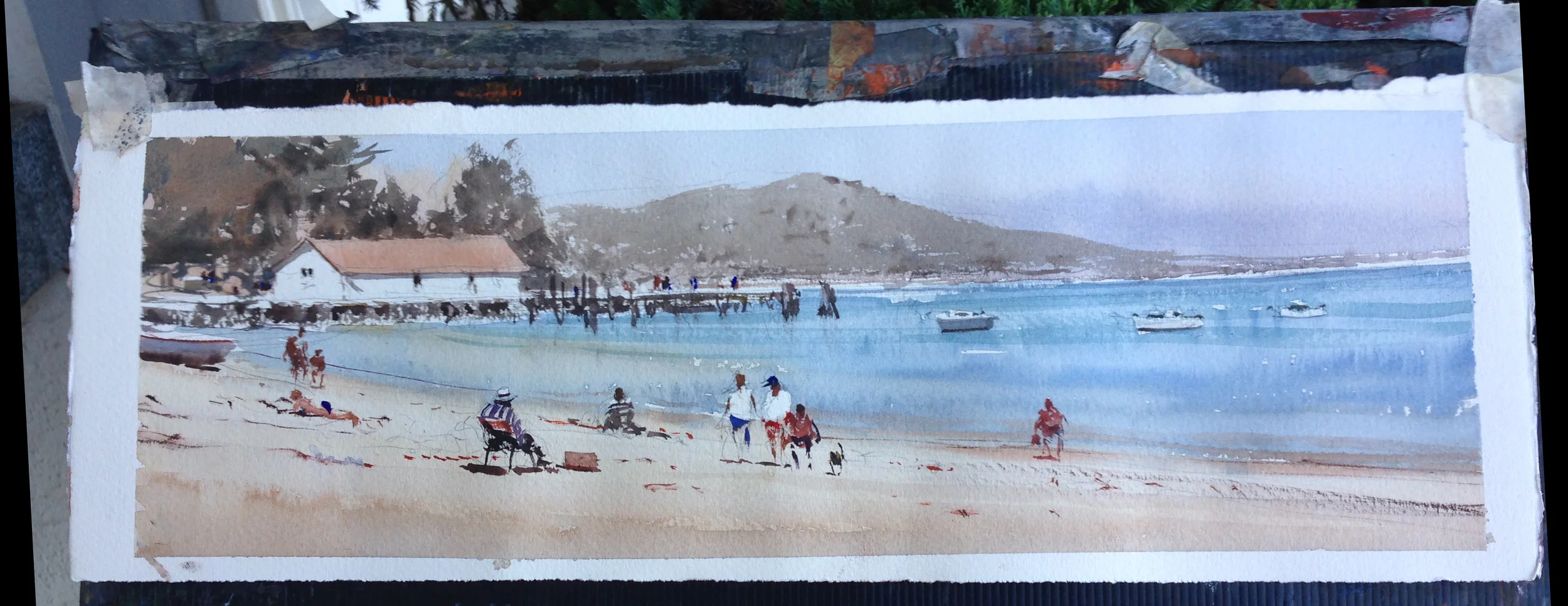
#12- Day 6
This is from Aquatic park. Our final piece. I shared this in the last post. Joseph painted on a long quarter sheet (22" x 7.5"). I would have liked to have done so too, but I did not carry that kind of backing with me. However, it pushed me to explore alternate formats. My piece is approximately 7.5 x 15". I enjoyed this quite a lot, and have been playing with format more since the workshop.
And that's it folks! Thank you so much for coming along for this series of posts. I've had almost 20,000 visitors this month alone, and almost 200 new subscribers in just the last 6 weeks. An impressive amount, considering my typical traffic. I hope some of you stick around as I move back into sharing some of my own work, reviews of books, and other fun watercolor stuff. It's been a true pleasure communicating with so many of you and responding to your emails and comments.