How I Work With Greens, pt. 2

Yesterday I discussed how I mix my pigments and “Navigate the Color Wheel”. This is always the first step. But in this regard, greens can be kind of messy. Particularly compared to other named hues. Why? Well, they take up a huge part of the color wheel, and there aren’t a lot of names.
Colors Without Names
Check out the Artist’s Color Wheel again-

There is some research into the idea that human eyes are better able to see the separation of hues in the yellow/orange/red quadrant, but whatever the reasoning, one thing is clear- we differentiate many MANY more hues in that warm part of the color wheel than we do in the huge area we call “green”.
Plus, the problem is made worse by the fact that there’s a giant hole in the green area where there aren’t any pigments available. We just don’t have as many names for all those greens, the way we do for Yellow, Orange, Red, Brown, Ochre, Lemon Yellow, Maroon, Scarlett, and onwards. And there’s also some research about the idea that cultures without names for certain hues just don’t really “see” them. Are we “green blind”? Maybe. At the least, there’s a dearth of words at our disposal to describe them with any nuance.
This is why, to me, it’s so important to mix your greens, when you’re working in a part of the color wheel that should be labeled “There Be Dragons”. We don’t have names to aim for, so the goal should instead be to mix hues that are comparative. Warm-er, cool-er, bright-er, dark-er. The truth is this is how you should always be mixing, in my opinion, no matter what part of the color wheel you’re working in. But it’s made very obvious in the green portion of the wheel.
Sensation Through Contrast
For sure, this idea of comparative color is how greens (and all colors) work— in cohort with each other. A hue you use as a highlight in one painting is a shadow in another. It has everything to do with context.

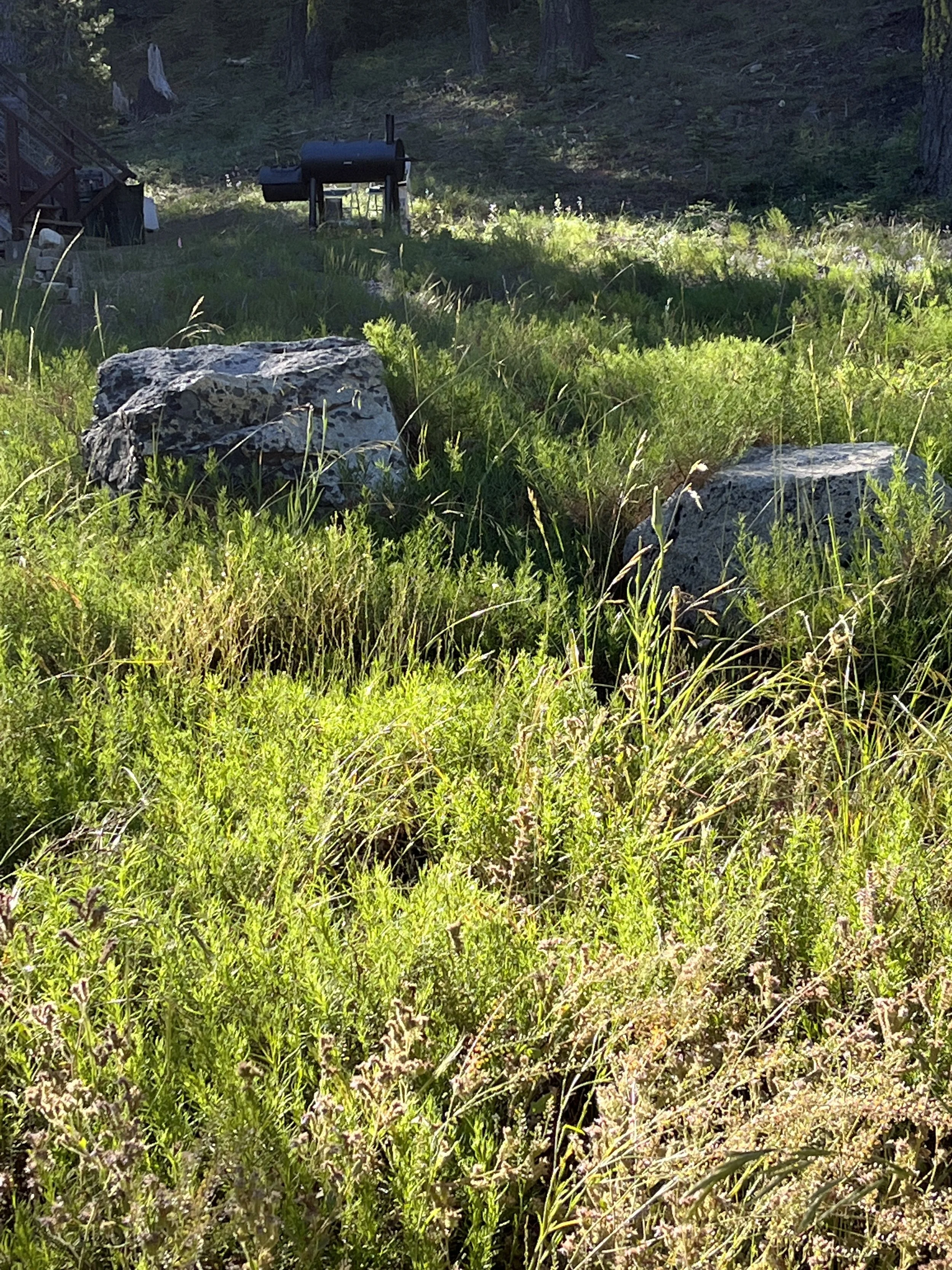
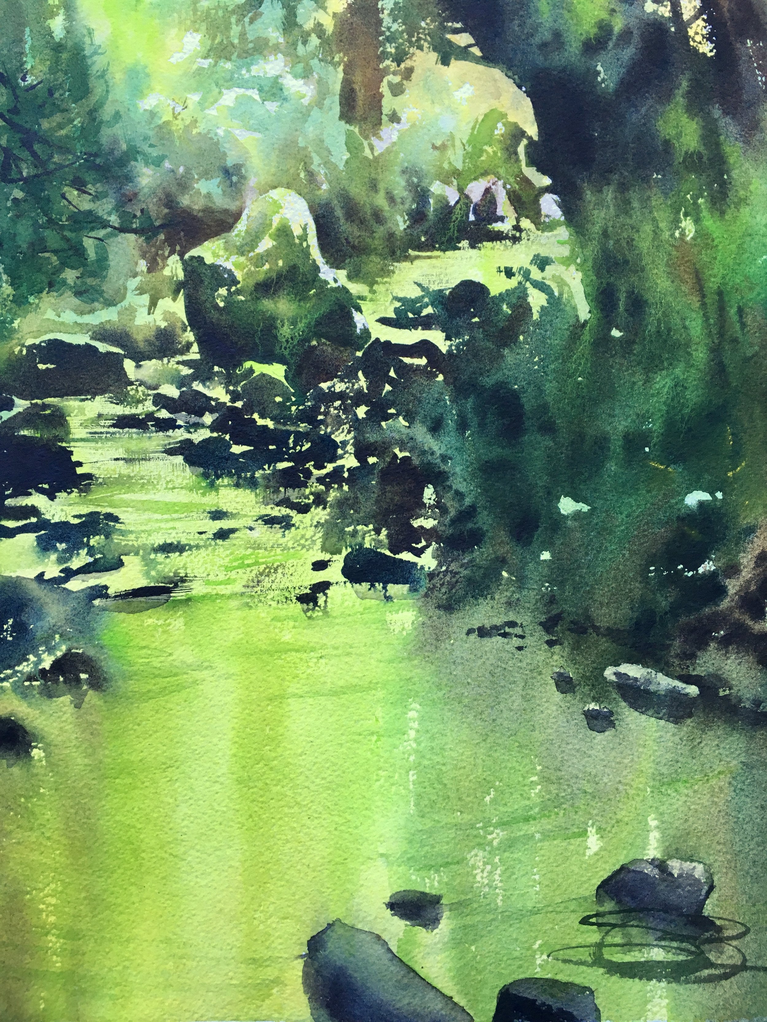
the lime-green shadows in the ferns you see here…

Are the vibrant highlights in this painting. it’s all about context.
Now, sometimes you can actually mix up a hue that matches what’s in front of you. Novice painters can get lost trying to replicate a color they’re experiencing. I understand. It’s a challenge I myself feel— to be accurate, to pay homage to something I find beautiful, that moves me. And when you nail it? Yes!
But it’s worth recognizing that certain light-experiences just can’t be translated to the canvas anyways. We don’t have pigments that can do it. Nature is too vibrant, leaves too translucent, reflections off the water too sharp, the sky too blue, too clean for pigments to be its equal. The good news is that there’s lots to learn from this limitation, because the primary tool for creating a similar experience of light is the same either way— contrast. Contrast of hue. Contrast of value. And this can be more powerful than “accuracy.”
As artists, we have to lie a little to tell the truth. The very nature of our tools requires it. Hues don’t always match what we see, or sometimes we have to exaggerate values, all in an attempt to translate (not replicate!) what we experience with our bodies into paint on paper.
Hues Have Value

I’m going to end today by introducing what can be a novel concept to a lot of artists- hues have inherent value. When we attempt to create light in a painting, a common response is to thin out a mix to make it paler. Of course, to a certain extent, this works. But if you want to push your color-work farther, an excellent place to start is to attempt using different hues to create light, instead of the same hue with a different value.
Bruce MacEvoy has a great little pigment-focused chart that attempts to express this, called the Artists Value Wheel-

If we think of each color in its purest form, green and red and are of equal value, blues and magentas are of equal (darker) value, yellows and oranges are the palest values, and purple is the darkest.
When you work on a piece, what one really needs to start attempting is to inject color into your highlights, and color into your shadows. Of course, the white of the paper is the highest value at your disposal (and not to be dismissed!! it’s super useful), but if you mix up a yellow or lime green, it will sing with a vibrancy that’s different and compelling. Paper-white will tell the beautiful story of sharp refracting light, bouncing off of something, but the temperature of the hues you use will tell the story of heat and shade, of translucency, of reflected light bouncing up into a shadow- all things white can’t do.

This painting is almost entirely greens, but it reads and has contrast. The values of the hues are doing the work.
Below is a subject I painted 3 times. Twice on site on different days, and once in the studio. Each has its own personality and sense of place. As I move from muted hues (a subject I’ve not even touched on yet) to more vibrant hues, things shift and warm up a bit. When I cool them down in the final piece, the temp changes again. Color is doing all the heavy lifting in these subtle but important changes.


Zoom Demo and Upcoming Class
I’ll be doing a free zoom demo tomorrow morning (Sunday the 21st) from 9-1030/1100 am PST. I’ll be talking about greens and working on a painting. I’ll be sharing the recording of the demo on Monday morning, in case you can’t make it. Here’s the link if you’d like to join me-
https://us02web.zoom.us/j/84063174008?pwd=dTRIZkoxZDNpSXhCOW1zVE02T2RyZz09
Interested in diving deeper into greens, color mixing, and getting your brushes wet? My class on greens will be on Saturday, August 27th, 930-430, with an hour lunch break. We’ll be going more in depth with pigmetns, exploring mixing lines and the “rubberband” method I use for nudging things around, etc as well as doing a few demos and having everyone dig in and get their brushes wet. I’ll be opening up the cart on Monday. Sign up for my Art Learners List to learn more, and get updates on other upcoming online classes too! :)
https://www.subscribepage.com/c1b3n2
edit-
Reference photo for live zoom demo-