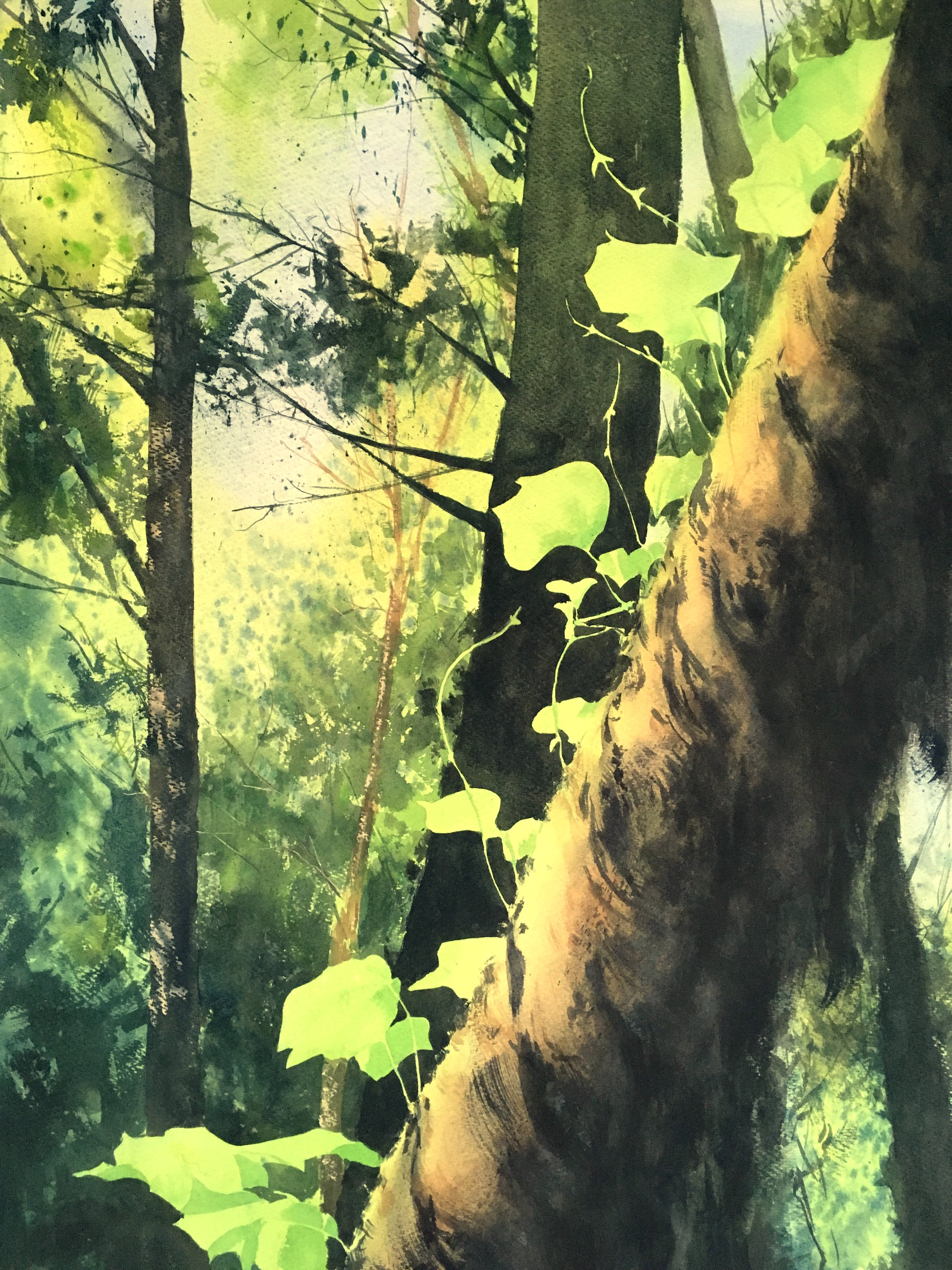
How I Work With Greens, pt. 1
When we’re working with color, at its most simple there are two basic things we need to be able to do- mix the desired hue, and then use it to best effect. For greens, both can be complicated! But there are ways to work our way in. ;)
Ok. So, before you start putting paint to the canvas, you’ve got to be able to mix the hue you want. That sounds very straightforward, but I know that for many artists it’s not. You memorize “recipes”, or sort of “hold close” to your tube colors, or just wing it. Yikes! I’ve been there. What we really need, as I see it, is an approach to mixing color that’s repeatable yet flexible. It has to be clear mentally so you can adapt it to unexpected situations. And yet, not so complex that it’s intimidating.
I call my approach “Navigating the Color Wheel.” What it requires of you is a healthy knowledge of your pigments- most importantly, where they land on the color wheel in relationship to each other. This is key, because then we can start to create repeatable Mixing Lines between them. But that’s just the beginning, because once you add in another pigment (of your choice) it’s actually super flexible!
Let’s see how it works.
The Artist’s Color Wheel
The first step is to know our pigments better. Why? Because we paint with pigments, not color theories. They’re not perfect, but they’re all we’ve got. The good news is that others have done a lot of footwork for us.
Years ago, I discovered Bruce MacEvoy’s Handprint website. It’s a vast treasure trove/minotaur’s maze of watercolor information. Amongst many other things, it introduced me to his Artist’s Color Wheel.

The Artists Color Wheel doesn’t change color theory, it just visualizes it in a very functional way. You’ve still got to know some basic stuff to really use it well. Teal is greener than Blue because it has more yellow in it. Lemon is a green-yellow. Colors are more vibrant (chromatic) on the outside of the color wheel, more muted (greyer) the closer they get to the middle. Etcetera.
If you want, on his website you can read all about the technical aspects of how he created this pigment map. For the sake of this conversation, all that really matters is that it’s a relatively accurate depiction of where the most common pigments land on the color wheel. Why does this matter? Because once we can locate our pigments, we can start to connect them. When we connect them, we make a mixing line, and then, folks, we’re on our way!
Navigating the Color Wheel
I’m a spatial thinker, and so my approach has a spatial element to it. It’s like sailing the seas of color. LOL! Actually, that’s a pretty good analogy. :D
Let's try a common real world example- mixing Ultramarine Blue and Cadmium Yellow. If I locate them on the Artists Color Wheel and connect them with a curved line (there’s a whole thing about light refraction, blah blah blah, that explains this, but the short of it is that many colors mix on a curved line)… Anyways, if we mix them, we get this-

This is actually a pretty good depiction of what you really DO get if you mix them. Slide back and forth on the mixing line, add more or less yellow, etc., and you’ll get a different hue. But what happens when we throw in another pigment to the mix? That’s where things get interesting.
It’s where we start “navigating”.
Here I’ve marked Cadmium Orange and Burnt Sienna with blue circles. These are two other colors I have on my palette. In the example below, I’ve connected them to my primary mixing line.

What’s this show us? What we get if we add one of them to the first mixing line. Need to warm up a muted green at sunset? Add a touch of one of these colors. Daub by daub, the more you add of a third color, the more you pull the mix towards it, like a rubber band.
What’s great is this approach applies to any mix. For example, another initial combo I use when I want a very vibrant green is Cobalt Turquoise Light and Cadmium Lemon. When you combine them, you get a mixing line like this-

Accidentally make too vibrant of a green? Not too worry, you can add any of a host of pigments to pull it towards the oranges, like these-

What’s great is that since it makes clear the results you’ll get, you can compare them. Like this-


Do I still mark these things out myself? No, but at one point I did. And I made many many swatches, to educate myself about my mixes. Sometimes I do make mixing lines in my head though, when I’m having a hard time and am pondering just which pigment I should use to nudge the rubberband in the best direction. 100% it’s my mental model.
And that is pretty much how I mix my greens. First is that I HAVE to atleast approximately know where my pigments land on the color wheel. Then I pick two pigments and start with a mixing line that gets me close-ish. After that, I start to nudge things around, a little this way, a little that way. Nope, too warm- add this color and pull the rubber band this way. Nope, a bit too dull- better add that color, and pull it that way. It’s organic and dynamic. It’s responsive. It helps me hunt out “colors without names.”
That’s part of what I’ll be talking about in Saturday’s post. “Colors without names”. Stay tuned! I’ll also be going deeper into why I choose which colors I do, as well as sharing the details on my free zoom demo on Sunday.
Interested in learning about my upcoming workshop on greens, or other future online workshops? Follow this link and sign up to my Art Learners list. Through it, I’ll share announcements and info on workshops as they develop! :)