The Ins and Outs of Repainting Older Paintings

santa cruz bluffs
In 2020, I did a large multi-painting commission for the University Retirement Committee, in Davis CA. They liked a number of my old paintings, and were hoping I could repaint them for them, in a larger size (full sheet) for one of their living spaces. These 5 paintings below are a selection from that process.
Repainting older work is something I do. Often times, after 3 or 4 or more years, my approach to a subject will change, and I have the opportunity to apply new skills and vision to passages I was never particularly satisfied with. Iterating, in general, is a good method for learning and teaching ourselves as well, and is something I often propose to students. The real question I get from students is “Why? How do I go about it? What is interesting about painting the same subject again?”
When I repaint something, the focus, to me, is almost always to assess what I want to change. It’s a comparative process. This initial mental phase is essential. If I’m going to just repaint it and make it the same, that is boring. In fact, if I’m really satisfied with an image and don’t want to make any changes, I don’t repaint it. It’s done for me- I’ve figured out the puzzle. So, the fundamental required element is that I’m dissatisfied with what I’ve already painted and think I could do it better. That is the mental gateway into how I’m going to approach things differently. On a technical level, the new versions are almost always larger and more ambitious. This can provide the space for different techniques and greater detail, but it can also create problems, when a simple image done well is sort of “empty” on a bigger canvas.
The primary thing, whether we are talking about my mental approach or my technical approach, is that I’m engaged in painting things differently, in making changes, and attempting to improve on the original. Then, when I’m done, I have two versions of the same subject that are clearly different because of choices I actively made. From there, I have the tools to teach myself. It can be very instructive to compare the two and decide what I like best about each. That can inform my future decisions and help my mental game grow as an artist.
Nursery Tree, Muir Woods-
This was a quick study that I did a few years ago. It was so hard to create a focal point or capture the light. But I loved the abstract quality of shapes and the strong contrast, the lost and found edges, and the story of the nursery tree. This sort of “unfinished” work is perfect for repainting.
From the get-go, I knew I wanted a greater variety of edges in the new version. I needed sharp staccato leaves with a pure white paper to capture the refracting light, but to combine it with soft dissolving edges that hint at the explosion of shapes and growth. This approach with the leaves is echoed with my approach to the cast shadows, where some areas are soft and diffused, and other, new areas are clear and delicate- a definite change from the original that helps me capture that little spot of sunlight.

The clear, sharp edged shapes work as symbols and help us decode the looser areas, while the looser areas express the joy of the medium and hint at a greater sense of detail without hitting us over the head with it. I like this kind of combination, and it’s something I’m better able to accomplish now than I was 4 or 5 years ago. New techniques too, like wetting the back of the paper and working flat, helped me better achieve the control I wanted.
The other big change was that I wanted a greater range of hue and chroma to help me express the light. So, for the new batch of leaves are deliberately a brighter spring-green, that’s more chromatic and limey. Hints of a clearer, cleaner orange here and there also help create a sense of vibrant, warm light, surrounded by the cool darkness of the forest.
Seam of Light-
Alternately, some paintings, like this one, I honestly was satisfied with the original when I started. Repainting things like this is more difficult, because it’s not clear what I’d like to improve. I decided to cool the background off, in an attempt to make the warm light at the focal point feel even brighter.


Is it any better? Maybe, maybe not. Do I also like it? Yes. What’s most compelling to me on an educational level is that, by changing things, it helps me develop a clearer opinion about what I like and don’t like. Sometimes, it’s hard to pinpoint why a painting works, but when I change things and repaint it, it becomes clearer— sometimes because I like elements of the original better! The important thing is that now I can compare my work to itself, and results that were accidental the first time I did the image (that particularly warm background and the warm grey of the bluff in the distance) can now become intentional when I do other pieces in the future.
A Break in the Clouds-
I’ve painted this a number of times over the years. It’s fun, and I love working wet into wet. It’s another image where I was essentially satisfied with the original, and there was a kind of magic that happened with the clouds that is almost impossible to recapture, but when I went to repaint it, I explored other changes just the same.

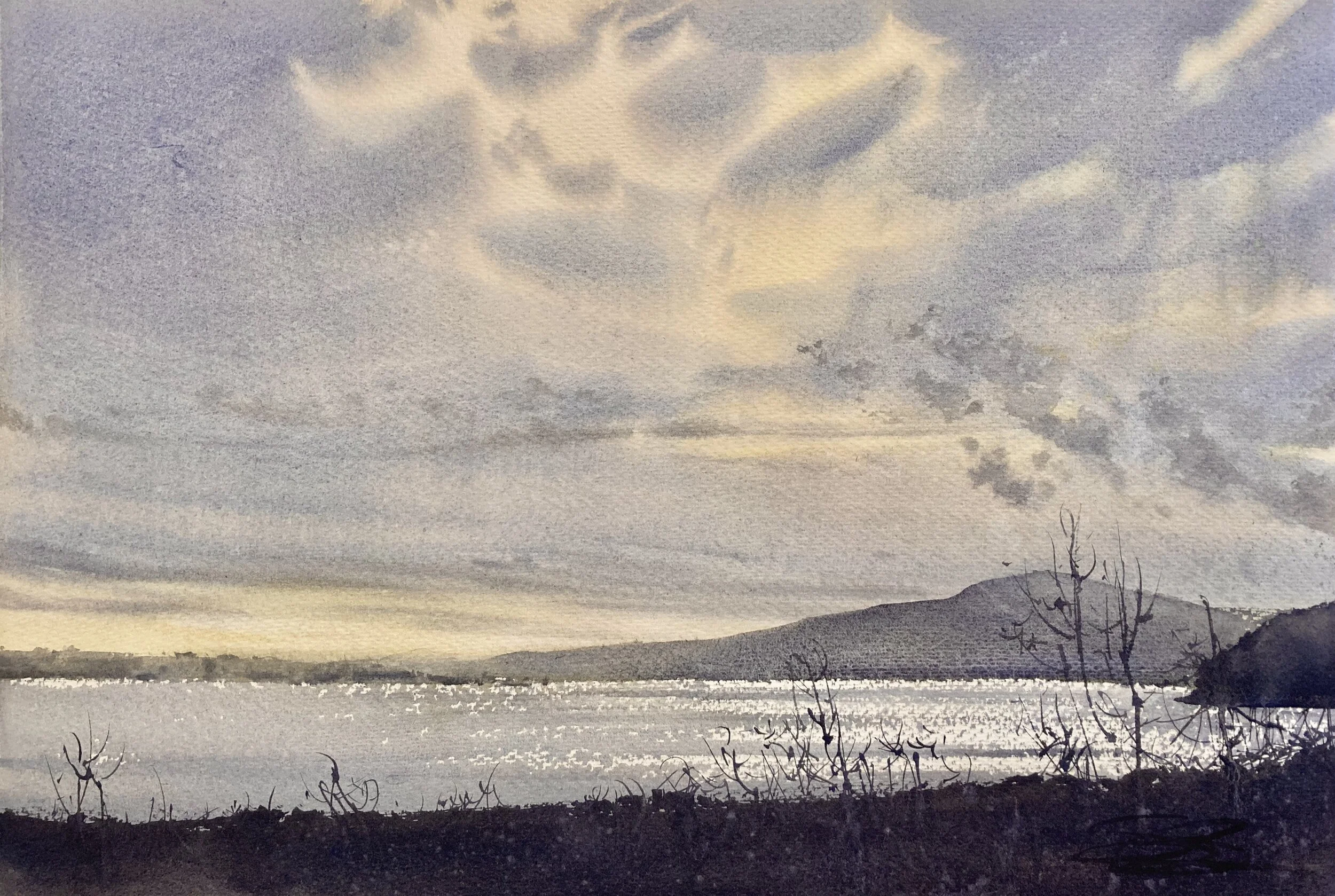
I can’t replicate those perfectly soft clouds, but I like that punch of yellow in the distance in the new version, and the staccato light on the water. If I could, I would combine the two paintings and take the best elements from each.
A Pitcher-full of Flowers-
This original was a painting from my early days of working with florals. It’s fun, but I was never quite satisfied with it. I find it too loose, and it lacks contrast. For me, this larger, newer work is much more compelling. For the new work, I knew from the getgo that I wanted richer, more vibrant color and darker darks. It’s the same basic image, but my color application is much more vibrant, and I’m chiseling out a bit more detail with my edges. There’s still lost edges in there, but less.

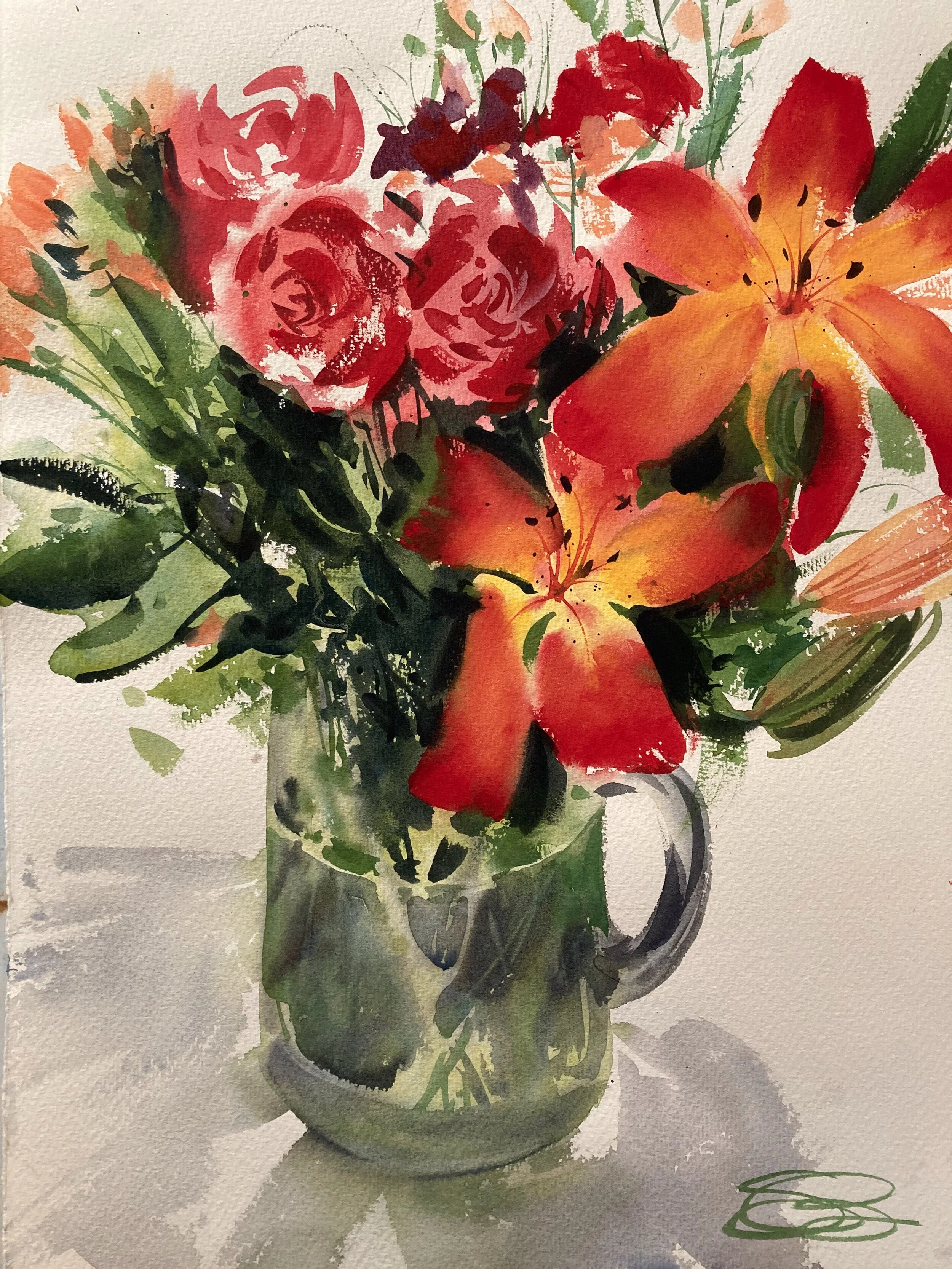
I really focused on the wet-into-wet work on the lilies, to pull the eye in with the transition from red to yellow. This was something I lost in the original, and once lost you can’t get back. I knew it was extra important, so I took my time in that part of the painting to preserve my vibrant yellows, and allowed myself to let loose in other areas instead. Note too the altered sense of perspective on the pitcher. It now read that we’re looking from a position slightly above it, rather than the sort of abstract straight-on look from the original. To me, this makes much more sense for how we often see flowers, on a table.
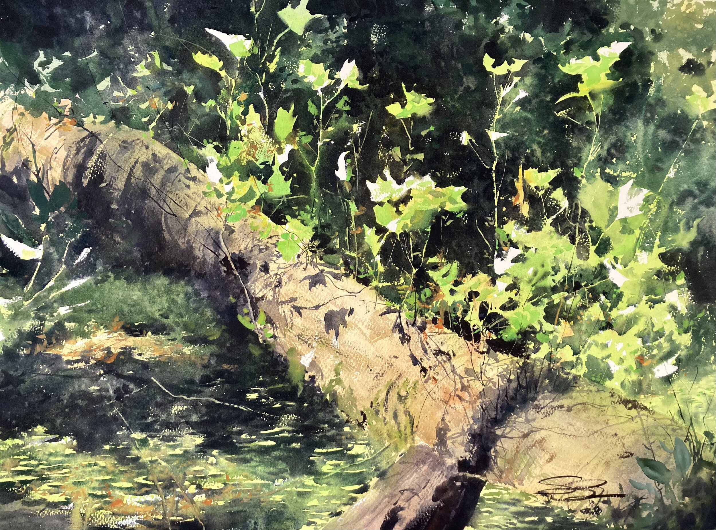
Santa Cruz Bluffs-
This original was done plein air along the Pacific coast 5 or 6 years ago, and I loved being there, painting with fellow watercolorist Mike Bailey. It’s a very good memory. Color-wise, I like it, and I like the soft edges, but things are simplified, sometimes more than I’d like. When I came back to it, I was working much larger, and in the studio. That means I can channel more detail into it from the beginning. The question is where, and to what purpose? I’m not really one to add detail for just the sake of it, but sometimes there are limitations to plein air work that aren’t necessarily what I would choose to do if I had more time. And detail can mean contrast, and contrast can mean light. So, that was my push, the change I was looking to implement.


In the new version, there are the tree trunks now in the background, to catch the light, and the shadows in the midground vegetation to do the same. Even the wet-into-wet pine in the midground has a bit more definition, to separate it from the far-back trees. Note too the heightened value contrast on the background meadow and on the bluffs, and the slight increase in detail on the rocky cliffs. The utmost foreground stays almost the same, but the rest of it is all working to capture a bit more light on that semi-foggy morning.
So, the goal is to repaint it, but not to replicate it. I’m always looking for ways to change things, alter and experiment, etc. Then, I can put them side by side and compare. That can be very illustrative, and is a great way to educate myself about the success (or lack thereof) of my choices. In the future, exercises like this will help me better know my own mind before I start a painting, and that sort of growth is good news!