Evolution of an Image- Seam of Light

"seam of light"- 11" x 15"
This weekend I'll be sharing this piece as part of a larger group show at the Benicia Plein Air Gallery. 11 other artists painted their own works from the same cove in Benicia- just around the corner from the gallery! There's a reception on Sunday, August 6th, from 300-500. I'll be there, as well as many of the other artists. There will also be a variety of local poets doing a reading, who've written works that use the art as their focal point.
I actually worked on this all month, and had a hard time getting a painting I was satisfied with enough to share. I went in and painted plein air in early July, and got a serviceable piece, but it didn't have much mood. I wanted something more. Below is that first plein air piece. It was a cold and windy morning!

A few weeks later, I went back down at sunset and went to work under a tree. The light was ABSOLUTELY BLINDING! But, I also really liked it. I decided that this was the real subject of my painting- the boats are just a means to get there. Staring into those sparkles, I explored how to paint what I was experiencing, and less what I was seeing. Here's a shot of the view. I've zoomed in a lot for my painting, but that's the nature of taking photos versus being there.

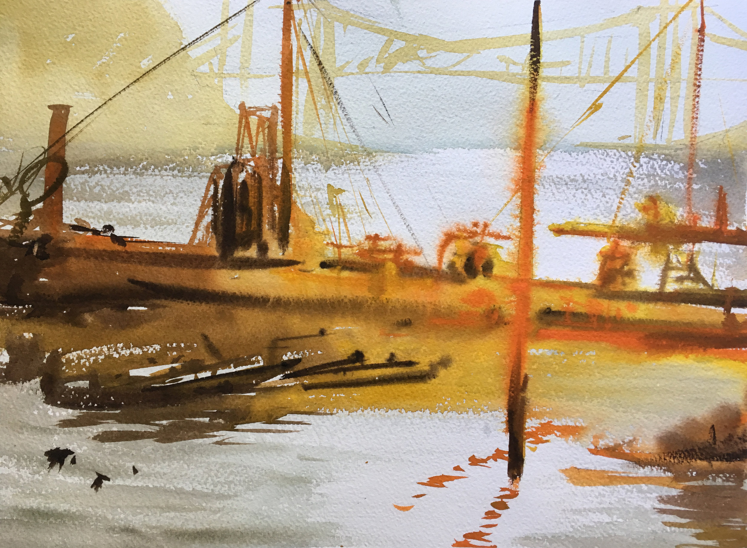
I did these two quick plein air sketches as I tried to capture the feel. Each took 30-45 minutes max. The sun was getting low in the sky and I was racing against time!! I liked the light in the first, but not the color palette. I liked the color palette in the second, but felt it was a bit over the top. Together, I hoped I could gather enough info to make something I was satisfied with later on, in the studio.
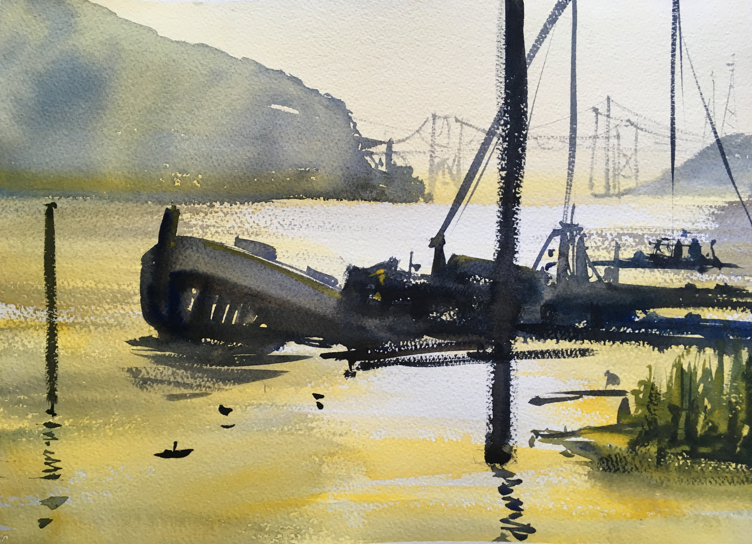
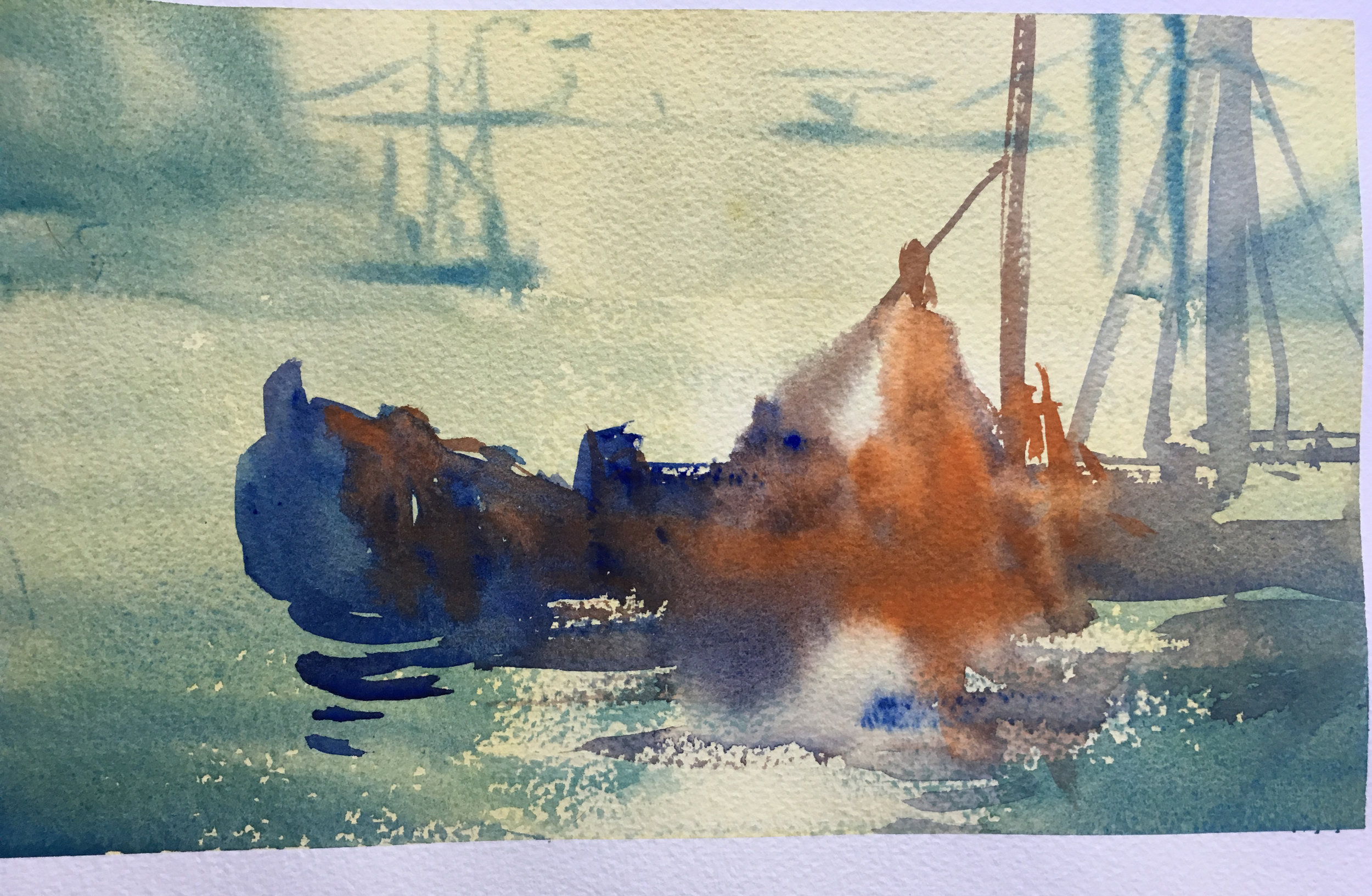
A week or so later, I sat down to do some color studies. Each of these is pretty small- only an 1/8th sheet. I slopped on the water and went about just trying stuff out and seeing what I got. The results were really interesting for all of them! But I could tell I liked the warmer background that was softer and more recessive, matched with a harder warmer foreground. The truth is you can see the bridge as the mountain very well from this spot- but they're not the focus of the painting, and were stealing too much attention. I wanted to include them mostly to create a sense of distance.


I took what I liked and went back to work, and did one more 1/4 sheet- the last one you see here. All in all not bad- too rough technically, but I decided I liked where things were going. I worked on softening the horizon light to make it less dominant, and to help express the glare of the light better- how it "eats up" edges. The addition of the green was also a key improvement in my mind. It provided a framing device, and most importantly, I gave me another tool to help express light. I had a lot of fun moving form the dark blue-greens up top down to the paler and more vibrant yellow leaves closer to the center.
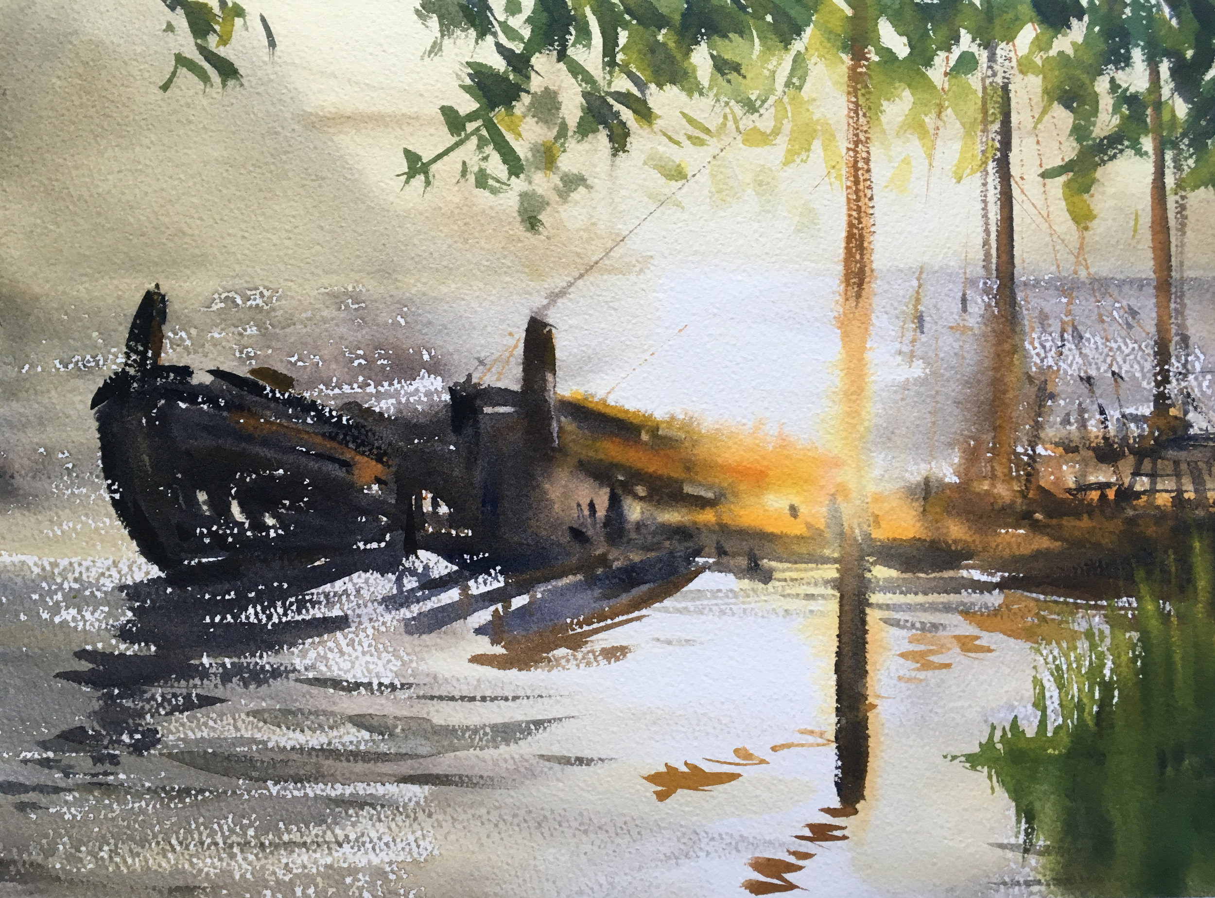
A few days later I tried another quarter sheet. Much to like! The next big change compositionally was that I felt, in the end, including the prow of the boat on the left was important. Not only did it work a bit like a key, being more recognizable and unlocking the more abstract passages of the boats, but it also helped me move more fully from very soft warm edges in the center to very hard, cool edges father from the light. I also included more yellows for the heart of the glowing, bright area.
I did this last one at the end of the week- about a month after starting. Sheesh! Every painting has little changes, little things that shift around. The previous one retained more whites and had a bit more pepper on the water. This one is much warmer and softer, with a humid light in the air. Is it better? I don't know. In my opinion, yes, on a technical level at the very least. I liked the boats better, though they too have their issues. Still, I worked on getting the transition from very warm yellows and oranges to be more gradual as it moves to the darker blues and browns- I subtle difference that I found useful. The overall value is lighter for the painting, in my opinion, with only the darkest darks hitting the same scale as last time.

For now, whatever further improvements I might think of, it's time for this composition to rest. It's come a long way from the first pass, and I like the viewing experience with this one much better than the one I did back at the beginning of July. Many features come more fully into play in terms of hue and value- the trees and grasses, the dissolving pylon, the dark muted blues of the boat on the left, the softening of the bridge in the background. If you stare at the painting and feel like you ought to squint because of the glare, then I'm getting close to the right result. !