Historical Examples of Fugitive Pigments

There are lots of examples of fugitive pigments, but the most common modern culprits come down to just a few, in my opinion- Alizarin Crimson, Brown Madder, Opera Rose, and Aureolin Yellow. It's the warm hues that have the most issues, whereas blues tend to perform well. What's interesting is to see what happens to (often famous) works of art done with fugitive paints. As with modern pigments, the reds often fade away, and the blues become dominant. This was particularly true for a variety of painters in the late 19th Century, who happened to paint during a time when many new, richly colored... fugitive pigments were being discovered and developed.
Through the help of clever gallery workers (who found sections of paintings that had long been hidden under a frame, thus showing the original colors) and through the use of scientific equipment that can analyze the painting molecularly (allowing them to understand what pigments were used and how much they've broken down) we now have some examples of just what kind of damage a fugitive pigment can really do. Why should it matter to us as artists? Because, as these examples show, sometimes famous paintings we think we know well (dominated by neutrals or blues), in fact no longer express the artist's intention in terms of color. They were originally much more vibrant and chromatic. It's particularly interesting, as an artist, to explore and potentially see what their color choices looked like at the time that they made the painting. Hopefully, it can inform our own choices as we build our own paintings.
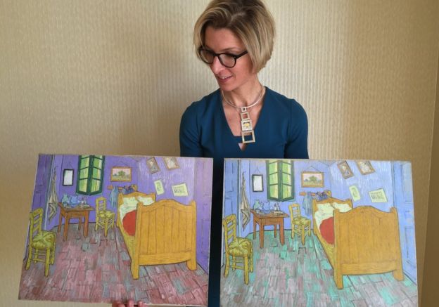
Van Gogh seems to be the one with the most problems. Reading seems to indicate he knew what he was doing, but didn't have the funds to buy different pigments. Or perhaps he just really wanted things to look a certain way when he put down the brush, fugitive paints or not. His "Bedroom in Arles" is a good example. When assessed scientifically, it was found that many of the blues were actually purples originally, and that the fugitive red pigments had faded away, leaving the blues we know so well. Here are two articles on the subject (first article and second article) both of which are interesting reads. Look at the difference between this modern reproduction (on the left) and the faded original (on the right)!
You can see this affect again in some of Van Goghs florals. The change is sometimes subtle in terms of color, but compositionally, masters like Van Gogh were using their hues in combination on purpose. People rightfully focus on his brushwork, but when the fugitive reds and purples are added back in, they begin to act as powerful compliments to the greens and pinks. The affect can be stunning. This article from the met on the subject is really interesting, but its their silent video on the subject that's most fascinating. It really drills the point home!
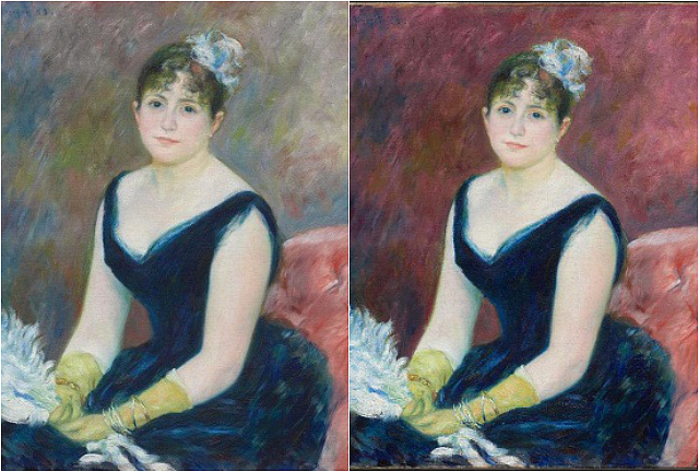
The photo at the top of the post is a portrait done by Renoir. The situation is similar to the Van Gogh examples, because it involved warm hued, fugitive "Lake" pigments. These were pigments, as far as I understand, that were made from organic dyes, and so brokedown differently than inorganic materials. Here's a link for those who would like to follow up. But the most amazing difference... is the absolutely importance of this background. It is not the same painting emotionally, at all, to me. She also actually looks like she's slightly smiling in the red one- perhaps its a bit of color applied around the mouth and eyes (long gone in the faded original), or perhaps it's just that I'm reading the painting different because of my emotional response to the color being used!
Finally, I have this piece by Winslow Homer, from a similar time historically. Here's the article, where they went through a scientific process similar to those above. If you're interested in the science of it, they had a follow up article as well.
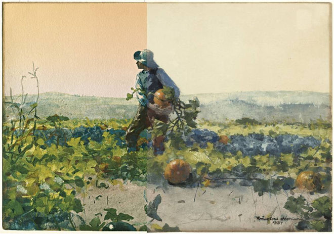
The primary focus is the clear, difference of the background sky, which is so important compositionally and emotionally, but it's also worth noting how the rich oranges also affect the greens. Together they make a warm, saturated image full of rich hue-based contrasts. The colors aren't there just to "look pretty"- they work in conjunction with each other, just like lights and darks do. It evokes (atleast in me) a different set of emotions than the pale, muted colors of the faded original. The importance of lightfast pigments can't be overstated.