Exploring Hue Shifts Through Iteration

"The Bells Are Ringing". The Alhambra at sunset in Granada, Spain. 40" x 18"
I wanted to share some step by steps this week, from a series of paintings I did of the Alhambra, in Granada, Spain. As I worked on these, it became clear that the composition was not the major challenge for me, but rather capturing that "glow" was what I was going to need to work on. For that, I began to do a number of studies, each with a shift in hue. This was very helpful and educational! Hopefully, watching me go through the sequence will help you think of ways you can iterate your own compositions to explore all the options your own paintings might be able to provide you.
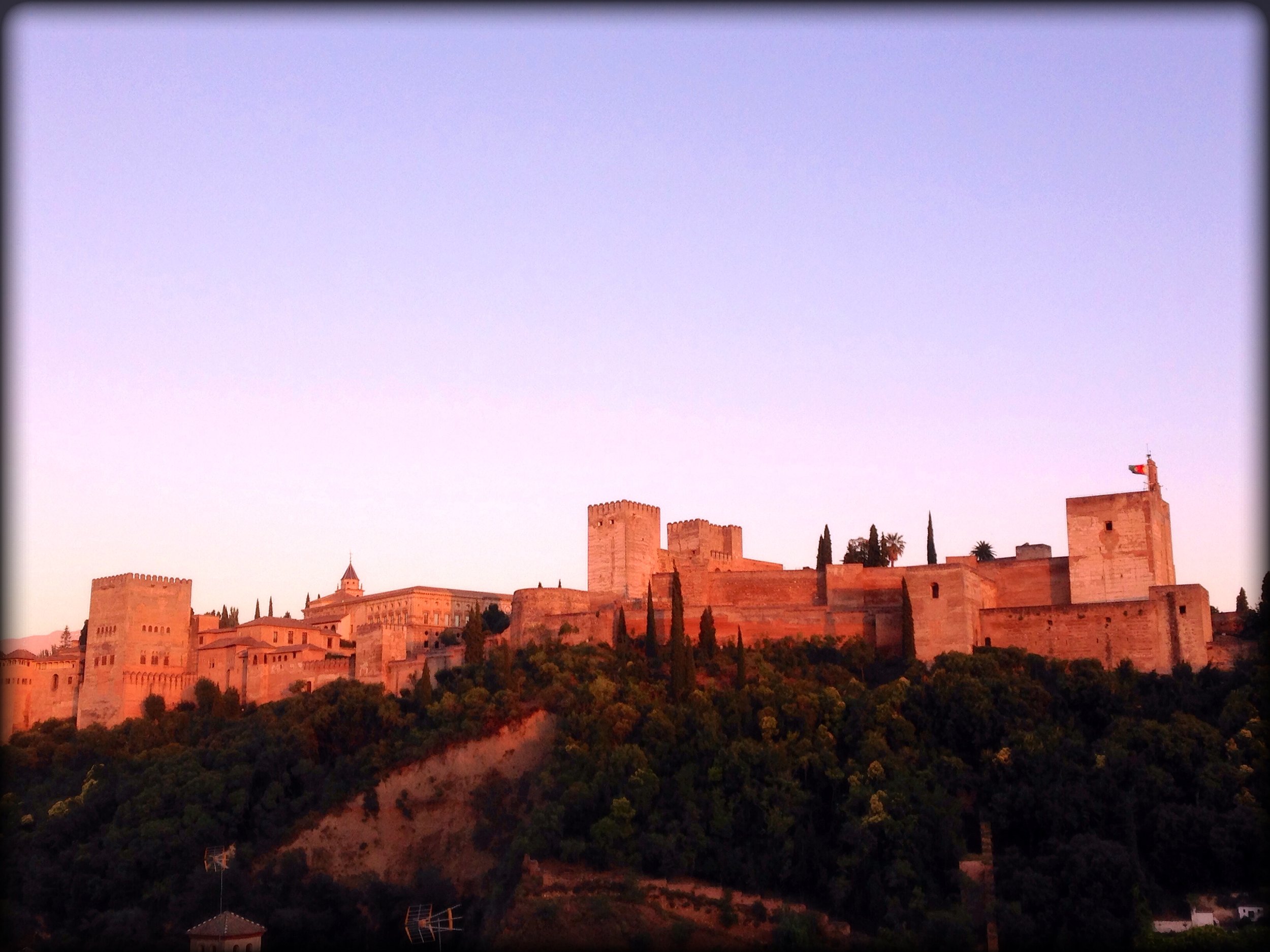
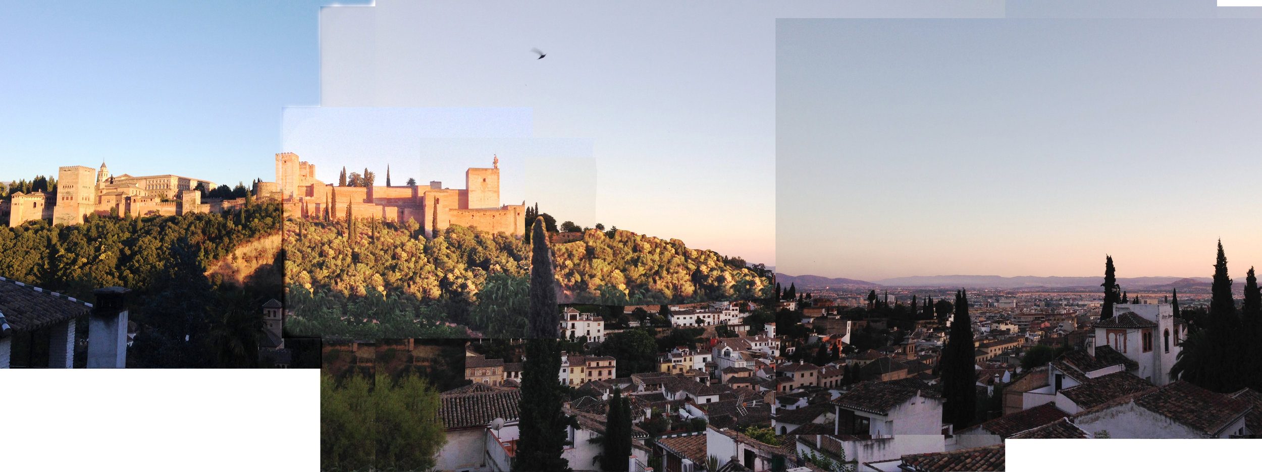
I started this series with the final painting I did last week, which was of the Alhambra too, but the reference photo I took was at dusk. The hues for the painting shifted cooler. The greens in the painting are bluer, the sky more purple, the oranges burnt and muted. There's not a sense of direct light hitting the castle walls. Looking back, I can see how much warmer the Alhambra is in the photo, but that's hindsight. At the time, my rendition seemed about right. And all in all, I actually like the painting.

When I went to do a larger piece, I thought I had it under control, but in the end I wasn't really pleased with the final result.

Bah! Six plus hour later, and it just didn't sing. I thought the forms were ok, but that a) obviously the white buildings FAR out-shined the Alhambra, and b) it just didn't glow. The whole thing was still too blue, the oranges too muted. In an effort to make the lower area recess into shadow, I had to push it bluer and darker than I wanted. So, I went back to the pieced-together reference photo (which never quite existed in real life), and figured out what I was going to have to do differently-

I was going to need to warm up the Alhambra astronomically. I also wanted to bring those lower shadow areas more into the whole composition. That's why I had brought those few white buildings into the light. The first problem was they were too bright, so I was going to need to give them a wash or two as well, to wrap the whole image in the same "warm light". The second problem was that they weren't peppered enough into the entire composition, to really let the eye travel from one to the next, like a chain. After a day off, sulking, I went back to work.
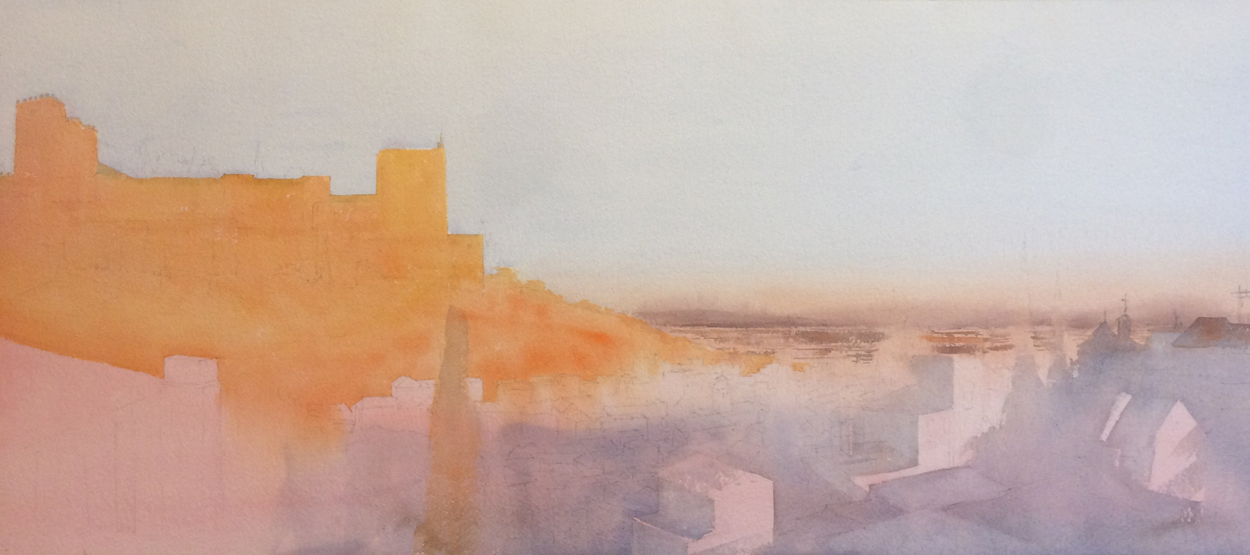
For this next step, I decided to do two color studies at the same time. Neither was going to be a finished work, because I wanted to feel free to explore the composition and color scheme as much as I needed. Time to experiment and see what I can make happen! For each of these, I tried different kinds of skies, and different underlying hues for the initial washes.

I used cerulean blue for the sky, and did a wash of yellow under everything. the shadows on the alhambra have more red in them, in an attempt to warm up the whole space.

This one had a pale pink wash under much of the painting. the shadows on the alhambra are cooler and have more purple this time.
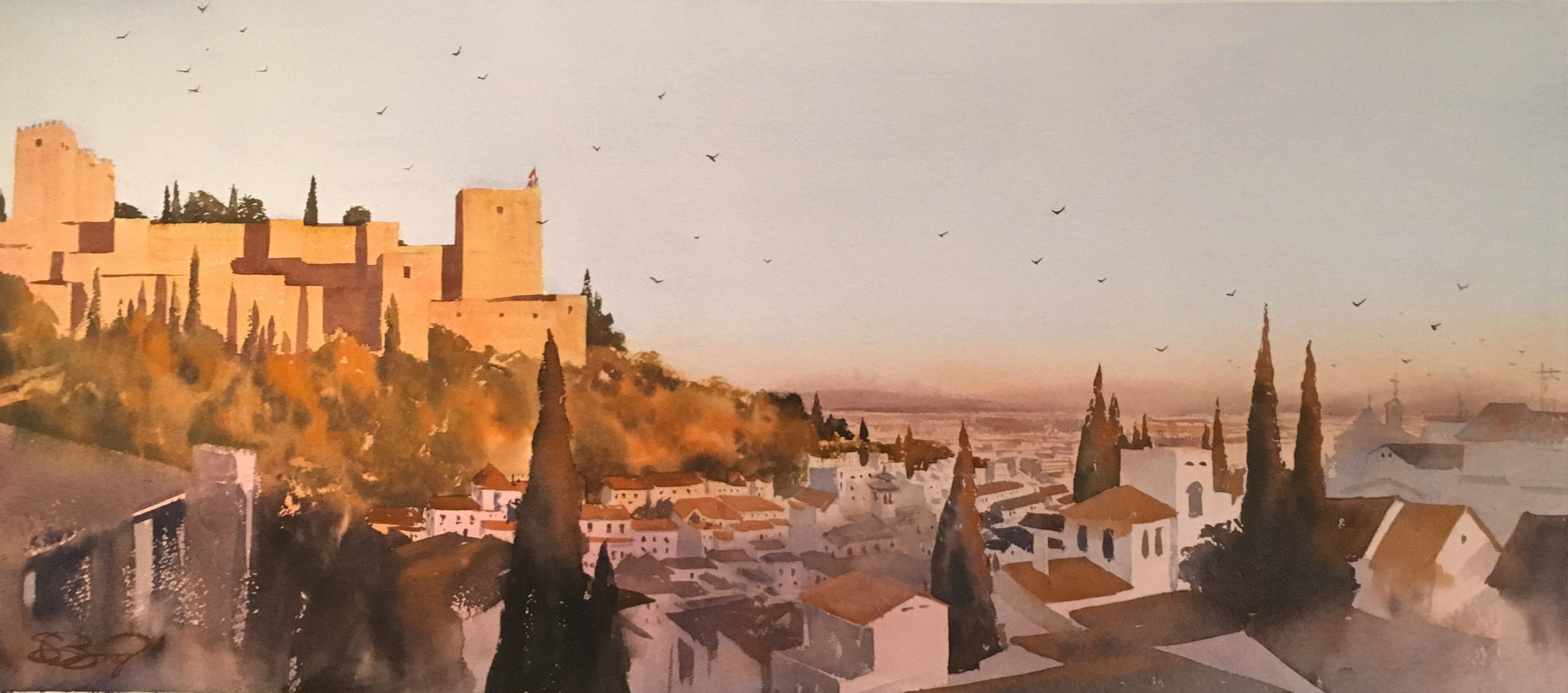
In the end, I liked the pink one better. It had the right late-afternoon glow to me. But I liked the yellow glow on the Alhambra in the first. I decided to combine them a bit , and have the hue slowly shift from one area to the next on my final piece. I also liked my decision to increase the size of the Alhambra, and yet to also push it more to the left, not allowing all of it onto the image. It created a better sense of balance.
Two days later I went back to work.The image is narrower (18" versus 22" or so), but as wide (40"). Here's the first wash on this last one. As always, things looked much brighter when wet, but I figured I might as well go for it color wise- I'd been more muted in earlier pieces and had never been quite satisfied...

By my standards, a pretty detailed sketch as well. Probably spent 1.5- 2 hours just on that.
Next up was the far away hills and dusty sky along the horizon, the oranges for the Alhambra and the the blue-purple shadows down below, capturing a bit of light here and there. I made an effort to use my spritz bottle and/or a clean wet brush more often, to soften edges and introduce some chance. I don't want it to be too tight! Yikes!
Here's the big jump, but I just started at the top and slowly worked my way down. Once I got to the sunlit buidlings in the center, I moved over to the right, and slowly worked my way down and to the left.

I thought I was pretty much done here. It was a clear improvement to me, particularly compositionally, with the lit buildings connecting you, like a string of pearls, bit by bit, from the 2ndary focal point in the bottom right, up to the Alhambra in the upper left.. I dropped in some birds to complete the circle, add some depth, and give some action to the title ("The Bells Are Ringing") and a signature, but I still wasn't quite satisfied with it. The sky was just too blue for me still. It didn't connect appropriately with the very warm pinks on the buildings down below-
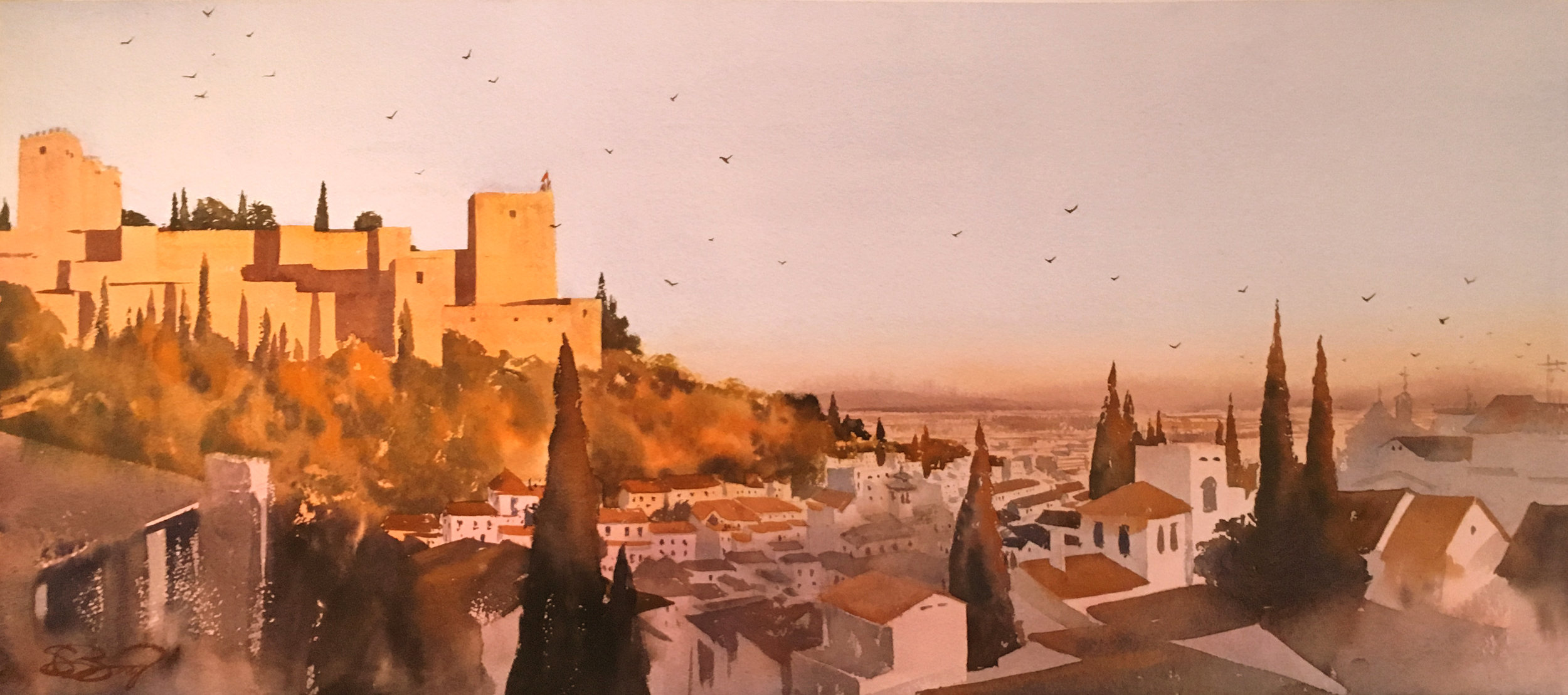
What's funny is it was the photo I took at this point that helped me see this from the outside. So I settled back down the next day, re-taped the painting to the board, and bravely set about doing one more wash of pale, dusty orange on the sky. Scary! I gently covered the sky and the Alhambra and took it all the way through to the horizon. Better, imo. Phew. Atleast I didn't screw it up...
There's a lot that's different from the original photo collage, and even from the first painting-

the Alhambra grew in size, the hues are rosier, the buildings are lit, etc. But I, at the least, prefer it as a painting- it leads the eye better, and it tells more of a story. It's more daring at the very least- I'll probably get more people that like it and more that hate it. All those iterations, where I explored different hues, helped me wrap the scene in a warm, dusty light. There's a good quote that says, "Sometimes you have to lie to tell the truth." That felt true to me.