Color Mixing, pt. 3- Why I Chose the Pigments I Use

Ah.... choosing your pigments. So personal. Instead of telling everyone what I think they should do, I'll try and focus instead of my own palette and why I choose the colors I do.
First, it's worth saying that my palette is always a work in progress. Some pigments have been with me since the beginning (Ultramarine Blue and Burnt Sienna), some hues have been represented by a revolving door of pigments (various deep reds, various warm yellows, various cool blues), some pigments I've picked up from workshops (Winsor Newton's Vandyke Brown, Holbein's Jaune Brilliant no. 2 and Lavender), and others have come and gone and come back again depending on my experiments and focus (Neutral Tint, Dioxazine Purple, Virdian, etc). Some I even keep in a separate ziplock baggie, and only pull out for special paintings or affects (Pthalo Yellow Green, Pthalo Green, White, etc). Every 6 months or so, I (literally) take notes on what is currently in my palette and see how things are shifting. I have a Word doc where I keep the info saved. So, things are often changing, and I like it that way.
Given all that, I'm not really evangelical about which exact pigments you should use. Do you need a warm and a cool version of yellow, and red, and blue, etc? I don't know. Maybe? I don't have a cool yellow, and it doesn't bother me. But if it floats your boat, it's not bad. I bet Carol Carter has some incredibly clean, zingy yellows, and her work is fantastic. Should you have Magenta and Cyan and Yellow because they're the "true" primaries? I don't know. Maybe?
Most important, in my mind anyways, is how you use your pigments and that you understand their mixing paths, regardless of the paints you pick. I can't stress that enough. If people get nothing else out of these three posts, I hope it's that. What's the point of having pigments if you don't know how they interact with each other? :) All of it rotates around what the paints do to each other, given the subjects and style you want to paint in. I'm definitely not the type to buy a pigment because I find the color attractive. Instead, I'm always thinking- how am I going to use this? what will I mix with this new color? why should I add this to my palette? what will it let me do that I can't currently do, with the paints I already have?
As for student versus artist grade pigments, I also don't think it really matters, as long as the paints are lightfast. Cotman is good, and so is Van Gogh. Both are cheaper than many other brands. Chien Chung-Wei used a lot of Cotman paints, and his paintings are superb. Student paints have a lighter pigment load, but as long as you get used to them and know how to mix them, it shouldn't matter. It used to be that Cotmans had fugitive pigments in their lineup, but that's changed over the last 5 years or so. Some artist-grade brands, like DaVinci and American Journey, are almost as cheap as Cotmans, if you don't mind ordering the paints online. Other brands, like Daniel Smith or M Graham or Winsor Newton are all basically on par with each other- each just has different versions of similar pigments. It's a matter of personal opinion- how different hues mix, how goopy the paint is, how granular, etc. .
The only things I really hold by are the following pieces of basic advice-
- a) its useful to have pigments spread out around the color wheel, so you don't have to work so hard to reach a particular hue,
- b) pigments often work in pairs and triads, so don't pick them alone, but rather in tandem with others
- c) single pigment tubes are often easier to mix and control, compared to convenience mixes with multiple pigments inside
- d) Pthalos are tough to control, particularly if you're a beginner
My (Current) Palette-

This diagram is meant to represent the basic pigments and mixing paths of my palette. If I use a mix a lot, I gave it a double line. If I use a pigment a lot, I gave it a double or triple circle. As you can see, I use Ultramarine Blue for a lot of stuff! Also- many colors are used to make a variety of greens. Browns and various warms, though, come more easily. There are lots of temperature options to choose from as "home base", and no consistent mixing choices. Of course, I also use many more mixing paths than what is represented here, but these are the basics I often come back to again and again.
The red dashes around the outside show the various hues. Only 9! That's because i have "duplicates", where I have a darker valued, muted twin in the middle of the color wheel. Over time, I've learned that I greatly appreciate have various shades of the same hue. It can speed the mixing process up. And some pigments just don't mix dark values. Sometimes, I want a dark value quick, and I don't care if it's chromatic or not. So, my palette dances around the color wheel, often going in to the middle and then back out to the chromatic (pure) colors, like this-
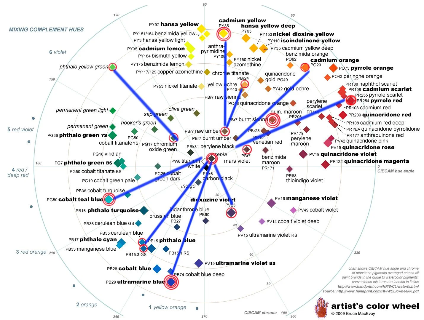
Yellow Ochre for my muted yellow, Burnt Sienna as a muted orange, Vandyke Brown as a muted red, and Caput Mortem as a kind of muted purple. And I do have cool blues (Cobalt Turquoise Light, Cerulean Blue) and warm blues (Ultramarine and Pthalo). So there you go, there is some order to the madness!
As you go through the list below, you'll soon notice that I have lots of Winsor Newton paints. They're generally lightfast and easy to find anywhere. I've gotten them before, and I know how they work, so I've stuck with them. That's why I get them. Other brands are obviously also very wonderful- Daniel Smith, DaVinci, Sennelier, M. Graham, etc. The only really essential thing is that the paints be lightfast. The brand shouldn't really matter. It's worth saying, however, that different brands have different versions of the same hue, so don't presume they're all the same! Many brands of Burnt Sienna or Raw Umber can be quite different from each other, for example.
I'm also very interested in the actual physical location of each pigment on my palette.
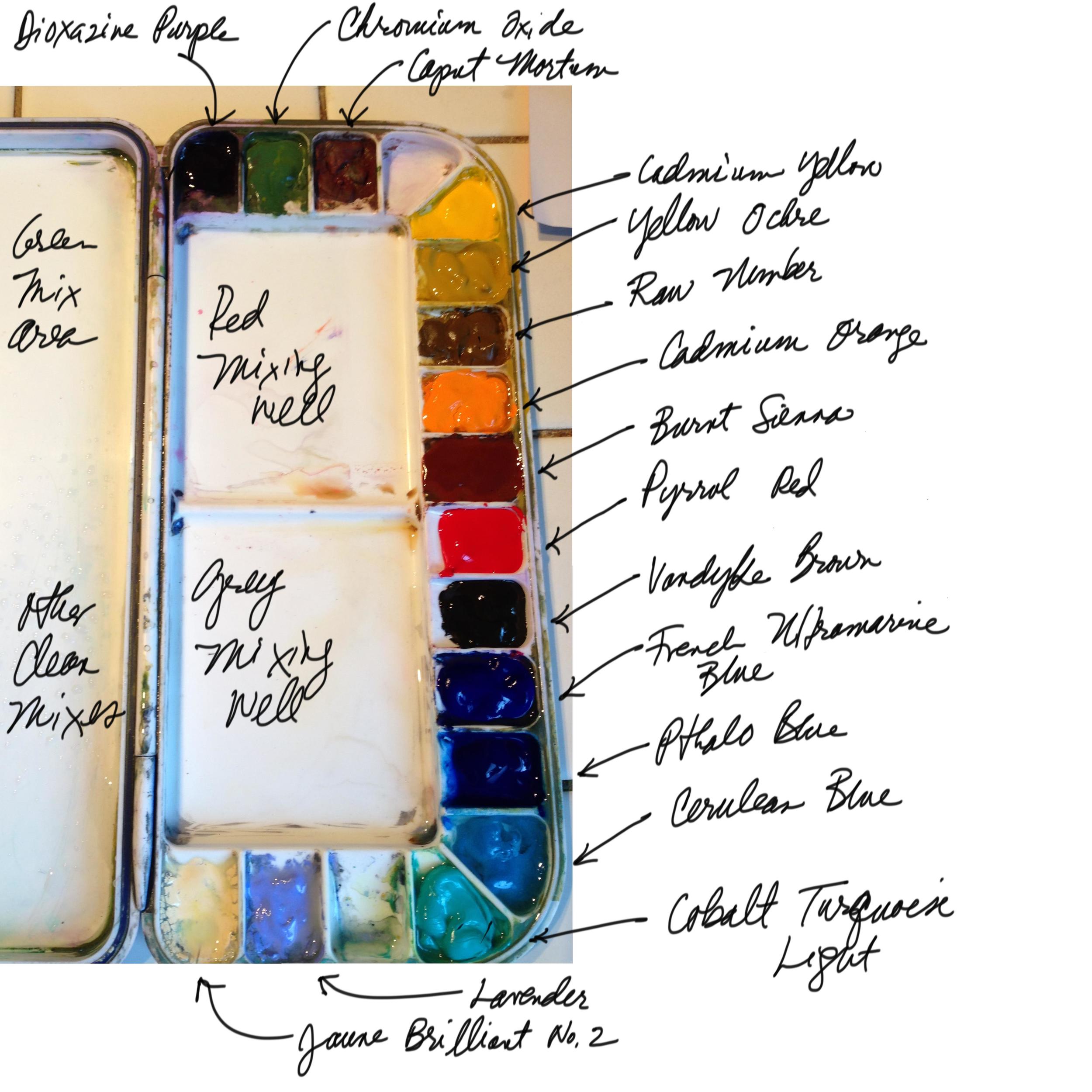
Dioxazine Purple is far way from everything else because its so messy. My warm colors (yellow, orange, red) all border the same mixing well (always used for mixing my warm hues), so if I make a mistake, atleast it's only another warm color mixing in. It's the same for my cool colors (my blues and greens) and the mixing well they border (where I mix my blues and greys). My darker colors (like Ultamarine Blue and Vandyke Brown, and Neutral Tint in the past) generally go side by side inbetween my warm and cool colors. This way, if they mix up with each other some, it's also only one dark value mixing with another dark value. My specialty pigments get placed side by side off in the corners, because I frequently mix them together. The setup of the pigments makes things easier to navigate quickly.
Winsor Newton Dioxazine Purple- A messy color that gets into everything else. I've learned to keep it by itself, and to put just a bit(!) in the pan, as it'll contaminate anything it's next to. I use it to mute my greens, to mute my yellows, and to darken my shadows sometimes. It's value is very dark, but it's also a strong mixer and can take things over easily. I took it off my palette at one point, and eventually brought it back. It's useful.
Winsor Newton Chromium Oxide- This is new in the last year. Its dull and "boring" and super opaque. It's very useful when dropping in trees and shrubs over backgrounds that are just a bit too dark. I don't use it on it's own though- I mix it with other colors, and put that opacity to good use! Not a pigment I've seen anyone else use.
Winsor Newton Caput Mortem- Yes, another drab opaque color, like a bruised up plum. Very good for mixing with Chromium Oxide if you want a nearly grey green, which is why I put them side by side. Also good for some opacity, if you need it warm. Another pigment I've never seen anyone else use in person. Read about it online though.
Winsor Newton Cadmium Yellow- I keep this off at the end, to keep it clean. One of those rare colors that needs to really be clean when I need a clean yellow. Great for mixing my greens. I don't use it for a whole lot else. It's a bit opaque, but does fine in a wash just the same. I like it as my yellow because it's a strong mixer. Other yellows can be a bit delicate, and get easily overwhelmed. This pigment warms other things up with gusto, which I like.
Winsor Newton Raw Umber- I picked this up at the Bjorn Bernstrom workshop I took. This used to be in my ziplock "specialty bag", but I liked how I used its drab greenish sort of brown, so I recently put it on my palette to see if I'd use it more. It's very much the color of dry grassy fields, and also has a wonderful granular, rivulet-forming habit when using just right. This affect only seems to work with the WN version of this pigment. I've tried it with the Raw Umber of other brands, to no affect.
M. Graham Yellow Ochre- I love how goopy this M. Graham paint is. Sometimes, I swipe it into paintings freshly daubed from the tube- 100% pigment!- when I'm making grasses and whatnot. Mixes great browns with your purple, which can be great for beaches, old buildings, etc. Also works great in skies, as it's a bit opaque and doesn't mix to a green as easily as other yellows.
Winsor Newton Cadmium Orange- Mostly used to warm up my yellows from time to time. It has come and gone and come again to my palette. Sometimes, I drop it into skies along the horizon. It's a very clean orange, which is hard to match with a mix. I've used other oranges in the past, like Pyrrol Orange, and they've been fine too. Cad Orange seems to move around less wet into wet though, which I like.
Winsor Newton Burnt Sienna- Indispensable. Besides Ultramarine, the color I run out of fastest. I buy it in huge tubes from Winsor Newton. Use it with Ultramarine Blue, of course, for mixing medium valued neutrals. Great for clouds, shadows, dusty horizons... anything.
Winsor Newton Cadmium Red- I've used other reds in the past, and may go back to one of them. I particularly liked Pyrrol Red (PR 254), which is a bit cooler. Honestly, I find this Cad Red rather too orangey- more of a Scarlet. It doesn't offer me strong enough differences from Cad Orange. In general, I use whatever red hue I have on my palette for red objects, but also find dropping it into mixes for skies and whatnot can do some lovely things. A good red, when mixed with a granulating blue, can produce a lovely nuanced purple. Red is not a much used hue for me, but it's needed when it's needed.
Winsor Newton Vandyke Brown- I got this from Chien Chung Wei's class. It's one of the lightfast Vandykes, according to Handprint. Very similar to Burnt Sienna, in truth, but it mixes much darker darks with Ultramarine Blue, much more quickly. I took this off my palette because I relied on it too much, and I found my greys were getting too dark. I wanted more light in my shadows, more nuance which Burnt Sienna was better at providing, but after Carmel I'm putting it back. Burnt Sienna and Ult. Blue just don't get dark enough easily enough. But with Vandyke Brown, I have two muted reds for mixing greys, and each readily mixes to a different maximum value. Used in tandem with Burnt Sienna, it should be a useful combo. Would Sepia work just as well? Maybe. As long as the hue and value is similar.
Winsor Newton French Ultramarine Blue- My favorite paint that I use the most. Is this hue more purple than normal Ultramarine Blue? Perhaps. Does it granulate more? In my opinion, yes. I love it in combo with Burnt Sienna and VanDyke Brown. It mixes with a rich red to make a wonderful dual-toned purple. It mixes well with yellow to make a dull, dark green. It can make a beautiful, delicately violet upper sky when diluted, but helps make very dark darks when mixed at full intensity. Indispensable.
Winsor Newton Pthalo Blue/ Cobalt Blue- I used to have Cobalt Blue, and am now trying this alternate blue out. I never could figure out what to do with Cobalt Blue, as I found it too similar to Ult. Blue. It's cleaner in chroma, but those uses are rare for me. Pthalo Blue is, of course, a total brute. It takes over everything it touches. But it's a hyper-chromatic dark, and can be beautiful if diluted for skies, or in oceans. I'm giving it a go. I've also been told that Cotman's Intense Blue is a Pthalo Blue that is (ironically) less intense and more manageable. I may try that later, as I like the hue, but find pigment properties of the Artist Grade paint tough to deal with. I also like that Pthalo Blue doesn't granulate, as all my other blues do. Sometimes you just want a perfectly smooth blue wash, which this provides.
Winsor Newton Cerulean Blue- I picked this up from the Alvaro workshop a few years ago. He uses it in his skies, and I agree 100%. Works well with Yellow Ochre in skies. If you don't overwork them, you can get a wonderful transition from blue to yellow, without really getting a green. It granulates heavily, which I like, but I generally use it on its own, as it's a very weak mixer. Other colors easily take over the mix. I don't use it for very many things, but I use it all the time for skies and water.
Winsor Newton Cobalt Turquoise Light- I bit of a stronger mixer than Cerulean, but relatively similar in hue. Perhaps a bit more green. Definitely a cleaner green. I use this absolutely all the time for greens now. I used to have Cobalt Turquoise (PG36), but it's a bit duller. I wanted the option of being more chromatic if I wanted, and so switched. I also used to have the M Graham version of this pigment, but it just wouldn't stay put. It was way too goopy, and literally slipped all over the place in my palette during transit. This WN version behaves much better, but also dries out more.
Holbein Lavender- I picked this up from the Alvaro workshop as well. It mixes well with Burnt Sienna to make an opaque grey. I use it very sparingly, and may still have the same tube I had from the workshop two years ago. I don't use it a lot, but it's very useful for mid-valued opaque highlights- those sorts of things you don't want to use white for, that are in the midground, but that are still brighter than the background. Definitely a specialty pigment.
Holbein Jaune Brilliant No.2- I got this from the Chien Chung-Wei workshop. He used it in skies and such. I've not gotten the hang of that. But instead of that, I often use it to mix up pale valued opaque colors. Good for slightly pastel objects that are lit by light. Clothing, skin, plants, etc. Sometimes, I also use it instead of white, for highlights and such, as it's warmer and can seem a bit more natural.
My Spare Pigment Bag- I carry Titanium or Chinese White (I'm not finicky), which I use straight from the tube. Sometimes for bright highlights, other times to mix with things and make them opaque. Sometimes for smoke. I carry Neutral Tint in my bag too. I use it very sparingly. I used to carry it on my palette, but I almost never used it, and often, when I did, I wished I hadn't. It's so dark as to appear almost unnatural. I generally prefer my darks to tip into either the cool or warm spectrum a bit. Finally, I also generally carry Pthalo Yellow-Green in my bag too. I don't keep it on my palette because it likes to move around too much, and contaminates other colors, but I find it critical often enough that it's worth keeping with me at all times. The pigment bag is also where I keep various pare colors that I'm interested in trying out in daubs, but don't yet know if I want to include on my palette permanently.