Review of the Zoom demo, and the next scheduled one!

Thanks to those who were able to come to the Zoom meeting last Saturday. I felt it was a success! There are little things we’ll be trying for the next one, including an attempt at turning on the audio for viewers so they can ask questions directly, and recording an uploading the video to Youtube. We’ll see how it all goes, but it was fun to do.
Here’s the wacky setup we made. LOL.
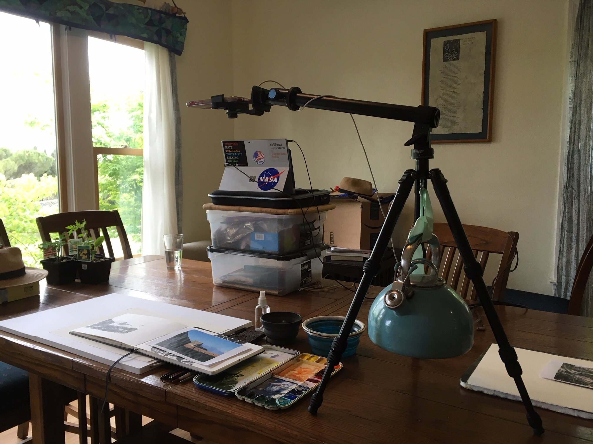
Check out the tea pot we tied to the tripod to make a counter-balance for the boom! Hahaha! And the laptop we used as a second “camera” on storage boxes and a cutting board. :P But it was fun, and got the job done…
Next Zoom Meeting, Sat Apr 25th 200-400 pm-
I’m going to be doing another Zoom meeting in a week, on Saturday the 25th. This time we’ll be on from 2-4 pm, Pacific Standard Time (California time). That’ll be 11 pm on Saturday for Paris, and 7 am on Sunday in Sidney, for reference.
Just like last time, you’ll need to click on the hotlink below. It’ll open up a window for you to give your permission for Zoom to start up it’s video window. You’ll need to copy and paste the password to gain access to the meeting. Follow the instructions and go from there. We’ll have the video turned off for all of you, to make it easier for everyone to only see my demo. I’m going to attempt to have the audio on for the audience. We’ll see how it goes. Last time, we had a chat box, which worked fine, but it would be nice hear your voices too! :)
Topic: My Meeting
Time: Apr 25, 2020 02:00 PM Pacific Time (US and Canada)
Join Zoom Meeting https://us02web.zoom.us/j/86165128456?pwd=SUk4VXhFSWk2WUpqZEhEaHRwZ0kxdz09
Meeting ID- 861-6512-8456
Meeting Password- 946034
Logistics and Such-
Folks asked a number of questions during the meeting, and I wanted to follow up here in regards to them first. If I’ve forgotten something, please ask in the comments.
1) Paper- I use Saunders Waterford Rough, 140 lb when I can. Arches Rough 140 lb works fine too. I find Rough paper tends to stay wet longer when painting wet into wet. Perhaps it has to do with the little divets holding water? Of course, I also like the texture, which I find makes dry brush work easier.
2) Pigments- The subject is definitely focused on a push between warms and cools. Most of the painting was done working between Burnt Sienna and Ultramarine Blue. Here’s the palette I was using though. I’ve included pigment info when it’s unclear from the name. Cadmium Yellow Light (American Journey), Naples Yellow (M Graham), Cadmium Orange (AJ), Burnt Sienna (AJ), Joe’s Red- PR254 (AJ), Alizarin Crimson- PV19 (AJ), Ultramarine Blue (AJ), Cobalt Blue (AJ), Cobalt Turquoise Light (WN), Viridian (AJ), Perelyne Green (WN), Dioxazine Purple (WN).
Notan and Prep-
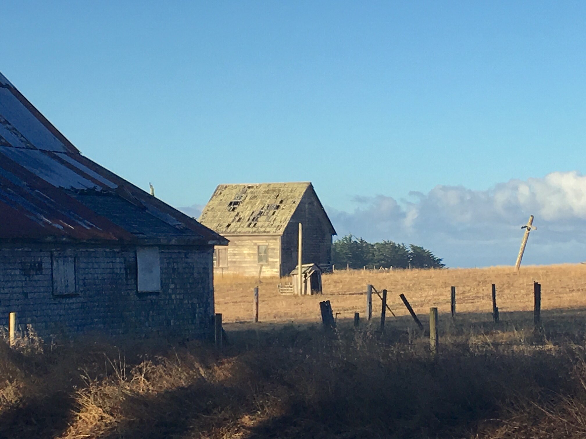
Here’s the notan I did ahead of time, and my photo reference. This is from up in the Mendocino area.
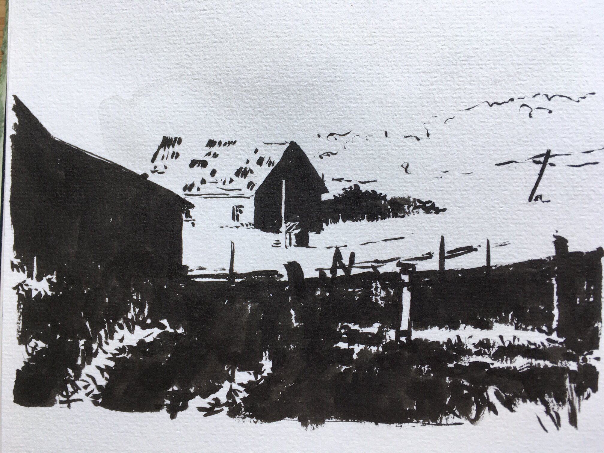
You can see right away that, in order to capture and separate the shapes in the foreground, I’ve had to push the contrast. I wanted to open that area up and make it more dynamic— even the photo, after all, is just a representation of what I saw, and not the “real” thing. Even what I saw may not have been the real thing!! LOL. Given the recent conversation about glasses and such. Therefore, I go with the story I want to tell- long shadows, bold contrasts, brightly lit patches of grass by old abandoned barns.
One of the participants asked about the difference between value studies and notan studies. This is a good question, and a matter of preference and function. As I see it, value studies help you break your painting into glazes. It’s much easier to see painting steps, when you have to drop in different values when making a value study. This isn’t wasted knowledge, so I don’t think they’re a bad thing to do. However, my experience is that people tend to simplify values when they view a subject. At most they see 3 values (white, black, grey), but sometimes it’s really just 2— what is dark and what is light… with the middle values getting dynamically assigned to one or the other, depending on it’s context in the composition. Thus, in terms of composition, I find notan helps me see these black/white shapes better.
Notans help me better arrange shapes based on value. They help me see where I need to separate values and change things, when two similarly-valued objects are side by side and get lost in each other. Or when I want to do that, and leave it be. The goal is to better see these sorts of relationships, and the notan does that.
Final Painting-
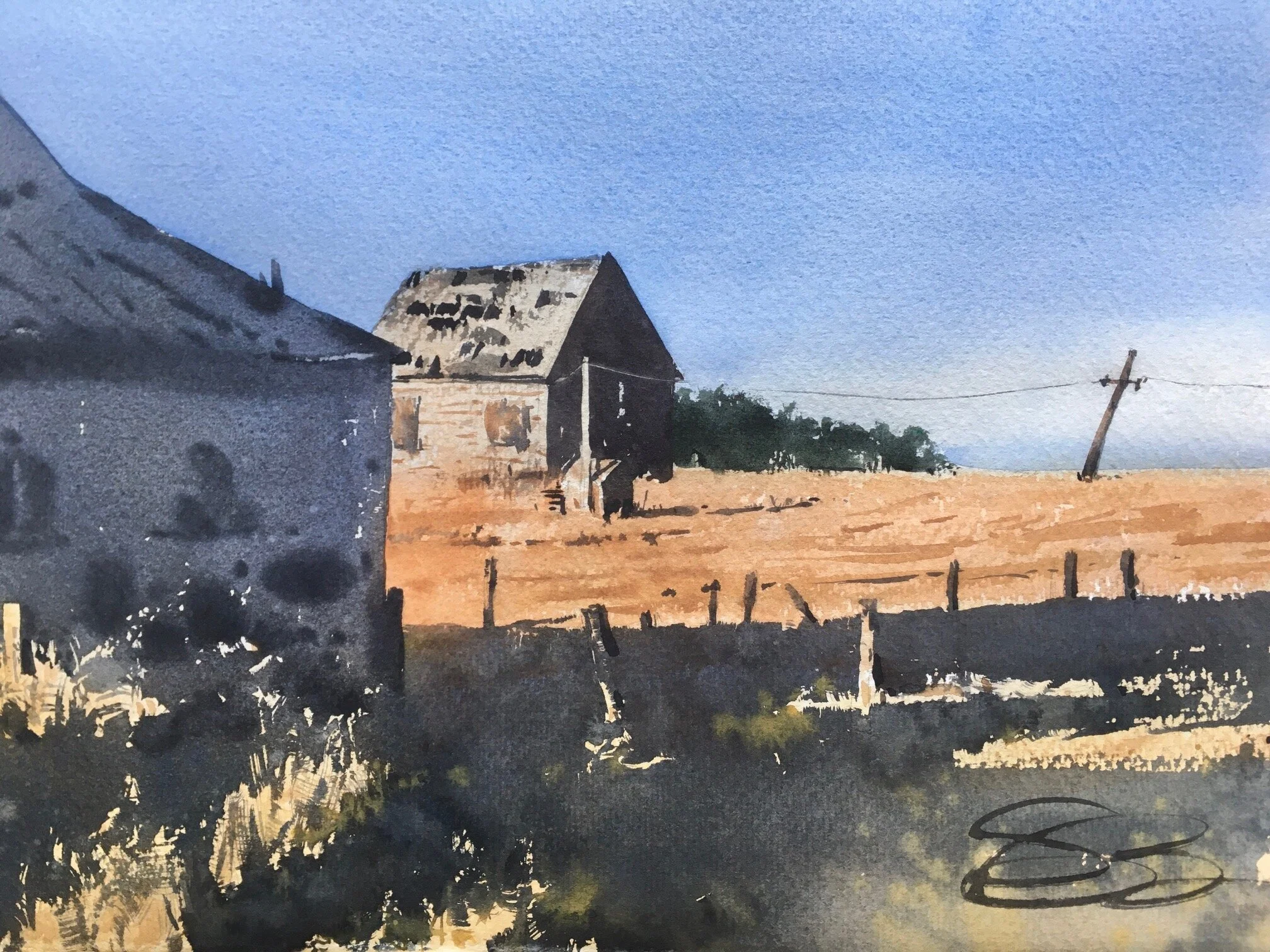

I wanted to note that this final image is altered from where it was at the end of the demo. I did not feel the sky or the midground was strong enough in value or hue. There’s a certain middle-value-range when hue is strongest. Too dark, and we just see value. Too pale, and the color goes away. I wanted the cool sky to play against the warm barn and midground. As such, both areas required a light final wash to push the hue-contrast.
I did the sky first. Turning the paper upside down and tilting it, I wet the “bottom” of the sky (now on top) with clean water, and then gradated the wash up to the top of the paper. After I let that dry all the way, I glazed the roof of the barn and the orange-brown field. It’s important to let them dry in between because the two hues are opposing compliments. If one bleeds in to the other (sometimes a very nice thing to have happen!), we won’t get the strong hue-contrast I was looking for.
Sometimes, I need to finish a piece, and set it aside, after I think I’m done. Then I come back some time later with clean, new eyes, and see the final stages I’d like to do.