Spotlight on an Artist- Richard Thorn


Richard Thorn is a UK watercolorist that I discovered on Facebook. I’ve known about his paintings for some time, and have wanted to do a spotlight on him for atleast a year or two. As a watercolorist, his use of color is uncommonly dynamic and full of light. However, (as is often the case) it’s really his masterful, restrained use of values, and mid-values in particular, that secretly keeps drawing me in. Out of an overabundance of confidence, I contacted him and set up an interview. To our benefit, Richard was very mellow and chatty! Thank you Richard!
I asked him about his evocative blue shadows that one almost never sees in the real world, his incredibly vibrant greens, his whites that popped and glowed, and the beautifully composed spaces that he shared. He said it was “all about distance”, to be able to “walk into the shadows in the distance. We want,” he said, “to paint what our experience of the world is”, to get at “the essence of a thing.”
And I think we’re arriving at that essence. These paintings are fantastic. Sometimes artists musts lie a bit to tell the truth, to paint, eh? Well, I agree on that. ;)
Well, that was back in April or May, and a lot has happened since then. But here we are now! Let’s see how he does what he does, how he plays with color and plays with values.


When White Opens Up the “Rainbow Area”

I’m often pushing watercolor artists to get their darks darker, to not be too tentative with their darks (which I think is true), but Richard does something really different. The darks are dark, he’s not tentative at all, but many of his paintings feature only a very small usage of black. Instead, if you look at enough of Thorn’s paintings, you can see how often he uses big, fat bold whites and near-whites, either in the water or the sky. His liberal usage of white anchors his paintings and acts as the “value counterbalance” to the color sections. Like an Alvaro Castagnet painting in reverse, this usage of white is what lets his color really sing.
Chien Chung Wei called the mid-values of a painting “the rainbow area”- the value range where color can speak strongest. And this is true-- it’s hard to have rich chromatic color as you approach your deep darks or in your palest lights. By having his whites be so strong, Thorn can play with color more liberally because it lets him tilt his whole value scale into a higher key. Let me show you some examples.
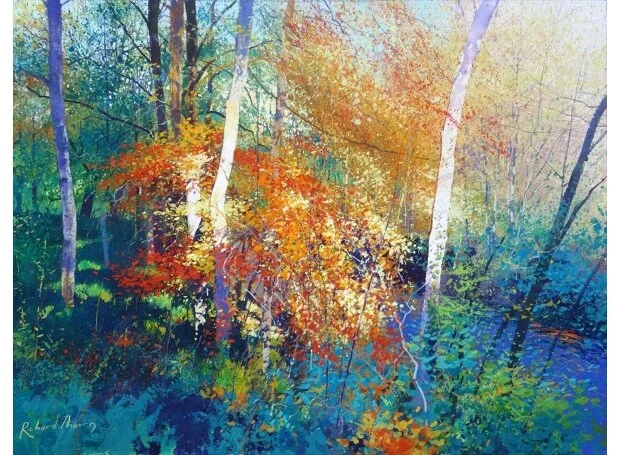
In this painting, if we look at the area labeled #1, we can see a lot of this going on.

Here the sky is almost white, and the yellow leaves are also very pale, yet everything reads—and vibrantly so! The value-context of the sky allows the naturally light-valued yellow foliage to be as pale as needed to arrive at a very pure chroma. A more common blue sky would require a darker hue for the foliage to read— or an opaque medium. The white allows Thorn to play with pale, fully vibrant hues in a way that is normally very hard (or practically impossible) to do. Everything starts with the white sky and steps down from there in value.
Additionally, because the value-scale is “tilted” towards the white end, his dark values can shift and lighten too, and stay inside Chien’s “rainbow area”. When he’s able to keep the whole painting in a higher key, he can easily use rich not-particularly-dark blues and mauves as his darks, because he doesn’t have to go super dark to get the required contrast. This can lead to very compelling illuminated shadows (a strong feature of many of Thorn’s paintings) and also allow for bold color contrasts. Look at the areas labeled #2 in both of these paintings, where I’ve zoomed in—
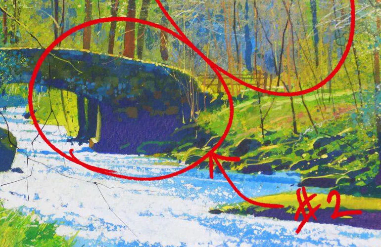
The shadows don’t dip into black in these areas, and so we’re allowed the pleasure of mauve against yellow-orange and chartreuse.
But, in my estimation, everything begins with those whites. I’ve got some examples to share that Richard talked about.
Getting Those Whites

The first thing to be clear about is that Thorn is clearly not a traditionalist. He seems happy to use whatever tools are necessary to get to his whites— scraping with a razor, gouache, ink, masking fluid, etc. So, he’s not preserving whites everywhere, painting around his highlights meticulously, or any such thing. Instead, the focus is to use tools that allow him to “paint with immunity”.
In this painting, you can see some examples where he’s used various methods to achieve his whites.

He started with masking fluid, but then later scraped with an exacto knife, and lifted paint and softened edges with a hogs hair brush.
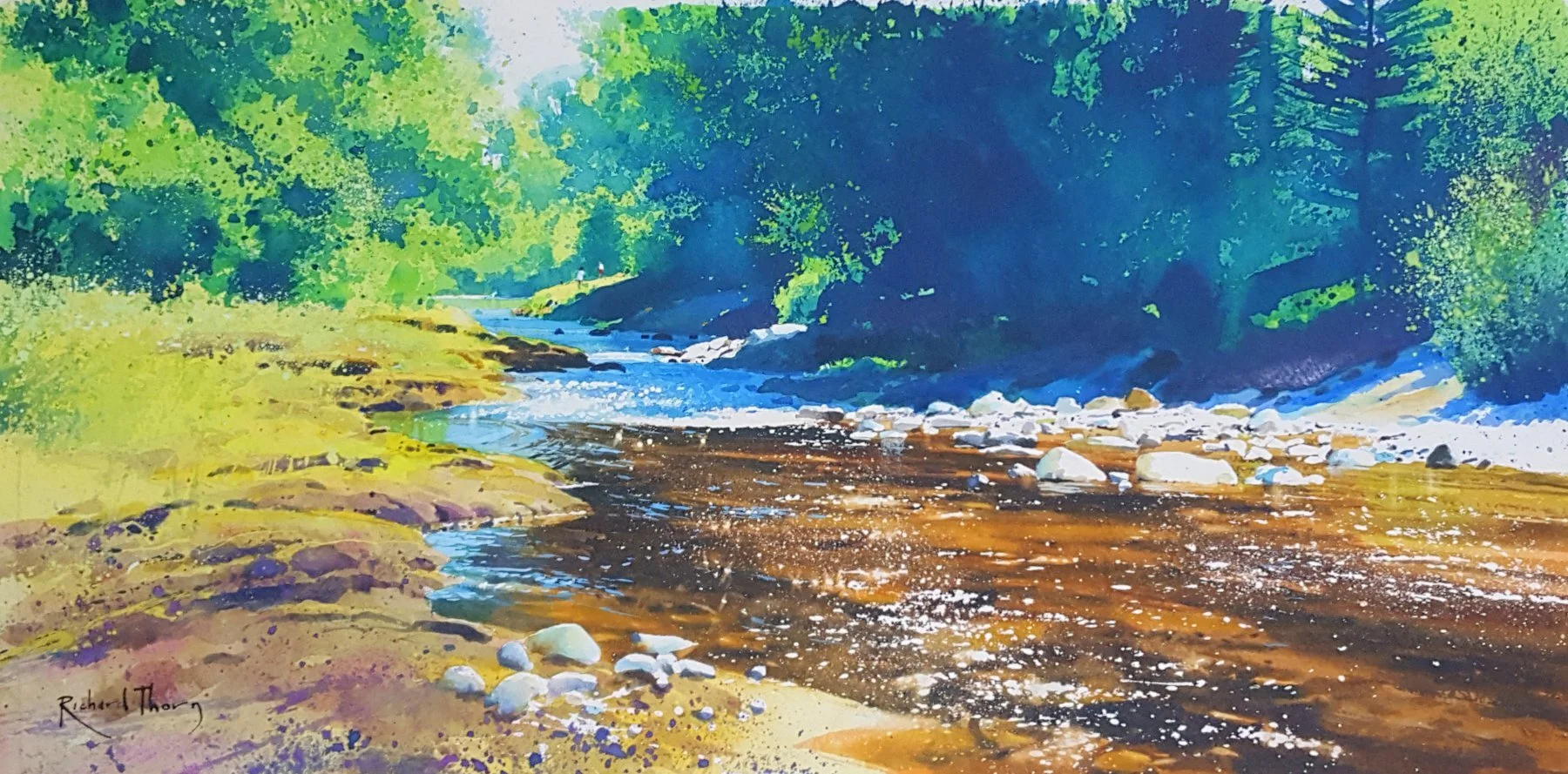
In this painting, it was masking fluid for the whites, which I’m assuming he lifted part way through to drop his pale blue shadows in—
In this one, he used a variety of tools for his highlights—

gouache, by the looks of it, for the white speckles of light in #2 and #3, but also, as he specifically told me, a dip pen with ink for some of the very fine lines, such as for #1.
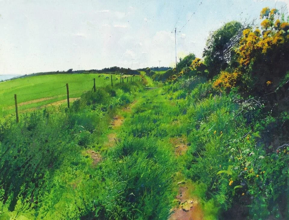
Opaques- Working “To and Fro”, Working With Value
Like most watercolorists, Thorn begins by moving back to front, pale to dark, but for him this only lasts for a while. As he said to me, he moves “to and fro” in the painting, from “light to dark and back again” (in a line that very much reminded me of Bilbo Baggins’ “There and Back Again”!). If we go back to the first painting in this post, you can see the back and forth manifested most clearly in this focal area—

where he noted how he would “start with the yellow, then build the holes, then disturb and mix highlights on top of the dark”, indeed moving “to and fro”. Again, in this painting—

you can see a similar example in area #1, where the pale blues, oranges, and chartreuse (each almost the same value as the other) play against each other magically—

Or in this portion of an earlier image (shown below), he develops an intense textural arrangement through the use of opaques, moving “to and fro”—

which I’m sure he’s achieving by laying down a pale valued wash, then applying darks on top, then light valued opaques again.
How does he get away with this beautiful sacrilege? A variety of means…
Thorn described to me how, a few years ago, he got fed up with using only watercolors, because of how hard it was to keep the luminosity he wanted in the shadows. That has led, it seems to me, to a lot of experimentation. Much like my comments on how he gets his whites, he is clearly not a traditionalist. At the very least, Thorn currently uses many different fluid mediums to get the pale body color he wants— gouache, opaque inks, body color mixed with watercolors, watercolor crayons, watercolor pencils, etc. The real goal, as I understood it, was to make sure he wasn’t confined by the medium. He wanted the necessary tools to explore the composition as he painted it, while not getting darker and darker (a problem that definitely happens while working with watercolors), and instead being able to build the color relationships he wanted, rather than relying just on value (as so much with watercolors does). Well, the proof is in the pudding… !
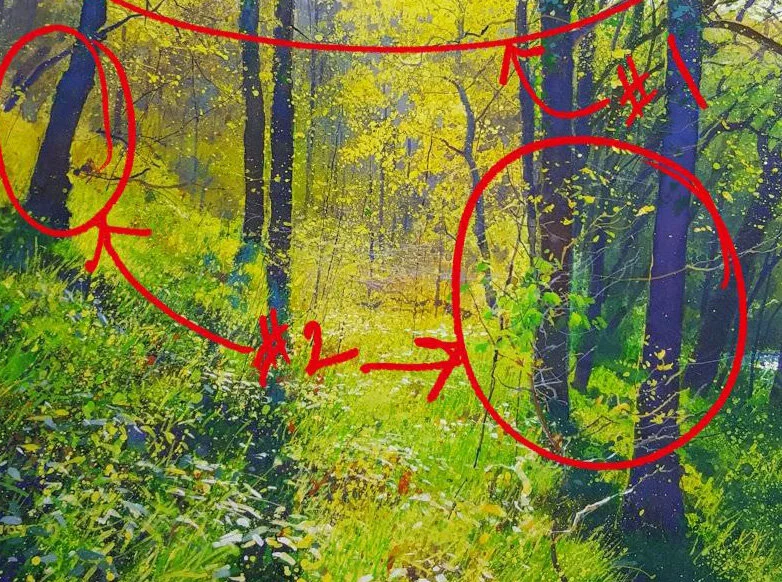
What’s also really interesting about Thorn’s use of opaques is how he uses them to drop in mid-valued dark-ish “highlights”. In many of his paintings, there are a variety of highlights in the shadows—spots that are actually the value of a shadow in one part of the painting are a highlight in another section. You can see it here in the areas labeled #3—

or here again, in the circled areas—
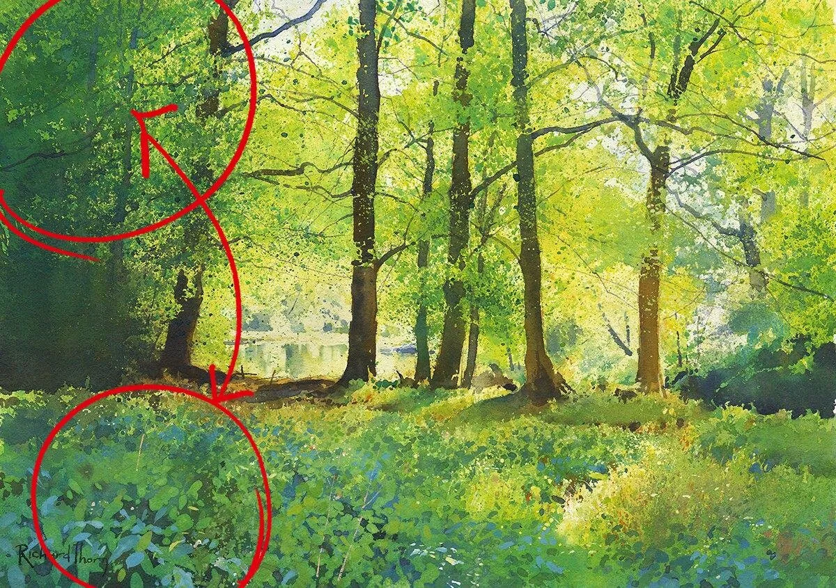
This sort of sophisticated modulation of value allows him to take advantage of color relationships in areas that might be too dark in paintings by many other watercolor artists. It also ties the paintings together spatially in interesting ways, through hue as much as through value.
Plein Air Work, Sketchy and Loose

an example of piece of his that started plein air.
Richard has this video up on Youtube, and I wanted to share it here. Richard’s plein air work is pencil and wash— more like a cousin to his studio work, than the same— but it’s a pencil and wash technique that I’ve not seen before.
The sketches features linework for sure, but they don’t focus solely on it. Instead, using the side of a large pencil, he introduces big blocks of different tone, which he later uses to liberate his color work from his value-work. This is quite interesting, and something I’ve not seen before! The pre-existing value shapes and linework allow him to apply the paint “with impunity”, much as he spoke about when applying masking fluid to preserve his whites.
Watch the video all the way through to the end to see some examples of the technique from his sketchbook.
edit- December 2021
Also, since this last post, a video of a zoom (?) demonstration of Richard’s has been made available online. Thank you to the Spokane Watercolor Society!! This video is long— it’s a full 1.5 hour demo—but it’s very insightful to watch it all the way through. An interesting technique that Richard uses here is to essentially do a grisaille before hand with ink, so that he’s primarily focused on color work during the demo, and less on value. I’ve done this one before myself for a muted painting, and it worked well, although Richard’s colorwork is still very strong. Well worth the watch!! :)
Getting Past Our Own Tools

Part of what was so interesting about talking to Richard was how his use of various mediums and tools was far outside the norm. It can be very limiting to only paint “traditional” transparent watercolors. It not only can make things more difficult than they need to be, but, more importantly, it can stop you from painting certain subjects. I don’t like that kind of artificial barrier-making. The art-making process is hard enough already— we don’t need to help it be any harder. Seeing how far Thorn took things was very compelling and made me ponder new approaches— inks, pencils, etc. It’s not that I feel a need to copy all his techniques, or that we should all start using gouache, but more that I was intrigued by his “open” approach. If he couldn’t figure out a way to get the effect he wanted, he brought in new tools and methods until he got a satisfactory result. In the end, what’s most important to me is that the paintings work and that I have the experience I want to have while creating them.
And truthfully, I’ve never been one to divide mediums. Not just in terms of what my methods are, but in terms of whom I admire and emulate as a painter. I love, for example, Monet and his colorwork, not just Turner’s or Sargent’s watercolors. It has nothing to do with the fact that Monet paints with oils— it’s his shape-making and juxtaposition of color that pulls me in. If Thorn can get the kind of color results he’s getting using various fluid mediums, that’s exciting. It means we can push the limits to get the kind of results we want too. As watercolorists, we should be moving beyond just value to more sophisticated uses of color too, whether that means meticulous transparent work or some alternative technique. He has his tools and methods, and we’ll need to experiment and find ours too.
If you want to view more of Richard Thorn’s work, you should go to his website— https://www.richardthornart.co.uk/ . He has books and art for sale there.
or follow him on Facebook— https://www.facebook.com/richard.thorn.391
He’s posting regularly, and is sharing some fantastic work.