Exploring Skin Tones

As I've noted in a previous post from February, these last 4 months I've jumped into doing figure studies from live models. Of course, lots of this has to do with seeing the human form and rendering its shape. You're trying to get comparative proportions right, a sense of balance and weight to the skeleton, how a chin tilts to express a certain kind of demeanor, etc. But a new subject, like skin, also requires that you mix new hues.
As humans, we're very aware of the shape and color of humans, even if we can't exactly say what color someone is. I can paint all sorts of browns, and believe me-- you'll know that they're all wrong. It's very nebulous. And, of course, folks have lots of skin tones, that range for golden yellow-browns, down into deep blue-purple browns, up into pale pink-browns. So it's not like you can nail it down and just rinse and repeat.
What's the Value in Making Color Charts?

When I get to a new conundrum like this, I go back to the well, so to speak. That means practice and experimentation, usually piecemeal over a few weeks. Just trying some out here and there, bit by bit educating myself.
For this sort of process, my desire is to know the colors on my palette well enough, and to know my subject well enough in terms of hue, that I can easily mix the tints and hues and shades that I want in the spur of the moment. I need some sort of recipe which I can branch off from, in the wild busy-ness of a 10-minute sitting. There's really nothing to be done but to get mileage on the brush, as always. But not all miles are built the same! Or so I think, anyways. The goal is to be thoughtful in your iteration. To notate, think, and try out an idea... and then to reassess what you want to do differently, and experiment again.
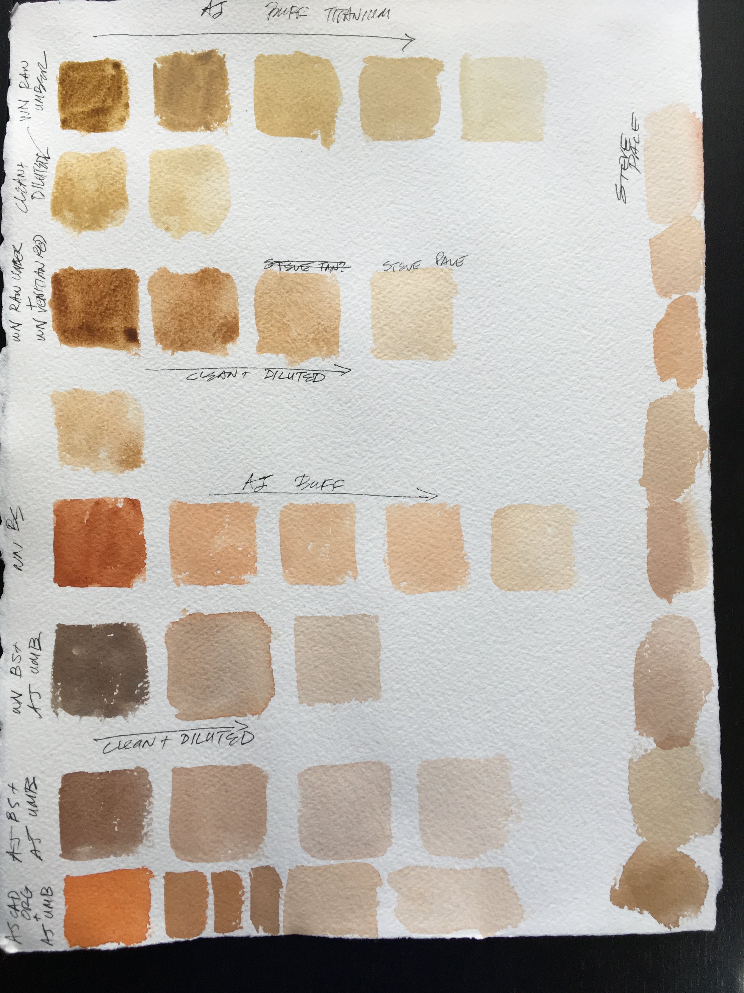
Below you can see me pushing through different mixing lines, noting the company, paint pigments, etc. All of these pages of swatches are on the back of throw away paintings. It's a good way to reuse the material, and I don't fret about wasting money or paper. I just experiment until I've had enough for the day. This is useful as a way of seeing how your pigments react to each other, and the kind of mixing lines you can get with different pairs and triads.

But it's also limited, because it doesn't really relate to the actual subject. This is where I got the fun idea of using my family as test subjects. LOL! I took the swatches I'd been working on, and began to see if we matched up to any of them. Here's my poor daughter at 8 in the morning on a Saturday, going with one of daddy's crazy ideas--

almost Matching the hue of her forehead

assessing how red lips really are...
Here's my arm, as I try and find a match. I work outdoors, and so my skin is pretty tan. Much darker and browner than my daughter's and wife's.


And my wife, on a Saturday morning. Thank you Kate! Kat's skin is much paler and pinker than my own.


This was an incredibly useful process, and informed my paint mixtures after assessing real skin tones, versus the swatches I'd been painting. I went back to the drawing board, and tried out some new mixes, which were experiments informed by the results and analysis I'd done on the first batch. I began to zero in better on my target.

More Than One Way to the Same Hue-

Skin tones tend to fall within the red circle I've created in this image. It's a strange, magical place on the color wheel that's like a little black hole. Nothing really lands in the space just right, and getting the right hue pretty much always requires a mix of some sort.
Most of the mixes I was doing earlier involved a mixing line between Burnt Sienna or an alternate brown and Ultramarine Blue (represented by the blue lines and circles). This can work fine, but it has a limited range of hues, and can get "dead" pretty quick- it does, after all, make a nice neutral! Because of that, I often add a muted yellow, like Yellow Ochre. This warms it up, but can also lead to making green-browns as you add your darkening blue. Blegh!

This is why I began to explore other mixing lines, which you can see below. Yellows with pinks and oranges with purples. Neither will mix a cadaver color and instead make a variety of muted warms, which is nice. However, once again, the range of hues is limited.

I tried mixing various muted yellows with a variety of pinks/ magentas, but the outcome was often too pink for my taste. You can see my notes as I go along, noting if something was too light or pink or dark, or muted, etc. I also tried shrinking the color gamut of my mixes by using a variety of muted colors, like Caput Mortem, Indian Red, Raw Sienna, and Van Dyke Brown. This makes it harder to fail at mixing a human skin tone. Even your mistakes atleast look like a person. But it also has its own limitations, because you need to both a) carry more tubes of paint around just to paint skin tones, and b) the gamut is more limited, which makes it harder to move around fully within the little yellow circle. The hues were often more muted than I really wanted.


I tried mapping out and comparing various mixes with different yellow and oranges too. Always the goal is to experiment and then critically assess before I do more. The orangier I got, the better the mix got.

In the end, though, I really felt like there's a value in using paints one already has on one's palette, and I feel like skin tones vary so much that there's value in having the ability to mix a wider gamut of hues. That means mixing from three pigments or so. I went back to an earlier mix- Yellow Ochre and Burnt Sienna- and mixed them with Dioxazine Purple instead of Ultramarine Blue. This gave me a rich darkener that kept my mixes warm, instead of grey or green. Pretty good results!


A special little thing I like to add to my mixes is American Journey's Buff Titanium. This is a warm, muted creamy yellow-white. Having a pale, warm light with a bit of body to it can be very helpful for mixing. This allows me to lighten a hue I get, much like an oil painter would, without having to aggressively dilute my mixture with water. This can be nice for two reasons- first, because it has covering power, which can be useful when inserting people into scenes, and second, because it allows me to paint wet into wet with a pale value, but to do it with a thick pigment. That's very useful for a variety of wet-into-wet effects, as we work with the Watercolor Clock.
What's really fun is how many different recipes there are for mixing skin tones. You can go forever picking up hints and clues. This is where I've landed for now. Next week, I'll share some photos of some of my recent quick figure studies, as I've put some of this skin-tone mixing hullabaloo into practice.