DVD Review- Konstantin Sterkhov's "Noon Nap"
After my review of one of Konstantin’s videos in April, I got in contact with him and he shared some of his reference photos for his other demos. This is good news for us, because it helps his videos function better (in my opinion) as learning tools. With a reference photo, we can begin to see some of the decisions he made “behind the scenes”. Lots of people focus on technique (which of course is essential), but in the long run… how you think about painting and how you think while painting will be more important for expressing yourself and building a compelling image. Hopefully, if you decide you want to get the video, you should be able to combine it with the reference photo to use as a paint-along. There’s always stuff to learn from following the thought process of a more experience painter as they work on a subject, and then doing it on your own.
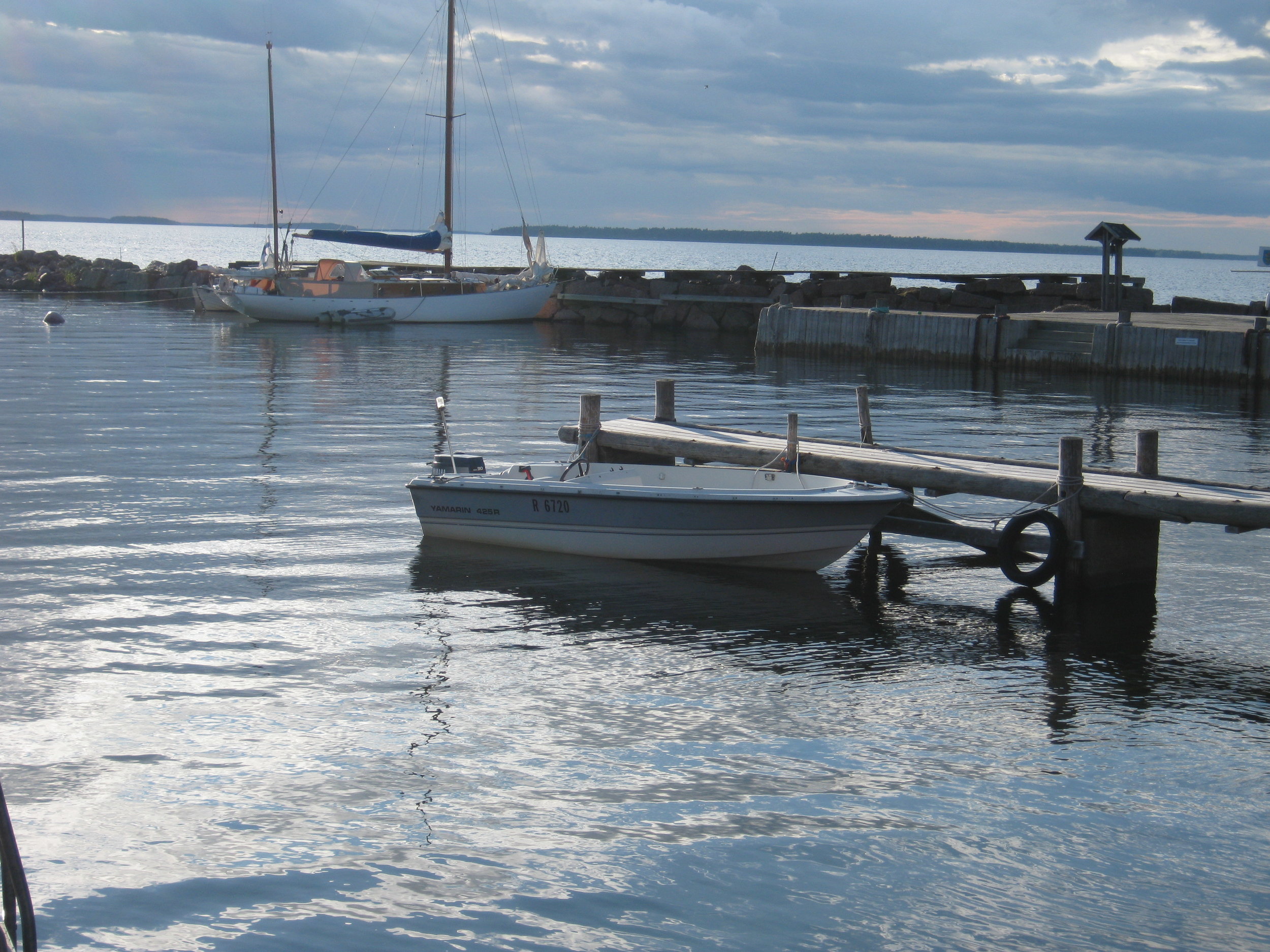
Here’s the reference photo for the video I reviewed back in late April,
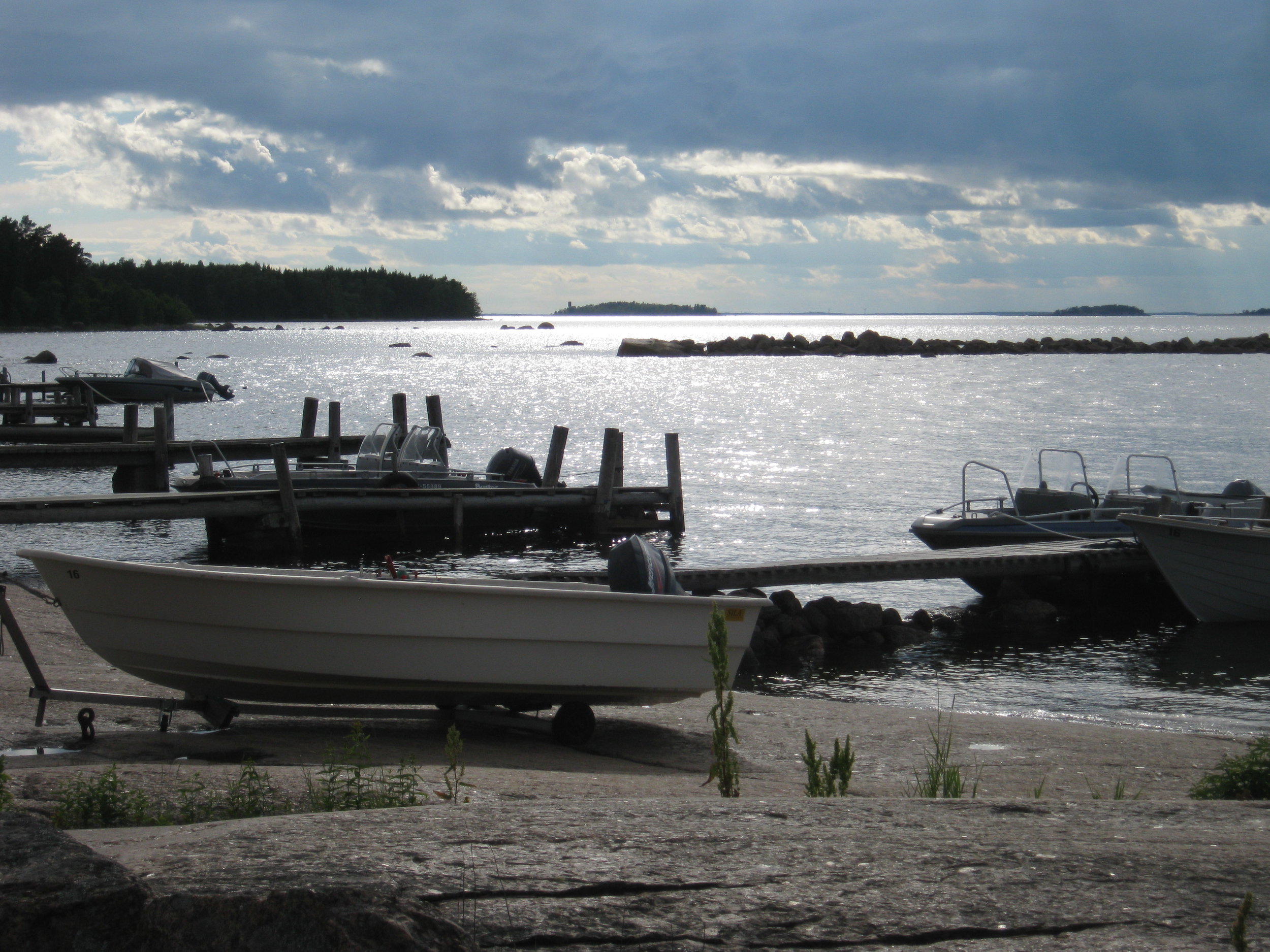
and here’s the photo he worked from for this new review-
Here’s a link to Konstantin's videos on Vimeo. The one I'm talking about today is “Noon Nap”. For almost 40 minutes of instruction, 4$ to rent and 8$ to buy is a pretty good deal, if you're looking around. Additionally, I didn't quite know where to include this in the review, but if you're liking Konstantin's videos and/or approach, he's starting to do workshops in the US. The workshop I mentioned last time, at Madeline Island in Wisconsin is full, but if you're interested enough, you could always get on their wait list. That seems like the only one he's doing so far state-side.
Choosing a Good Subject-
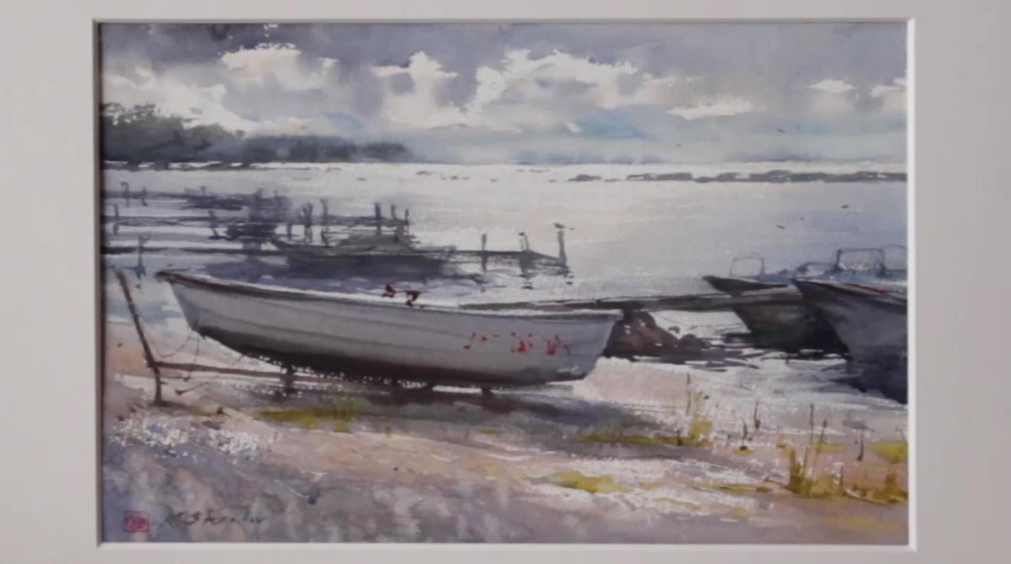
The first thing to notice from the photo is the composition of the subject he’s chosen. There’s a clear foreground (the empty pebble beach), a strong middle-ground subject (the main boat and the little boats beside it), and a clear background (the distant docks and the faraway islands). This makes the image easily readable. The shapes overlap a bit, which is good, but there’s very little negative painting- it’s primarily dark shapes (the boats and docks and islands) against a paler background (the water). Additionally, we’re looking down the light at the subject, which simplifies and combines the shapes. All in all, this is a good choice for a subject logistically- “active” brushstrokes that build positive dark shapes are often easier to paint than building an image from small, complicated, negative shapes we have to cut around.
The Sketch-
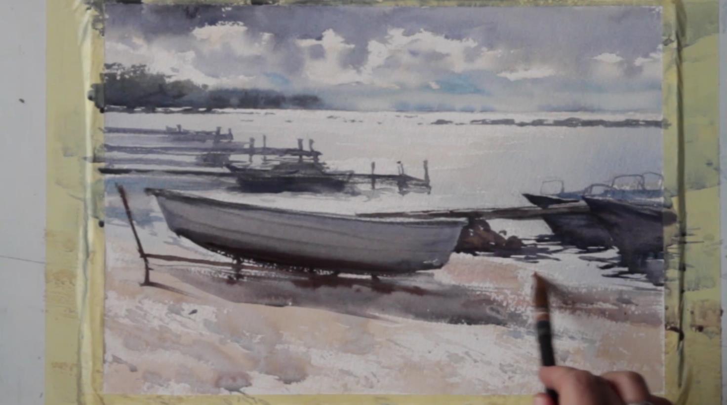
The sketch is pretty similar to the photo. He moves the main boat more in to the image, but otherwise, it’s much like the reference. You can see he spends his time getting his proportions correct, but it’s not too detailed!! He’s not actually doing a sketch. He’s just getting things ready for a painting. We should paint with brushes, not our pencils, right? He’s blocking in his shapes to guide his later strokes, working big to small. So he starts with the horizon and creates the two biggest, simplest shapes of all- heaven and earth, and then shrinks things from there.
How He Alters the Background-
Once he dives in to painting and begins to do the background, the reference photo begins to serve as a more interesting learning tool. One of first things to become clear is that value is more important to him than hue. Note how he reduces the green background of the photo to a simple blue-grey mass? He also begins to bond shapes together by their value- thus the background docks largely become a single tone and are painted in one go, as a single, complex shape. His shapes begin to shift in value too, compared to the photo. He reserves his darkest darks for this focal point and midground, but leaves the more distant docks and boats far paler than the photo renders them. He also definitely makes the background much softer than the photo. On all accounts (hue reduction, value shifts, softer edges), the goal is to push a sense of distance, and make the focal point pop later on. So fidelity to the photo goes by the wayside as the needs of the painting become clearer.
Creating (or Leaving) Nameless Details-
I also wanted to come back to this idea that he’s not painting every little thing. Part way through the demo, he talks about how he adds little details to the background docks, but that they’re really just “the idea of a thing”- a wonderfully poetic concept, that’s also very useful functionally. The goal is to not detail everything out and “fill it all in”. This mentality guides decisions as disparate as leaving a little bit of white under the bottom of the boat, to adding bits to the docks, to inventing some color and writing for the mid-ground boats. All of these are “nameless details” that sometimes aren’t even there in the photo. These are really painted (or left unpainted) for compositional reasons (balance, drawing attention, etc), and have little to do with making the painting look like the photo.
Here's the finished piece of his, compared again to the reference photo-