Workshop Review- Herman Pekel, pt. 2- Tools and Methods

Alright, lets jump right in. I'm going to start this post off with some technical details about Herman's setup.
Palette and Paints-
Of course, it's not much of a surprise that this is what his palette looks like. Haha! Although, note how he keeps one well pretty clean for his bright yellows. This was actually a consistent thing over the course of the workshop.
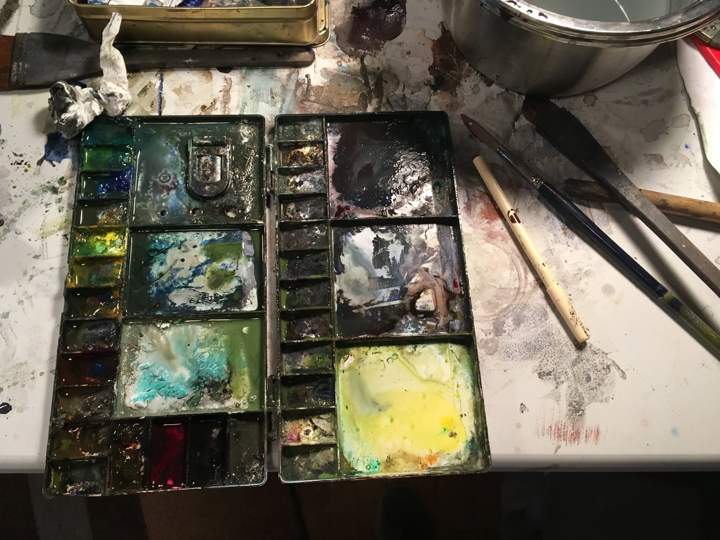
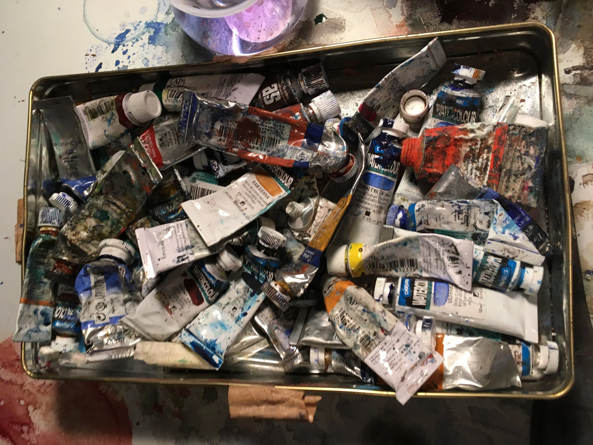
And check out the big tin of paints! In his defense, we were the last workshop before he headed home after something like 5 weeks of teaching. So, not so crazy in that light. :) Many of his paint choices were pretty common (Ultramarine Blue, Burnt Sienna, Cadmium Yellow, Permanent Alizarin Crimson, etc), but he did use Viridian a lot, which I thought intriguing. It has an innate dark value and is mildly opaque, so he mixed it up with other colors to get his dark, chromatic, cool greens. It's a color I've since added back to my palette after having it removed it a few years ago. I've enjoyed it since the workshop.
Brushes-
However, what was really interesting to me was the brushes he used. Basically no mops to found (perhaps they're there, but he just didn't use them much?). He did his washes with a big floppy hake, and then would transition to a variety of very scruffy flats! They ranged in size from perhaps 3/4" wide to 2". There was nothing finicky about them at all- they might have been house paint brushes for all I knew, or brushes for acrylics. What I do know, however, was that they were synthetic, were bristly and full of personality, and that they didn't carry much water when he was applying paints.

Why does this matter? Because Herman really pushed his darks. A lot. He was squeezing out fresh Ultramarine Blue and Burnt Sienna like nobody's business. He told us he even has jars of acrylic Ult. Blue and Burnt Sienna that he uses for large paintings, because they're more cost effective and basically work the same in that kind of "thick darks" application. Herman, by the way, was big on fresh juicy globs of paint. No miserly daubs of cracked paint on the palette! So, when you're trying to push juicy darks that you can scratch and spit into and mess around with, using a synthetic brush, in my experience, helps. It's hard to mix up a buttery consistency with a mop, because it carries so much moisture.
He also used the scruffy, broken nature of the brushes for all sorts of textural effects. One of his mantras was "never commit to a hard edge!" You could see how this was expressed in a subtle way with the sorts of brushes he used. For some of them, you'd have been hard pressed to get a hard edge, if you really wanted one. Beyond these flats, he kept a variety of funky brushes that made interesting marks- long, floppy lettering style brushes, flats, and even stuff like this fan brush below (which he used to amazing effect, flipping it around willy-nilly while painting soft wet-into-wet clouds!). The goal, to me, was to help yourself out by picking tools that helped you make the sort of organic marks you'd be hard pressed to make on purpose with a "normal" brush.

Wetting the Back of the Paper-
I don't have any photos of Herman with his spray bottle, but it was probably as important to his method as his scruffy brushes. How he wets the back of his paper was a real eye-opener. It's actually part of the reason I took his workshop. I'd read about methods like his while studying the work of various artists in the Spotlight series (check out this post on Endre Penovac and scroll to the bottom for a video demo using this method), but I hadn't seen anyone do it in person. So what's he do exactly?
Herman didn't tape anything down. Instead, he would wet the back liberally with water. Like... drenched it with the spray bottle. He'd tilt his board very slightly downhill, stick his paper to his backing with water tension, and paint away. This video of Jean Penderson shows a similar method, although she dunks hers too, which Herman never did. Skip to the 1:00 mark to get a sense of what I'm talking about.
What's really fascinating and useful about this method is many-fold. First, the upper surface of the paper can remain completely dry if you want it to. You can cut all the edges you want and its no big deal. The painting process at this point is exactly the same as normal. The water you put on the back, instead, just seeps into the body of the paper itself. Why is this useful? Because, when you get going with a wash and you want to paint wet into wet, or want to paint a difficult wash with many cut edges, you have for-ever to work. If you want to work a wash for 30 or 40 minutes, there's absolutely no issue. Change your mind about something and want to lift it a bit? No problem, because it stays moist. Want to stretch certain difficult phases so you can get wet into wet effects that are available for only a small length of time? No problem as well. Want to scratch something out that you painted a couple of minutes ago? Same thing. It's an amazing luxury if you like working wet into wet and it opens up doors in terms of subject matter.
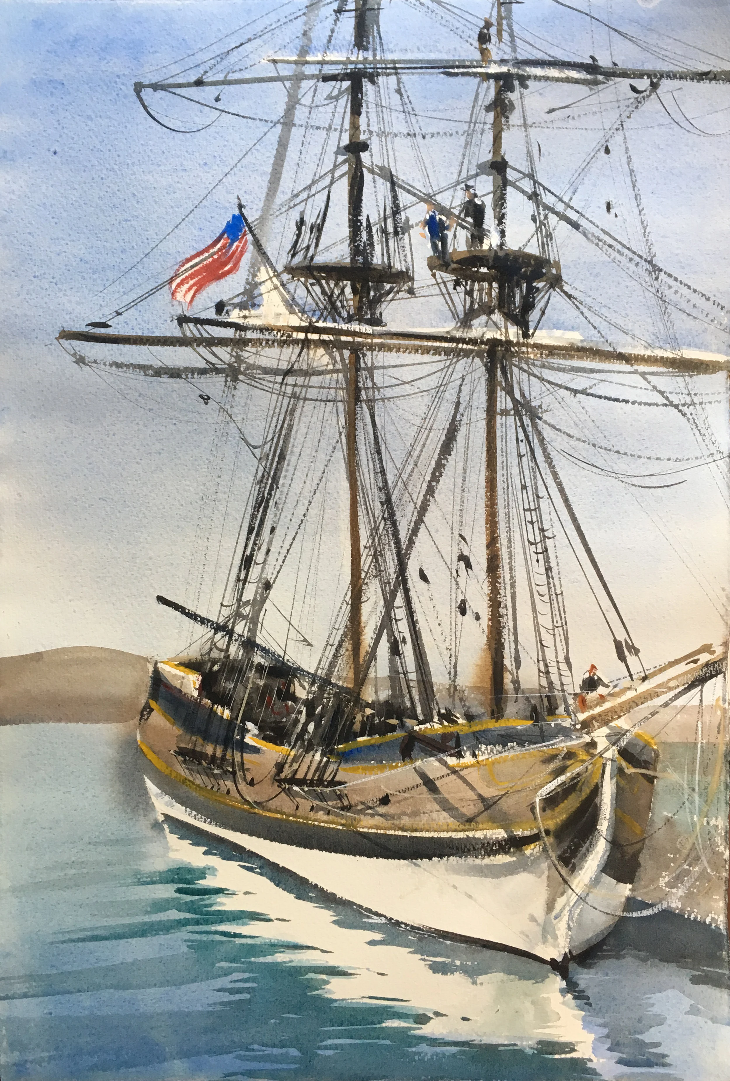
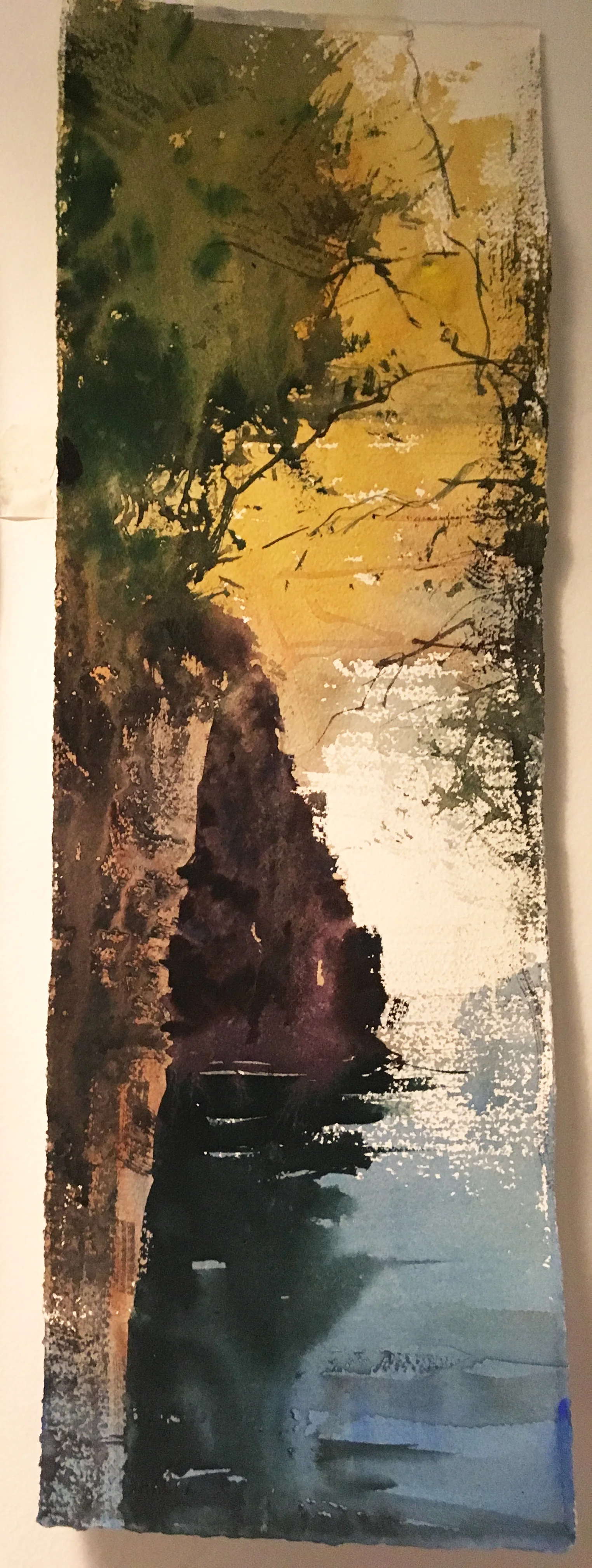
Pardon me, but just to proselytize for a minute like a convert... :P For example, this piece I recently did...
...would have been much more difficult without using this new method, because, after my first wash had dried, I wanted to connect all my darks and cut my edges. That took quite a while, but I never had to worry a jot about my paper drying out. If there's a negative, truthfully, I'd say that if you want to push from one wash into the other while using this method, sometimes the wait for the first wash to dry can be a bit longer. But, for me, the benefits so far outweigh the negatives it's not even a question.
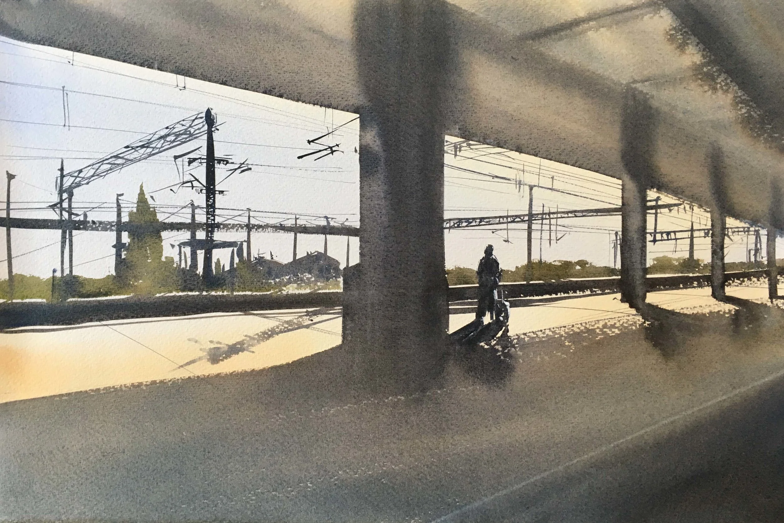
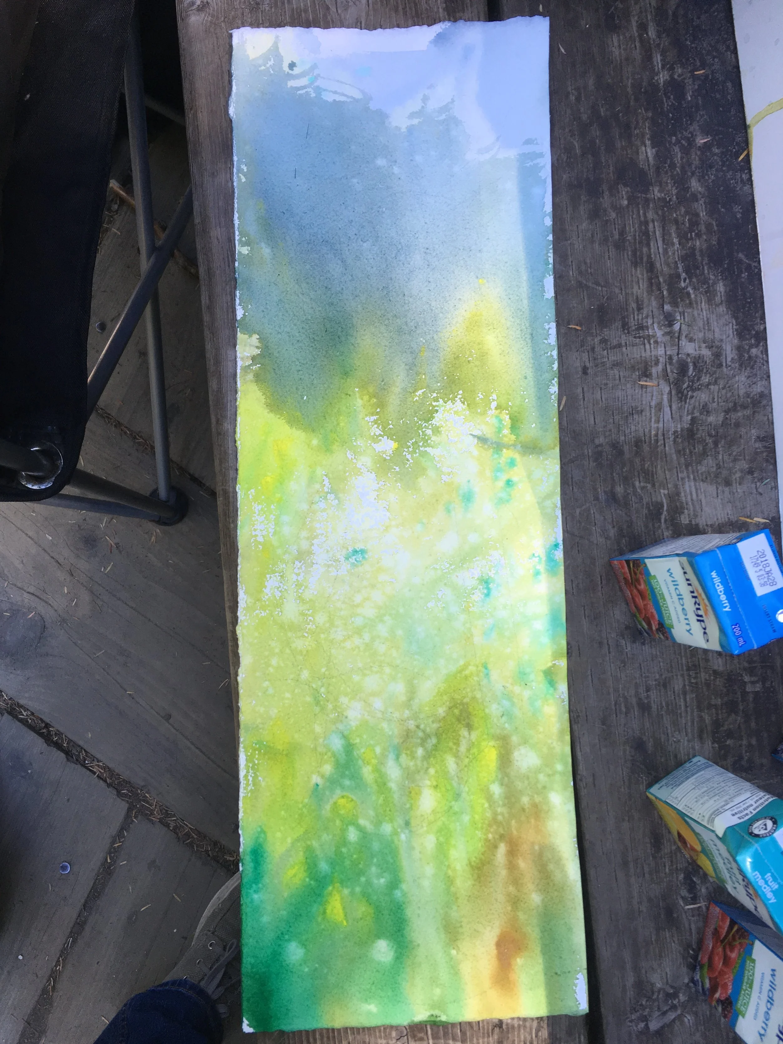
I've been trying out and experimenting with various technical things I learned in the workshop (brushes, paper, paints, etc), but this "wetting the back of your paper" thing is the one technical shift that I've wholeheartedly integrated into my work flow. It's almost the only way I've been painting for the last 3 months. I love it. I've used it for plein air work too. This half sheet piece was done this way, plein air-
The back of the paper will remain moist or cool to the touch, but the front surface dries out fast enough for you to do multiple washes. The paper also really sticks to the backing- you can even turn it upside down. Water tension is impressive! And you can always rewet the back some with the spritzer if the back starts to dry out. Herman used bulldog clips for some of the larger plein air pieces, but I've not really needed to yet.
Anyways, thanks Herman! LOL!
Paper-
As I remember it, Herman's stated paper preference is Saunders Waterford. Rough of CP? I don't know. He said it was partially because it seems to dry flatter when you use the "wet the back" method, whereas other papers such as Arches tended to buckle more. That may be true, but I've not tested it enough to be sure.
2 Demos in Capilano Gorge-
On Day 3, we went out to Capilano Gorge. A short 10 minute drive from downtown North Vancouver. All I can say is "Heaven!" So very very lovely there. Easily my favorite painting day of the 4-day workshop, particularly since I was most interested, personally, in Herman's landscapes and how he approached them.
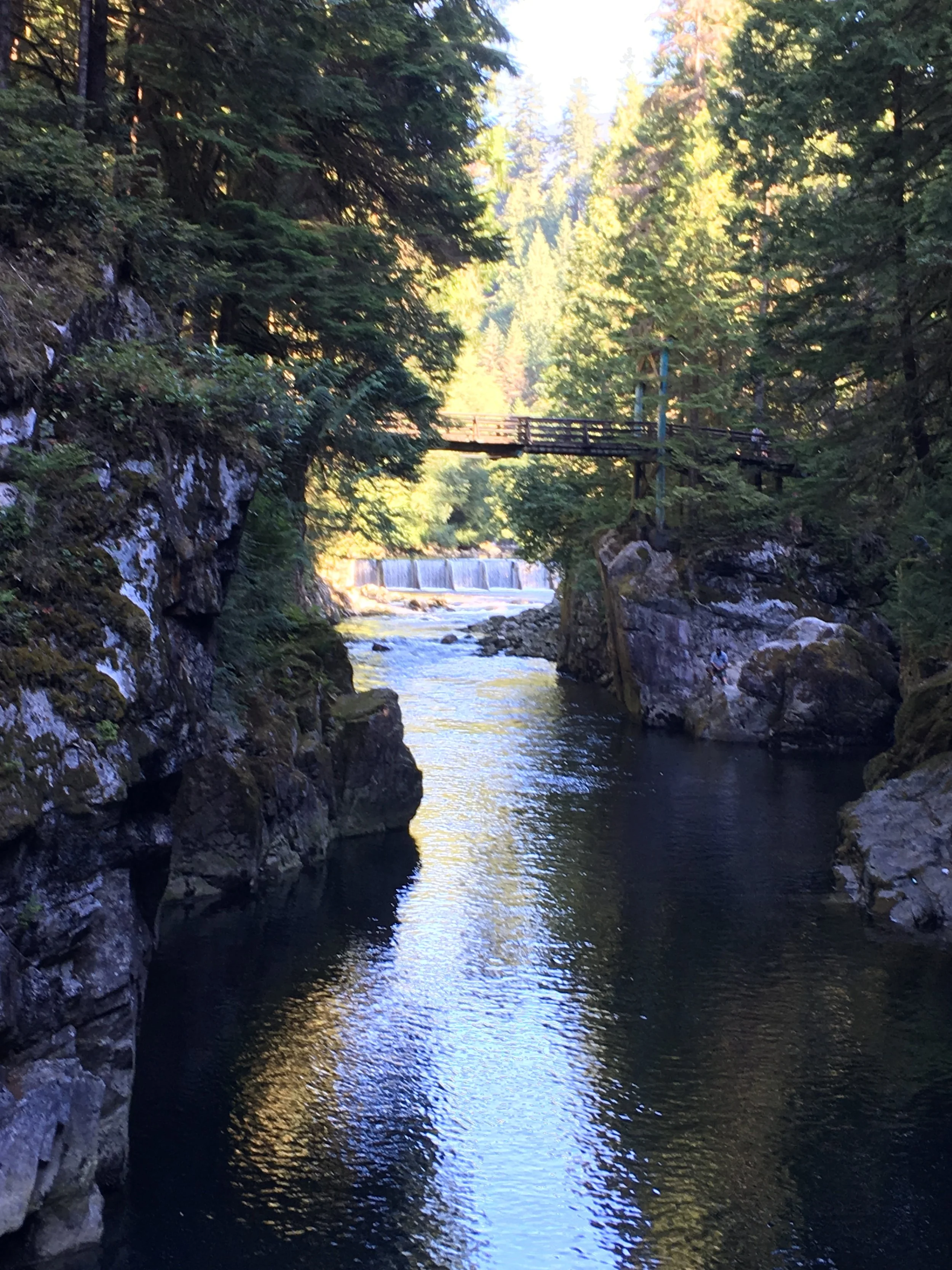
Herman almost seemed overwhelmed by the volume of green there. He made amusing comments about comparing it to the lack of greens in Australia, but the truth is that a good painter explores the subject regardless.

Clearly not afraid to use vibrant color on the first wash! :P
What was interesting about the second layer was that a) he didn't really care about the falls for the hatchery in the background, which he was (as I remember) concerned would not really read correctly at that distance-- “If you’re in doubt about something," he said, "don’t put it in." He had a lot to say about white space over the course of the workshop. Of course, as in the first day, we should start by "looking for an excuse for a patch of white" and build the painting around it. But also, he noted that, when in doubt, we should leave more space, like “presenting food on a plate instead of filling it all in.” It’s the way the negative space relates to the positive space that matters. It’s easy to over use positive space. “Every brushstroke fills in a bit. And you can’t go back.”
“Always leave more white if you can. You can always paint it in later. Watercolor is what you leave out... The moment I get caught up too much in something, I know I’ve lost it. Never get too bogged in detail. Watercolors is more a philosophy than a painting style. Never get too descriptive. Don't lose the philosophy of the painting."
However, it was also interesting to see where he added things on purpose. He seemed quite interested in the framing tool that the greenery on the right provided. It wasn't there in real life, but he spent a bit of time thoughtful connecting the tracery to the trees on the left. It was a clear compositional decision.
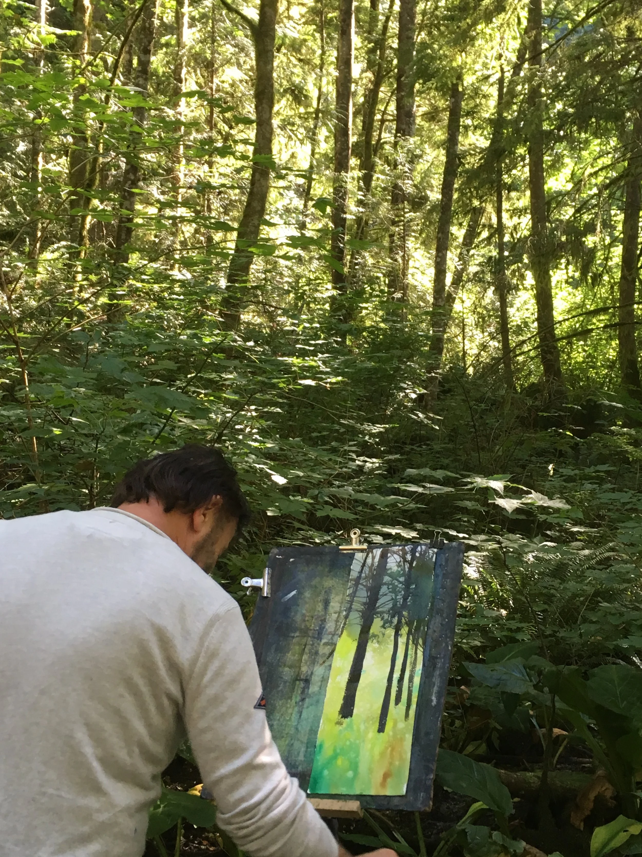
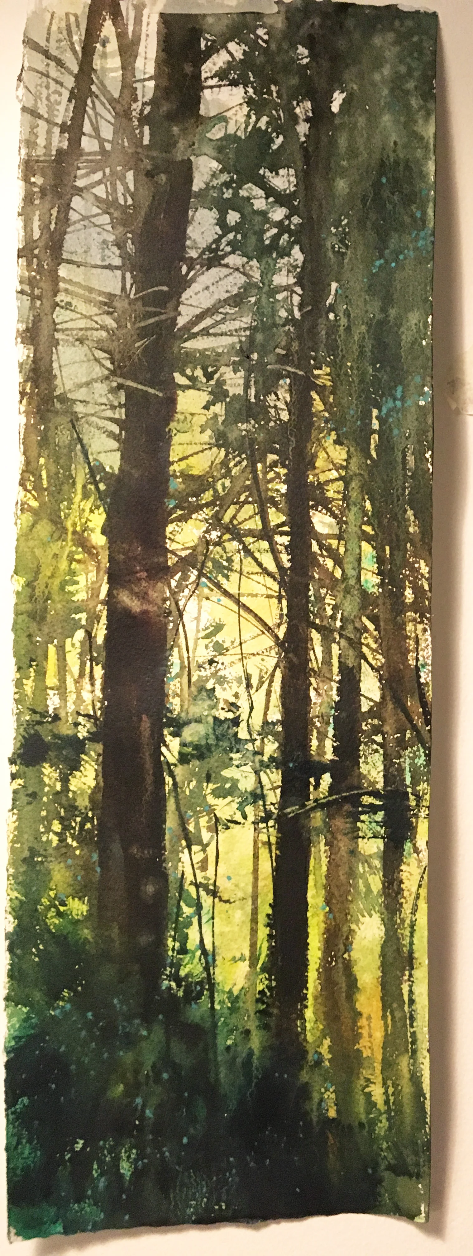
For this second painting, we moved into the woods proper. He did his first wash and let it dry. As usual, it was full of color, light, and spittle. Haha! Honestly, in it's own way, I really like it as it's own experience. It has a wonderful zingy sense of vibrancy. Almost reminds me of Carol Carter. I'm sure those two never thought they'd get mentioned in the watercolor sentence. LOL!
Here's Herman dropping in his first set of darks. It's actually amazing to me that he got a composition out that crazy wild mishmash of verdant forest out there.
...And yet I feel like he really captured the feel of the place.
We did our own set of paintings of the woods. These were surprisingly difficult. I did one and was dissatisfied with it...

so I jumped back in and started a second one, trying to break open the shapes a bit and get some light in the foreground and a bit of midground behind the trunks. This was a difference I noticed in Herman's painting. The truth, however, is it still looked much the same as my first go at the subject, and I couldn't figure out what it was missing. Herman came down the trail and saw what was going on pretty immediately. He took a bunch of Chinese White, mixed it with my limey yellow and went about slashing back and forth across the still-damp foreground, dropping in splatters, etc. Despite the fact that this was not at all the way it looked in reality, it really brought the painting to life. I don't have a photo of the process mid-way, but here are the results-
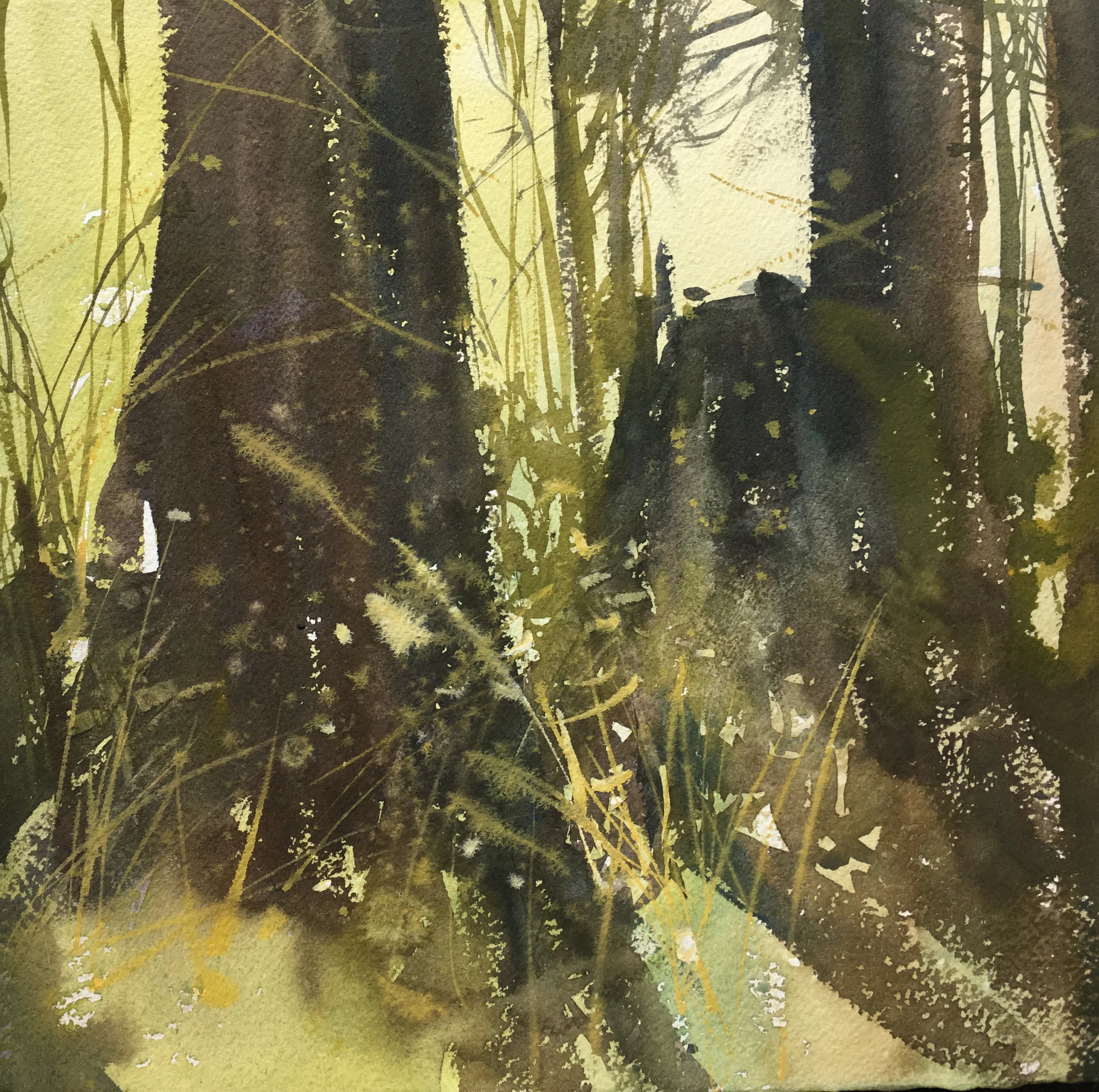
I clearly saw how I was too close to my subject, and as such my dark shapes were too monolithic and unintegrated with the light. If I had chosen a tree a bit farther away, this would have been remedied easily. If you go back to Herman's work at the same location, you can see how he broke up his shapes and created little sideways "funnels and ladders" (to steal a term from JZ's workshop) with scratch marks and splatters-

In the next post I'll be sharing some demos of Herman's from the last day of the workshop, my own work, and a lot of the really really interesting conversation Herman had, where we talked about having your own vision, having "something to say", understanding the philosophy of watercolor, and other wonderful esoteric stuff that really goes beyond technique and is more about what it means to be an artist. Great stuff!