Spotlight on an Artist- Konstantin Kuzema

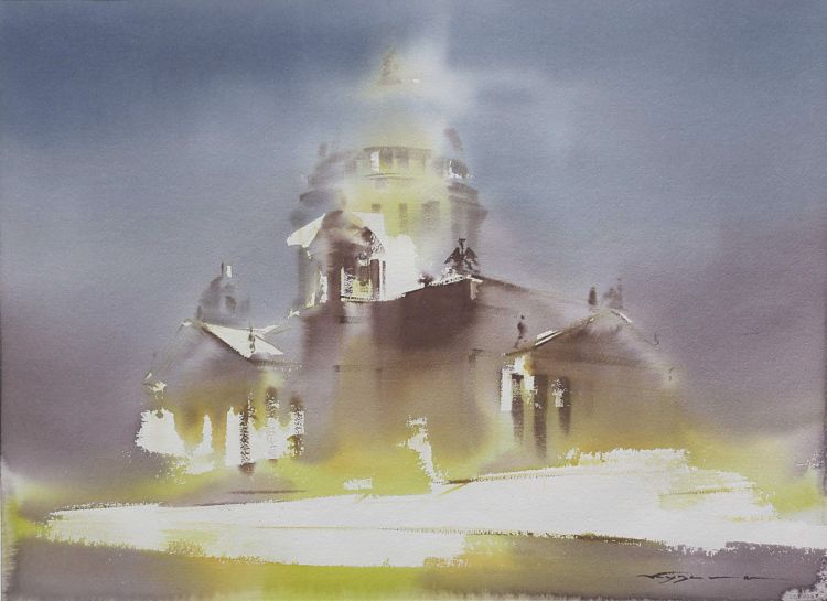


It's been 6 months since I last did a Spotlight, but while working on the last one, I discovered a different artist- Konstantin Kuzema. Konstantin does a variety of cityscapes. I could quibble about his color choices, or the fact that there are never any people in his cities, or the desire I have for some rich darks... all those issues are there, but as I watched his videos, I was instead... simply intrigued by his approach, which was simultaneously sharp and architectural, while also being very wet and loose. His buildings are clearly buildings, and yet they also completely dissolve into the light that wraps around them. As an artist that has had his own troubles making his peace with man-made objects and cityscapes, I found his approach refreshingly unconventional.
Because of his wet into wet approach, and the fact that there's no real follow-up layer of dry on dry for "jewlery", his subjects are radically simplified. Detail is kept only where needed, and yet, where it's desired, it's often very precise. The rest disappears into the washes. It's really about two things, as I see it- expressing light through color, and contrasting hard architectural forms versus soft washes. The rest is discarded. I wouldn't want to paint this way all the time, but it's very daring and interesting. There's lots to learn by watching him work. His paintings are so simplified and yet very detailed in other areas, that it makes me ponder about "what is really needed" to express a scene.
Not surprisingly, given how minimal his compositions are, his color palette is also minimal. It's all about warms versus cools. Yes, he's clearly capturing light with value, but he's also expressing it with hue. He is also aggressively simplifying the subject, reducing everything to 3-4 values, each expressed with a color- white paper, yellow, blue, and sometimes a purple. In some ways, his approach here with color reminds me a lot of Thomas Schaller. Tom's work also deals a great deal with architecture, although not nearly as much with wet into wet. His work also plays a great deal more with really rich darks and drybrush work. It does, however, have a lot to do with simplification, preserving strong areas of white, and simplifying your color palette-- focusing on bold applications of warms and cools to play off of each other. Neither of the artists seem particularly interested in realism. Instead, the goal is to "use" color for effect.


I found two videos of Konstantin, but this first one was the most instructional. In both of them he paints large, on a full sheet (22" x 30"- water likes to wander!), and he uses the white of his paper aggressively. The whole process is done wet into wet. So he's wetting the paper and sticking it to the board without the use of tape. I'm assuming he then waits 10-20 minutes for it to soak in, as I've seen other artists do who use this technique. Then he slowly builds his painting light to dark, wet into wet. Let's take a look at his first video-
The first few minutes are largely preparatory, but of particularly interest is when he shows us the totality of the hues he's going to be using at the 1:00 mark. He has each of them seemingly premixed, in different bowls. Not many at all!! But each one has a purpose that will become clear later. After that, it's the normal conversation about tools and materials. As its all in what I am assuming is Russian, you might want to skip to the 10:00 mark. He then proceeds to do what I can only assume is sketching with his brush. I've not seen this done before. The brush has a very fine point and he dips it in the yellow. He then uses that very cool "floating ruler" (I just made that name up) that I've basically only see Russian and Ukrainian watercolor painters use. Where do they come from? Are they re-purposed from old drafting tables?!? I don't know. But he uses it alot, and they're cool. Might have to figure out how to get one or make one... LOL! My presumption is he is laying down perspective lines, blocking out where he's going to preserve his whites, and generally guiding himself for later, but that he doesn't want pencil marks. From there, he begins to lay in his clean water with a flat brush at 15:00.
A note on this, for those who don't remember from the older videos that featured a similar technique. It's important, because its the logistical bones that everything else in his painting technique is predicated on. Because the paper has been pre-wet and then let to partially dry out a bit (until damp), when he goes back in with the brush the water doesn't spread everywhere. Instead, surface tension works again and he can preserve his whites.. His very loose washes can go wherever they want, but they'll never cross over into his "dry" areas. Additionally, the paper stays wet for a long time, because the "sponge" of the paper's mass has already been saturated. The new application of water has nowhere else to go, and so it stays on top longer. He lays his board flat, so the water doesn't wash down (the way Joseph Zbukvic might do), and again, it helps keep things moist for longer.
It's only at the 20:00 mark that he begins to apply color. It's all yellow at first, very pale. He drops in a muted blue at 22:00. It's all very boxy and looks a mess for quite a while. The colors merge, but the blue isn't dark enough to mask the edges of the earlier yellow shapes he laid in. Not to worry though! At 25:00 he starts to lay in his darker blue, and forms begin to emerge. It's dark enough to mask the yellow where he doesn't want you to see it, and let it glow and shine where he does. He spends the next 8 minutes using the ruler to lay in details and perspective lines. As he lays in these darker blues, and in particular the bold straight lines that come from the ruler, the areas where he preserved his whites begins to become very clear.
At first, I quite liked it like this, but as is almost always the case with watercolors, things begin to lighten up as they dry, and the requisite sense of contrast fades. This is where he gets more daring. Around 33:00, he judiciously brings in the last hue- a darker, muted purple- and builds up the values in his foreground. This helps his shadows pop. Then at 37:00, he drops water in to make a halo and pull out some whites for 2 extra lamps. Quite daring! I'm sure I'd screw it up. From there, it's a few more details and he's done.
The technique is quite interesting, and definitely makes me think about how I'd like to approach cityscapes. I don't need them all to be atmospheric, foggy scenes, but there's a release from the need for detail in his work that's invigorating. Much like his use of color for effect rather than representation, his use of details and wet into wet also focuses more on effect and less on replicating a scene. It's about choosing what you'd like to include, and letting the rest go.
If you like his work, and would like to see him play a little bit more with a different landscape/ river scene, you should watch the following video too-