Using Color Space, pt. 2- Rods and Cones

Monet's "Impression Sunrise"
I wanted to come back to talking about color and Color Space by talking about rods and cones, and sharing some really interesting Monet paintings that take advantage of the way we see. Louise Victor brought some of this up at the 1-day class I took last month, and I've followed up with some additional research to share with y'all. There's a book out there that I'm hoping to read, called "Art and Vision- The Biology of Seeing", and there's also an interesting article I read about the book, and the subject in general.
So, we've all got rods and cones in our eyes. For those who don't remember the details (like myself), rods help us see black and white, and cones help us see color. Interestingly, each type of vision is linked to different parts of the brain that are "as anatomically distinct as vision is from hearing." So rods and cones do really different things cognitively, as well as visually. The more ancient rods (black and white) show us "where" things are- depth, spatial elements, motion, etc. The more recently developed cones (color) are the "what" system- they helps us identify faces and recognize objects.
As artists, why should we care? Because sometimes we can create fascinating types of dissonance that help a viewer really experience color in a new way. Like I spoke about in the last post, colors have values- some pure hues are darker than others. Your rods know this, even if we don't. ;P

What's also interesting to ponder is that different hues can also have the same value. If we draw a level line across color space, we can see how a pure orange, for example, has the same value as a paler, muted blue. What happens when you combine different hues of similar value? Let see...
Monet has two well known examples of this. The first is his "Impression Sunrise." Some people feel like there's almost a faint vibrating sense of movement to it. Why? Because Monet is screwing with our typical methods of perception. If we put the color version next to a desaturated version of it, interesting things are revealed. Where'd the sun go?


Instead of having our two methods of seeing (color and black and white) reinforce each other, they disagree. In terms of what our rods see, the sun is almost not there. And yet, of course, in terms of color the orange sun is very much there- it's very chromatic and surrounded by complimentary, muted blues that accent it even more. This dissonance can lead to a "vibrating" visual experience, where the mind doesn't quite know where to place the sun. At the very least, it's visually evocative.
This same tool is used when we come to Monet's "Poppy Fields", which many people say is used to create a gentle sense of movement and "vibrancy" in the image. If you visit this site, they have a slider that lets you desaturate and resaturate the image. Watch how the red poppies against the green field slowly blend into the grass, as the image is desaturated.
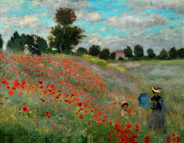
Much like the previous painting, Monet combines compliments and plays with saturation- the red, chromatic poppies really shine against the complimentary muted greens, which makes it all the more startling how they almost disappear in the black and white version.
The goal, as I see it, isn't to necessarily dupliate this effect (although... it sounds fun!), but rather to become more aware of how color works, and how we can use it in our own paintings. If nothing else, I would look at how he's using his muted compliments to make a very chromatic color sing, as well as how he is very subtly modulating the chroma and value of the red flowers, to get them to recede into the distance. In the distance, the two hues almost merge in terms of value- a common expression of atmospheric perspective. In the foreground, Monet's ability to mix a muted green or blue hue that has the same value as an almost pure hue demonstrates a pretty amazing control of value!!