A Reading Guide to Dow's "Composition", pt. 5- Notan in the Field

This is the last post in the series on Notan. I wanted to start with this video of Albala’s. It’s a great introduction to applied notan, and the nuts and bolts of “arranging contrast-patterns” (whatever the contrast might be, whether color, value, texture, etc).
Around the 4:00 mark, Alabala begins to pick apart a notan of an image. I really love this section, where he shows two notans of the same painting, the first based on what are globally the lightest lights and the darkest darks (the one that doesn’t work), and the second based on localized value and color contrast (the successful notan). Part of what makes Notan so interesting as a mental tool is that it’s not objective, but rather is flexible and reflective of the viewer-- you can take the same subject and make different notans from it, depending on how you apply mid-values.
What Tools Does Notan Give Us?
The last two posts have focused a lot on master studies, but in this post I’ll focus a little on how to apply that knowledge to real world images-- the raw data, so to speak, before a master has simplified and arranged things for us. Having said that, the notan master studies help us practice two skills that are very useful—
1) Learning how the mid-values can be shifted to the dark or the light, and
2) Integrating patterns to create that ever-elusive “beauty of intermingling dark and light shapes”
Those two kernels will guide us as we move forward into our own studies. We can get pretty far if we keep them in mind. But notan can also help with another skill set, which we’ll also be exploring here as well-
3) Understanding and fixing logistical value-issues through creating a notan
I’ll show you what I mean in the studies below.
Shifting Middle Values In Different Notans-
This is an exercise that can really help you explore a subject. Below is a black and white version with 4 values assigned to it, and a notan based on it with values 3 and 4 being the darks. I’ve added in the person who was passing through after the photo was taken.


Not bad, all in all. Are we done? It depends. If we shift the middle values around, moving our big shapes, we can explore things…
Below are four little notans. Each is about the size of a business card, so the shapes are very simplified. Sometimes, when I look at the subject I’ll squint or close one eye and let the other go blurry on purpose, just to see the bigger shapes better, and to stop focusing on detail so much. If I’m looking at a photo, I’ll actually shrink the image as much as possible (sometimes to something about as small as a stamp), which also helps me see the big shapes.
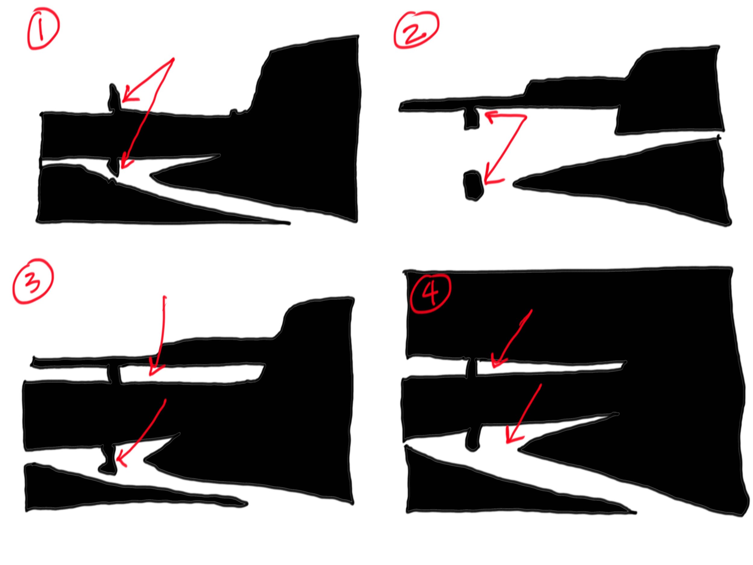

Each notan creates a different contrast pattern, which helps us focus on slightly different things. I’ve noted them with the red arrow. When I made little follow-up watercolor sketches, I separated out the values again, but you can see how I’ve tried to gently nudge the values one way or the other, to express the basic value-shapes that specific notan was expressing. Each version says something a little different, has a different mood, focuses our eye in a different way, but they’re all largely the same subject.
Different Orientations Affect the Intermingling of Shapes-
In these two follow ups, I explore different compositions as I alter the orientation of the image. Altering the orientation affects things in a variety of ways. Most importantly, the focal point often shifts, which requires some sort of change in the value patterns as well. This is one of the things that a notan can help us see really well.
In this pic of a suburban street after rain, the focal point shifts from somewhere in the sunlit midground, where the house is in the horizontal piece, to somewhere in the puddles and reflections themselves in the vertical piece. Each orientation requires us to push and open up contrast in a particular area. As we develop that area, deficiencies can become clear, and this is where the notan will help us decide how to nudge the middle values around.


In the horizontal photo above, you can see that the house is blown out and needs more dynamic values to read properly. In the vertical piece below, the limited values of the house are unimportant and left pale, and instead the reflections and seam of the path defining the tree trunks become more important. The process of making each notan points out to us the strengths of each composition, and what we might need to change to improve upon it specifically.


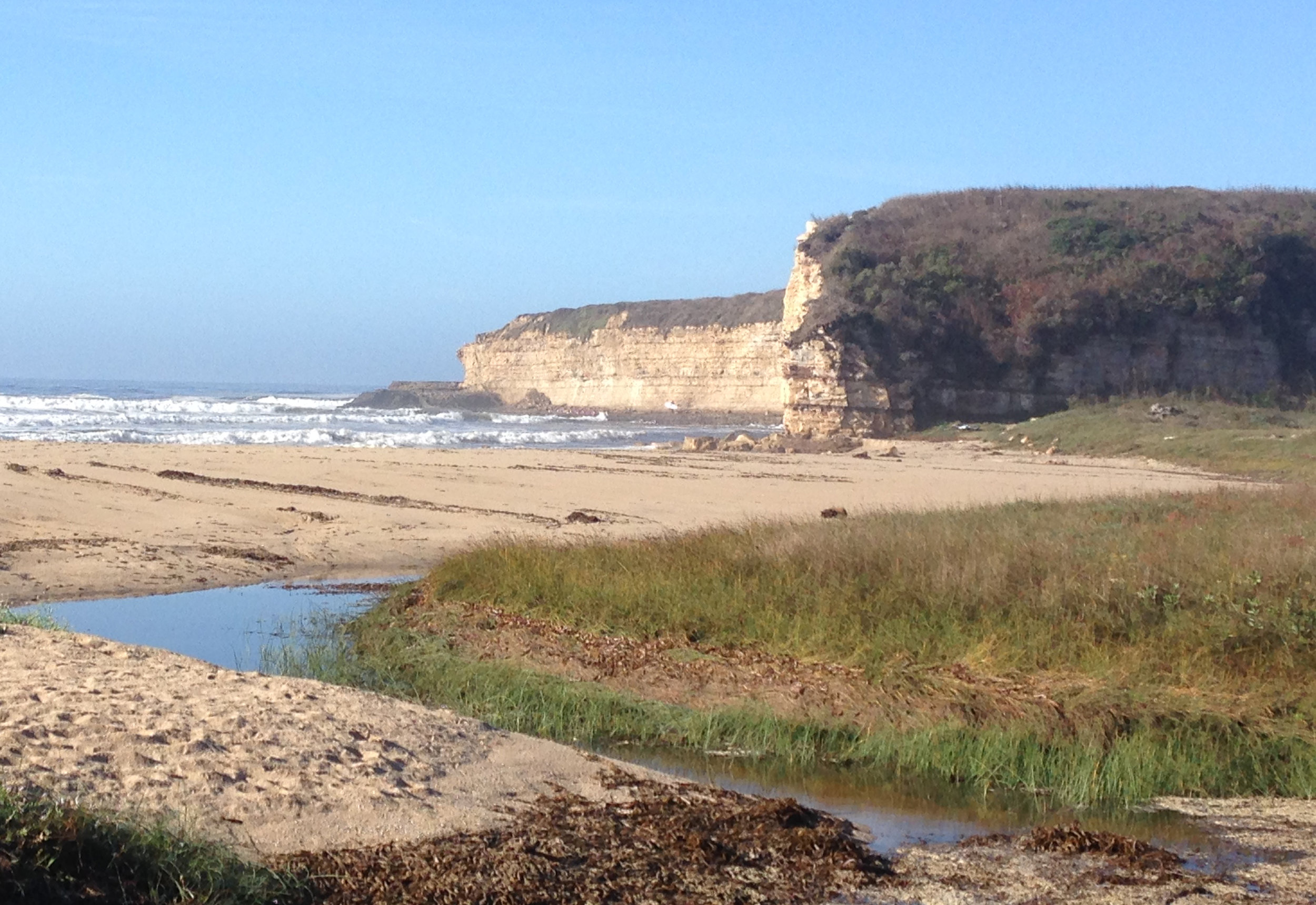
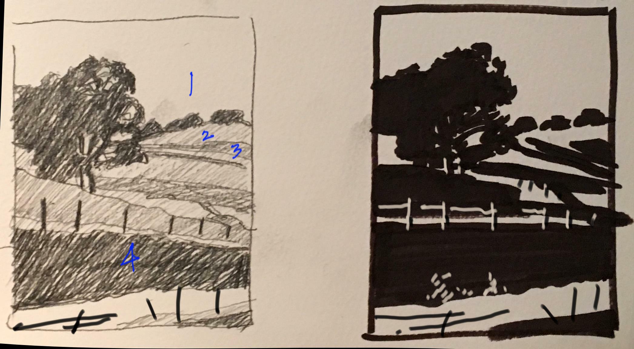
In the photo below, I explore two orientations again. In the horizontal, the goal is to let the long, sinuous shadows guide you to the tree, so I focus more on those, pushing and stretching the contrast between relatively similar faraway values, while letting the foreground remain uncomplicated.


In the vertical version, those long shadows are cropped from the picture plane, and the foreground and fence on the embankment become much more important. Here a problem is introduced. There’s simply not enough to really grab ahold of visually. I decide to 1) introduce contrast for the fence to make it more dominant and 2) to magic some interest and contrast out of the foreground, which is pretty uniformly bright. I get a result like this-

Notan Is a Logistical Assessment Tool-

9 paintable subjects. I refer to them by number, with #1 at the top left, #3 at the top right, #7 at the bottom left, and #9 at the bottom right
Here we have a collection of 9 color photos. Some are nicer than others, but they all seem paintable to me. However, photos are sneaky. They often have emotional content, or are a record of a memory, a trip, a place. And we imbue these images with that emotion. They sometimes have compelling color content as well. All of these elements are important, because they’re often why we want to paint something, but, in the voice of Yoda… “None of these things a good composition make!”
We’ll be going through some of them specifically, but I first wanted to give you a broader set to explore. What we’ll see as we go through the photos is that having a computer-generated notan is fine in some respects, but lacks the decision making required by the artist to make a notan achieve its full potential.
Below, we have the grid converted into a 4-value black and white set (on the left), and a 2-value Notan on the right. Most of the 4-value set still reads. The simplification just makes seeing the bigger shapes easier. But for some of the 2-value photos, the difference is stark and problematic. Some still read because of sneaky computer stippling that creates the feeling of a 3rd value (photo #1, 3, 7, 9). Some issues are very severe and obvious (#2 and 7 are the worst), and some are more subtle but just as problematic (#1, 3, 6, and 9, for example). It is at this point that we must begin to change things, and insert ourselves more thoroughly into the art-making process.

4-value grid

2-value Photoshop grid
Below are the notans I made for each. Each handmade notan looks to solve certain issues clearly visible in the 2-value computer generated versions. Common issues to assess include- dark reflections in already dark water (that then get lost) (#1, 4, 6), a blown out sky that makes the ground plane seem too dark (#2, 5), and dark midground objects that can’t separate from a dark background (# 8, 9). Sometimes I change certain things, the shape of trees or forms, to better “intermingle” the darks and lights, and let the eye travel through the subject (#7, 8). Sometimes the notan just makes it clear that certain subjects will be difficult to paint well (#6).

notan grid
Let’s take a look at a few of them up close.
Photo #2-
Obviously the 2-value computer generated notan doesn’t equate to the color photo. The handmade notan respects the gentle, localized shifts in value that makes the subject appealing and assigns importance to certain elements. This is very similar to notan #5.


Photo #4-
Here the computer generated notan is adequate in many ways, but two things fall away- the reflections in the water, and the sense of the distant mountains. I’ve provided two notans. Both open up the reflections on water, but one lets the mountains recede, while the other makes the mountain range a very important part of the composition. Is one better than the other? I don’t know, but they’re most definitely not the same. You’ll find similar reflection issues being solved in Notan #1.


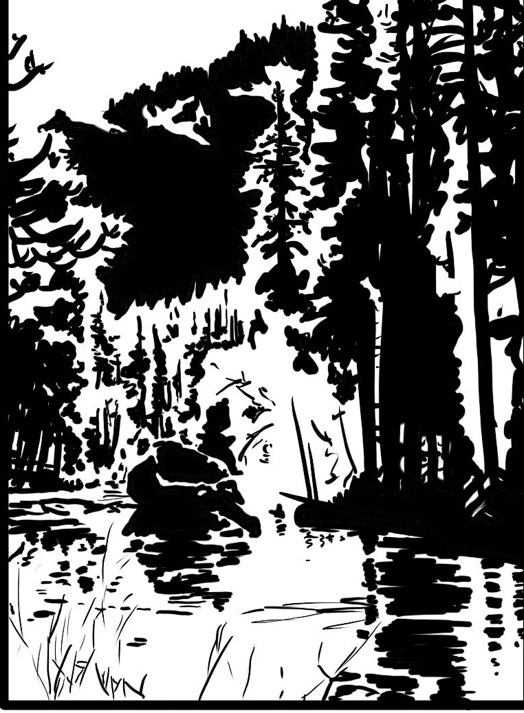
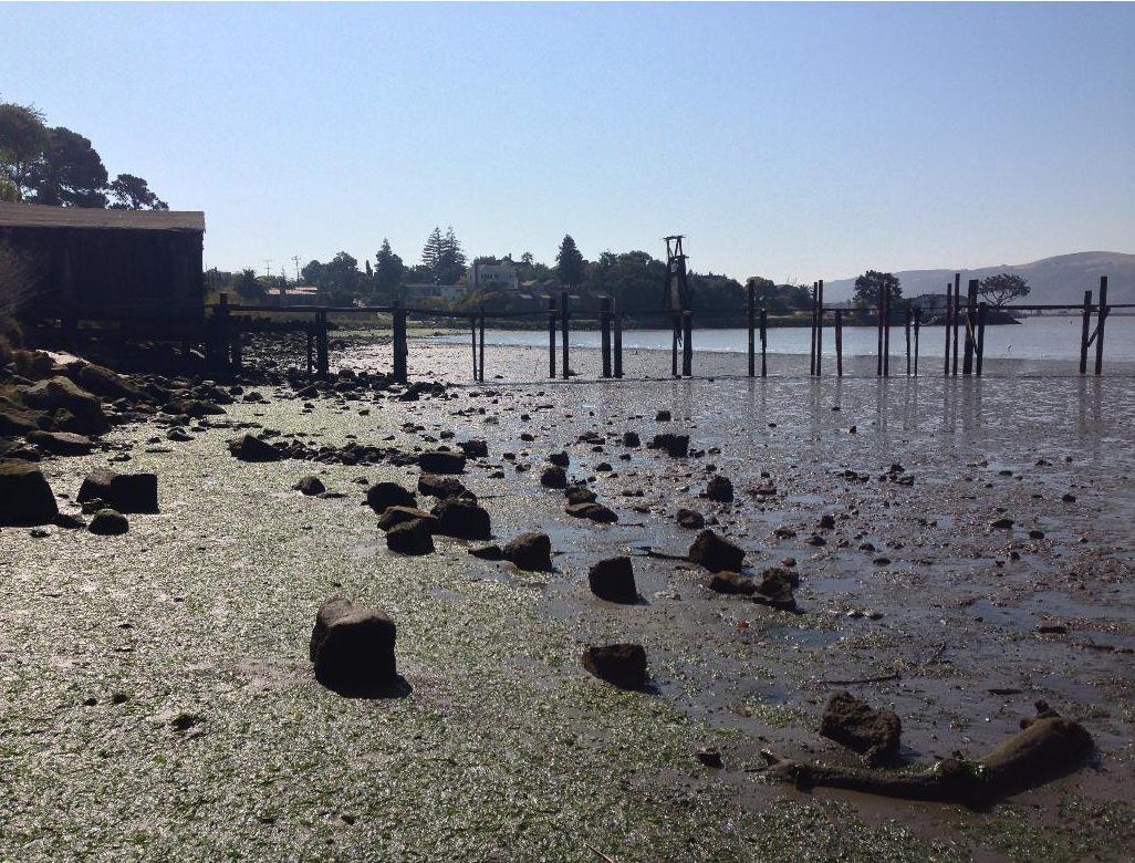
Photo #9-
Here the notan I’ve made fixes a number of problems in the photoshop version. Most notable is that a) the shed structure now has a roof, and b) that the foreground mudflats feel bright again, the way they do in the color photo. What is much more subtle, however, is that the dock was disappearing into the background, because they’re both dark values. This is actually a problem with the original photo too. What begins is a process of capturing some sort of directional light on the surface of the dock and pylons, as well as some judicious editing. These sorts of things are what makes making a notan a really stellar logistical tool. You’ll see similar sorts of dark against dark issues being solved in Notan #8, with the trees.


And that’s it for now.
I hope the posts provides folks with enough input to get them reading Dow’s book, learning from master studies, and with making their own notans. I was in NY last week, at the Met and the MOMA, and a huge part of how I was viewing work was as notans, whether with the delicately interlocking shapes of Vermeer, the dark and moody shapes of Rembrandt, the color-based shapes of Monet, or the scattered, woodblock-like shapes of Van Gogh. Even when I’m painting my own figure studies, I’m still thinking of Notan then too. It can be a very useful artistic tool, and affect how you see the world. It can be fun, honestly…
Happy intricate viewing! :)