Navigating Color Space- Arriving at the Color You Want
I was introduced to these videos last week and wanted to share them here. They're about "Navigating Color Space". They're designed for oil painters, but much still applies to watercolorists. This is something I tried to touch on back in the Spring, with the posts I did, such as "Color Mixing- Navigating the Color Wheel". In that post, I spoke about moving around the color wheel, connecting two or three colors to arrive at a desired hue. The series of videos below discusses many of the same elements, but also touches on moving through "Color Space". They call it Gamblin Color Space, but that's just marketing. Its the Munsell Color System.
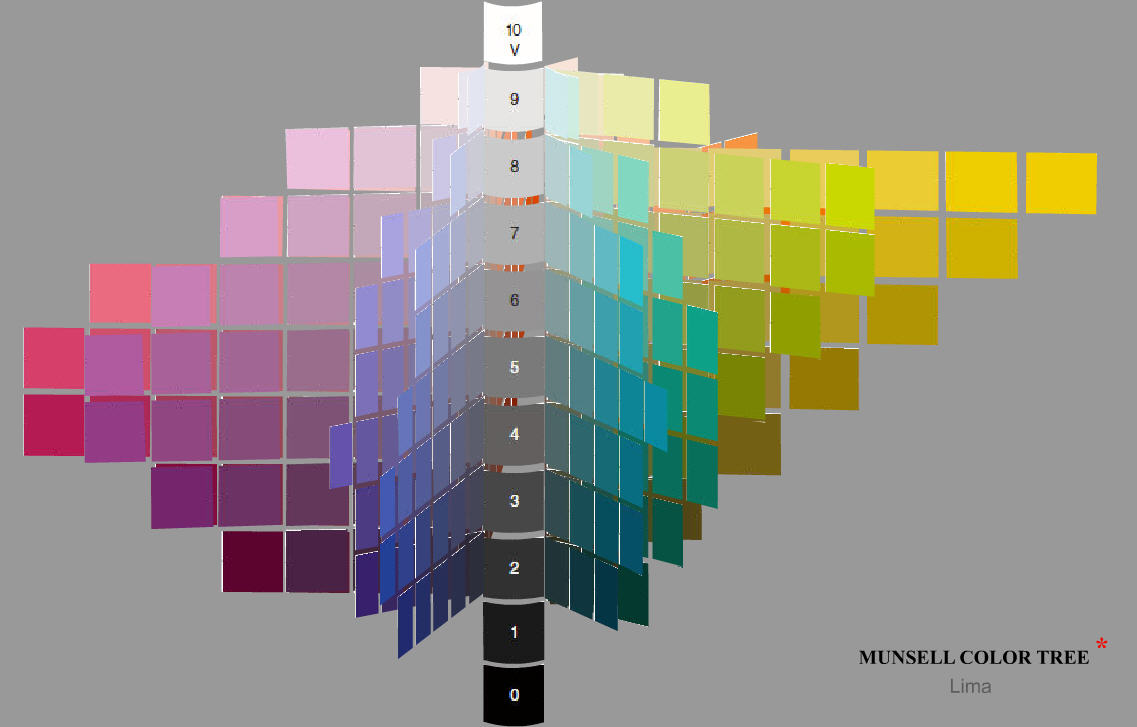
All color systems are just ways of thinking about and organizing the concept of color. It's a lot to think about! Systems help us organize our thoughts so we can better manipulate and use color. The Munsell system is no different. The basic idea it rests on, as I see it, is that the 3 core elements of color (hue, chroma, and value) can best be described by a 3-dimensional space (like a box) instead of a 2-dimensional space (like a piece of paper). If we take the normal ol' color wheel and look at it, we can only see 2 elements of color- for example, hue (the color name) and perhaps chroma/ intensity (how grey or how pure the color is). What you can't show is value- whether the color is pale or very dark. This is where the Munsell system comes into play. It takes the color wheel, and like an accordion or a Chinese lantern, it "opens up" color space in both directions.
Of course, the next question is "Why should we care?" ;PWe'll get to that too.
Are color systems an academic approach to the ineffable nuances and relationships of color? Yes. Does it involve labeling and organizing? Yes. Does it involve squishing your brain in ways it probably normally doesn't work? Most likely, unless you're one of those spatial people (like me) who are really good at packing the trunk of your car, and using every last inch! But given all that, what it can do is allow you to understand how colors relate to each other. It can break a color down into a selection of attributes (what hue is it? how pure is the color? what value is the color?), so you can figure out how to mix it and how to use it.
Lets take a look.
Video 1-
In this video, we get a sort of history lesson. Robert Gamblin talks about Classical, Impressionist and Modern painters, and the different palettes they used. His arbitrary labels are a tool for understanding different areas of color space (and how they were applied) by using specific examples from different eras.
In his example, he connects Value to Classical painters. Renaissance painters did not have very pure, chromatic pigments available to them. Their muted colors are located in the middle of the color wheel. Because of this, their paintings are dominated by the use of value- because they don't get to use a greater variety of clean hues, they have to move up or down in color space get the most out of value. It's like climbing a ladder with white at the top and black at the bottom. If we were looking at a typical 2-dimensinoal color wheel, this would be difficult to explain. We could show that their colors were muted chromatically (more grey, not so pure), but we wouldn't be able to show how important value was a tool.
In the second example, he connects Hue to Impressionist painters. A much wider variety of hues were available to them. They could explore color more, and not be so entirely dependent on value alone. Hue relationships become (perhaps) as important as value relationships.
His third example connects Chroma or Intensity to Modern painters. This era provided painters with new pigments that were very intense, very pure chromatically. But that's in the next video....
Video 2-
Robert starts this video talking about what he calls Modern painters and the hyper chromatic/ pure/ intense colors they used. In truth, part of this section doesn't apply much to watercolorists. He talks about mass tone (what an pigment looks like "in bulk"- squished right out of the tube), which is not a technique many watercolorists use. Of course, that doesn't mean we can't! Anyone who has seen Alvaro Castagnet dip his brush right into his red tube for tail lights has seen mass tone in use. He gets a much more vibrant, opaque color when the pigment used this way. Gamblin also talks about how to mute hues by mixing in greys and whites. Of course,
However, part way through he moves into some particularly interesting stuff. He starts by showing us the results of mixing 2 hues together, as they pass through the middle of the color wheel. First, it's Alizarin Crimson and Viridian, and then Alizarin Crimson and Lemon Yellow. This is an exceptionally instructive section. When we mix pigments together, the resulting mixes shift around in surprising ways. When we get our intermediary result, we need to assess its main attributes (hue, value, and chroma) and figure out how we want to nudge the mix one way or another. Of course, Gamblin mixes in a way that are different, since its oils. He's mixing greys and whites in. For us, it's different- we add water to lighten value, and we get our darks by mixing thicker compliments or glazing. But those things are really just the details- how we think about color space is the same. How we have to navigate through it is the same.
When I'm a little lost in the middle of my mixing and am swinging around the color wheel, never arriving at where I want to be (and that definitely happens), or just before I begin mixing, I often stop and visualize the color I want to arrive at in color space. Is it more green or more blue? More yellow or more purple? How muted is the color? Is it a pale muted green? or a darker grey muted green? As I find its place, I can begin to see how I'll mix it. First I get the hue I want (on its own, or by mixing two hues), then I get the intensity/ chroma I want (use a compliment to grey it out), then I assess its value (should I add water to get it paler, or use a synthetic with less water to mix up a thicker, darker mix?). From there, I go into the mixing.
At this point, it's worth saying what a great job he does in the video when gets down to mixing. Watching the string of beautiful greys he gets when he mixes Alizarin and Viridian is great. Same for all those muted oranges he gets when he mixes Alizarin and Cad Yellow. Understanding those mixing paths by exploring them ahead of time will let you anticipate the hues you'll get when you mix them- this will let you get to that hue you want more easily.
Video 3-
In this video, he demonstrates the idea of laying out your pigments according to where they land on the color wheel. Of course, many watercolorists aren't laying their paintings out in blobs the way he does with the oils, but the idea is sound. If you don't know where your colors fall on the color wheel, it is incredibly difficult to anticipate how they will mixing with each. This is super important for easily, repeatable color mixing!!! That's why the Artists Color Wheel is such a useful tool.
Then he shows us the idea of "unzipping the color wheel" to lay out your paints in your palette in a straight line, to keep the relationships always clear. This is almost exactly the way I lay out my paints as well- yellows to orange to reds, to blues to greens. Does it really matter how you lay out your paints? No. There's more than one way to skin a cat. But the value of this method is that it helps you organize the relationship of your paints to where they fall on the color wheel. It helps make quick mixing easier. It also keeps your darks away from your yellows, which is helpful! :P
As he says in the videos when he's wrapping up- the real goal is to do the color mixing in your mind, because that's where color space really resides. A little hokey, but actually very true. The goal of understanding and exploring color space is to allow yourself to more easily mix your hues, because you can break a color due into bite-sized pieces and use them to "navigate" the 3 dimensional space in your mind.