Kauai Clouds and Sea, pt. 2

I've been busy painting every most day the last week, and thought I'd share more of the paintings. The first few ones were done indoors on 1/2 sheets. Trying to get a handle on different types of clouds and how to approach ocean water. It's very interesting to look at the water and sky, and think about value patterns, patterns of color and vibrancy, how waves break, how to simplify things down to the essentials, etc. I want to do some closeups of waves and sea foam, but I think I'll need some time to really sit down and just have a few days of exploring techniques and experimenting again, if I really want to get a handle on that.
These next few were "first goes"- I'd like to try them again. I almost always have new ideas and approaches after I've tried a composition for the first time.
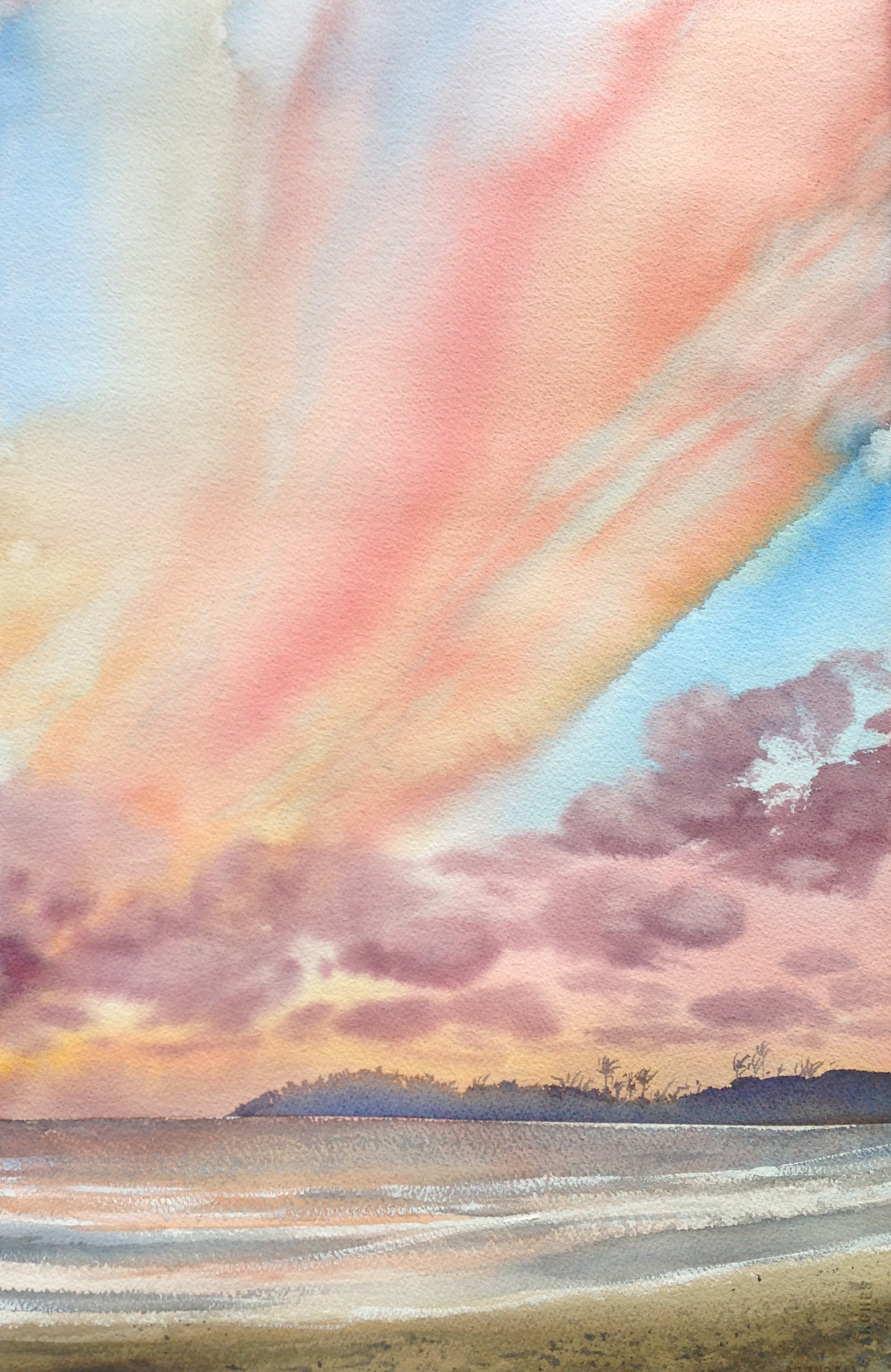
This had lots of pouring for the sky, with a piece of masking tape across the horizon. It's essentially two paintings.
the clouds in this one were particularly difficult, because orange and blue are compliments. they don't like to play with each other. I'm also using white for the glare- it seems like the only way to functionally let the washes play freely, and then carve out the whitecaps.
The sky is very important to representing the sea correctly- when it's cloudy in the morning, the sea is gray and monochromatic, and when the sky opens up and is blue, the sea has much more color. Things also move from a deeper blue in the distance, to a teal in the midground, to a yellowy green in the shallows to even a bit of sandy browns. Once we approach the shore, bluffs and whatnot also reflect in the water. The location of the sun also matters alot in terms of water color! Of course, there's glare on the water when looking down the light, but water is also far less chromatic where the glare is- something I hadn't expected, but makes a lot of sense!
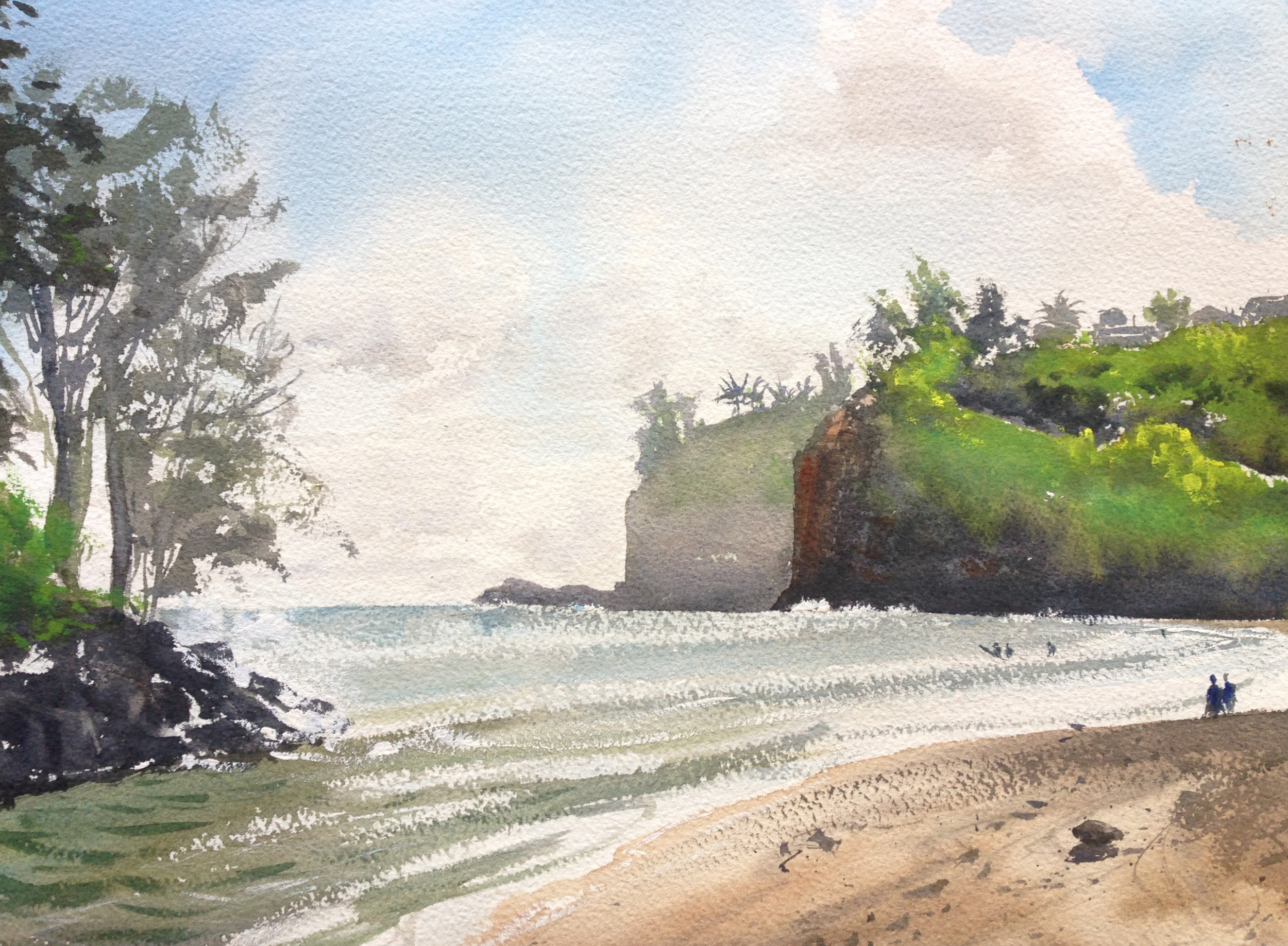
went back out plein air and did this 1/4 sheet study.
The other thing that has really struck me is how badly cameras represent such intense-glare situations. There is just absolutely no way to capture the real-world colors in these bluffs, with the glare coming off the water and sky. I like studio painting, and have no issues with it at all, but I can really see the value of plein air work if you want to include an info from the shoreline or land.

this painting is 1/2 sheet. I did it the day after. the photos show the bluff as a black silhouette- absolutely nothing like what it looks in reality.
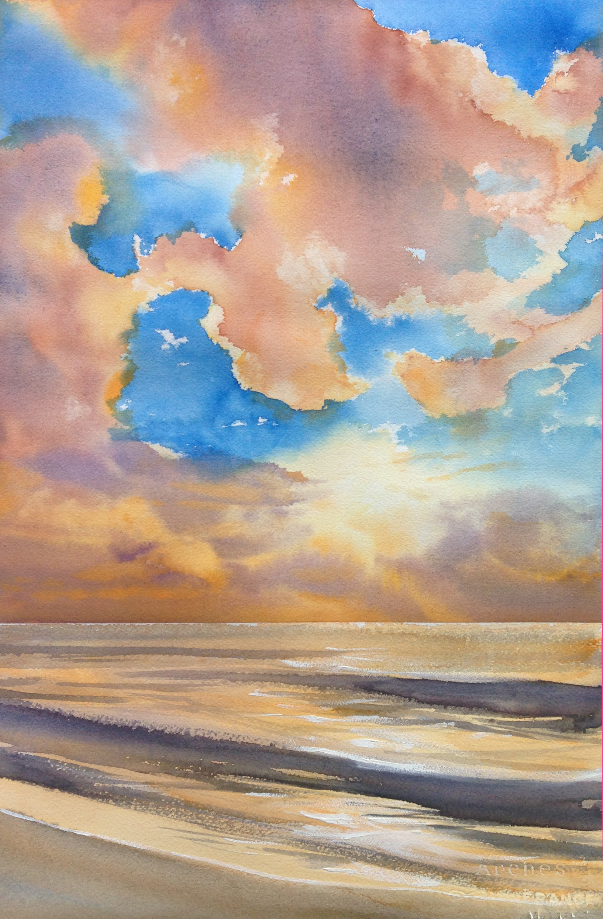
This last one is also a 1/2 sheet, and is a follow up on the 1/4 sheet I did last week. The sky came out a bit more muted, but I still like all that wet into wet play. Two very important details to me? Getting that wave to cross the horizon line, and putting in the paler valued, muted greens for the trees in the foreground. The bottom 1/3 is really just a sequence of strong horizontal bands, but I still wanted to break it up some.
