DVD Review- Castagnet's "The Passionate Painter in Antwerp"
In “The Passionate Painter in Antwerp,” Alvaro Castagnet does 5 paintings,
-inside a big, open air railway station

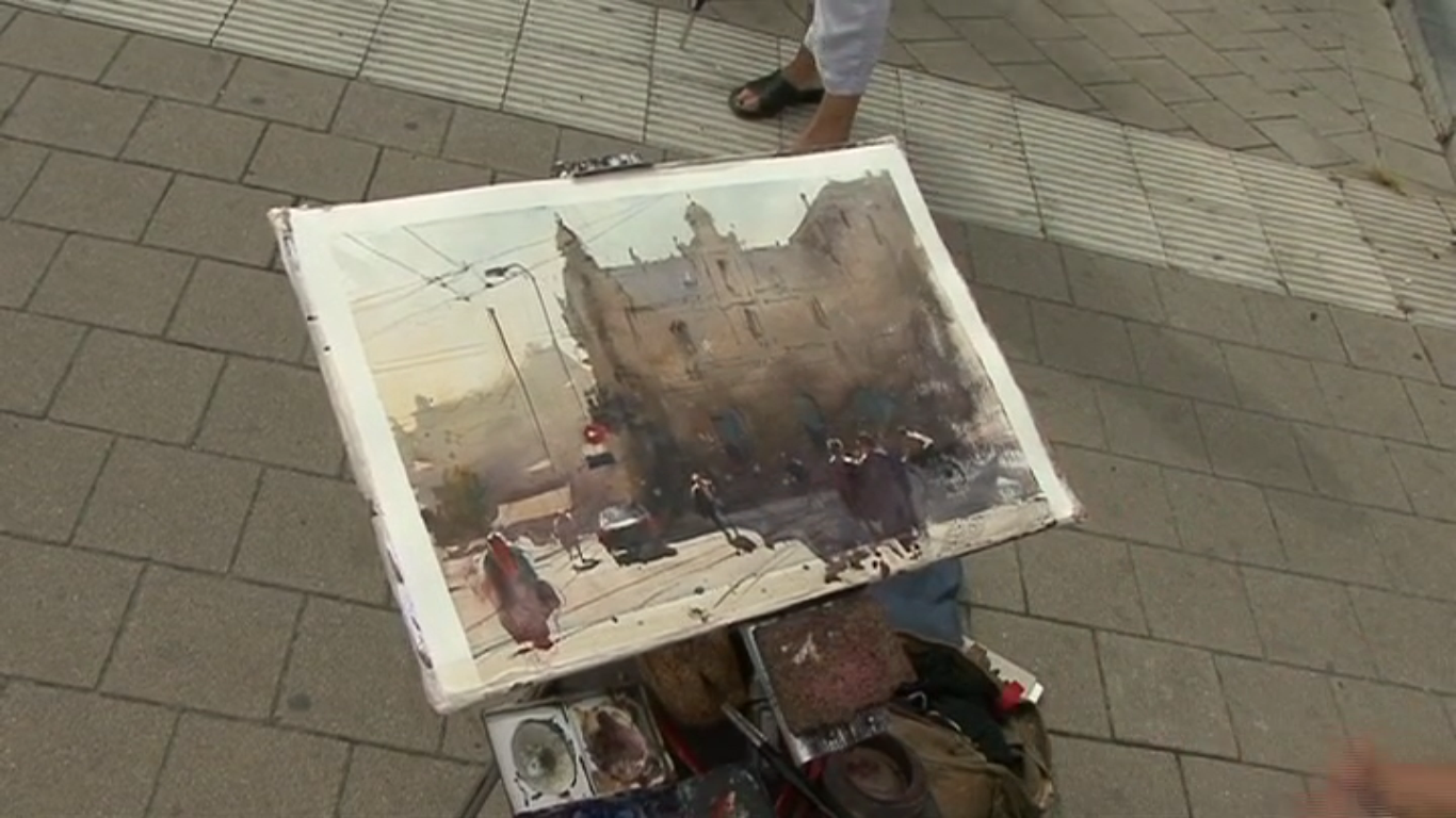
-a street scene with a distant church

-a street scene with a backlit building
-from inside a restaurant

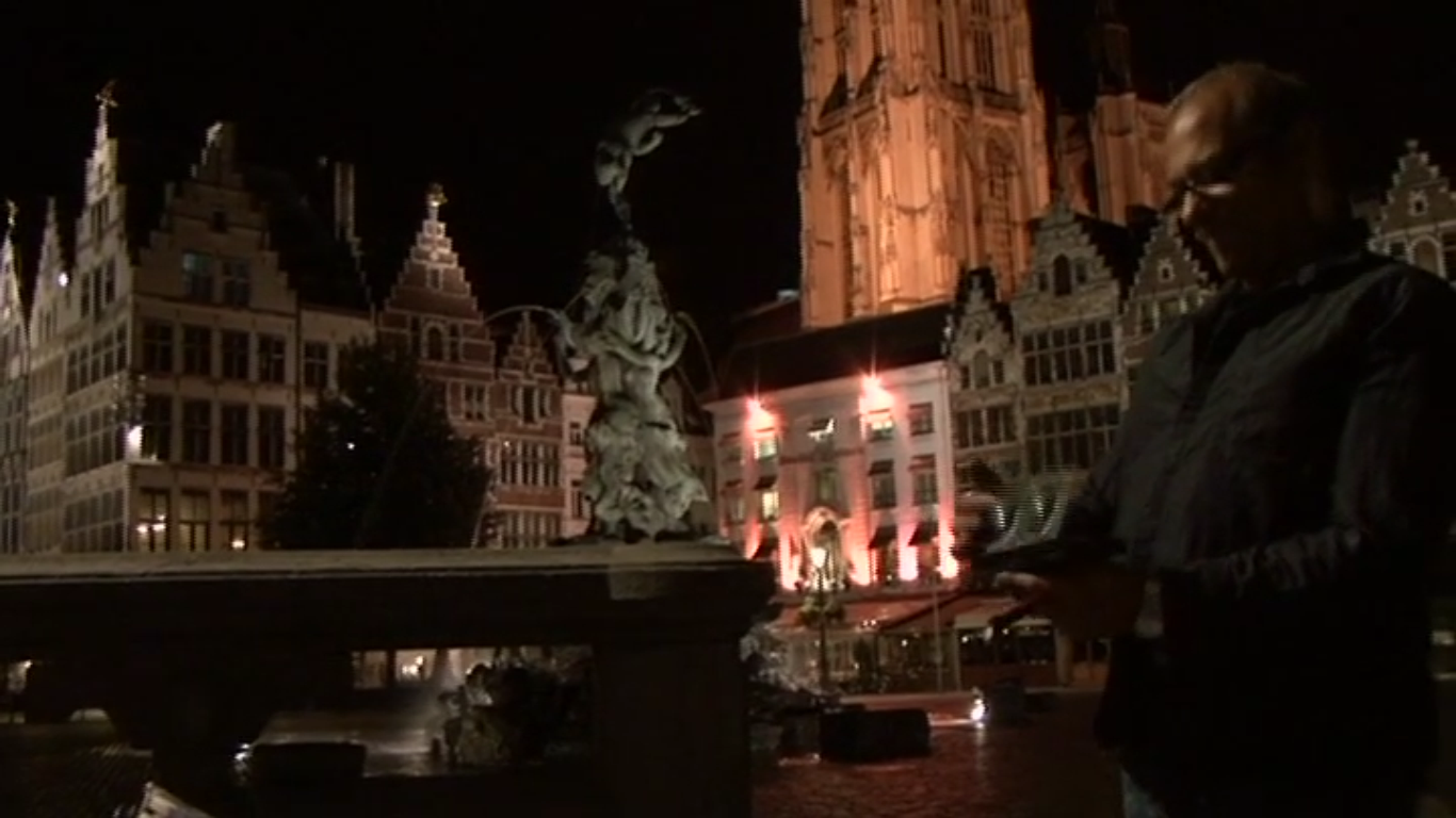
-and a night street scene

The paintings, as always with Alvaro, are beautiful, and everything is very professionally filmed. Originally, when I watched this over a year ago, it was a bit over my head and most valuable as inspiration (a quality not to be denied!), but this time around I picked up a lot more about values and how he achieves them. So the educational quality of a DVD like this has a lot to do with where you’re coming from, and what you already know. As before, these are only intermittently available for purchase on Amazon, though there are reviews there. You can buy them direct from APV, though it seems like they're all PAL (European DVD player) format. As far as I can tell, the best way for Americans to get the DVDs in NTSC format is through the interlibrary loan system, every once an a while on Amazon, or regularly through Alvaro's site directly, where he has them for sale, with a trailer, and in the right format for American DVD players.
The whole thing takes about 90 minutes, so it’s about 15 minutes a painting. It’s just enough to get into it, and for him to give you pointers here and there, but its also limiting because the duration for each painting makes it harder for him to really get into “teaching”. In a nutshell- the time spent on each painting is too short for me. A lot of the “inbetween parts” are edited out. No value sketches are shared, and the sketch on the watercolor paper is always done ahead of time, so you don’t get to see him simplify the composition from the scene you see in front of you, on location- you only get the end result. Of course, over the course of the each session, you follow him as he completes each painting, so he goes into values as he applies them. But if you’re looking for direct input on those sorts of things, then this is not the right DVD for you.
Instead, having more experience this time around, I was much more focused on various techniques he was using, particularly how he pushes values. This was interesting and helpful to watch. For example, he repeatedly talks about how he gets his darks so dark, which has a lot to do with the paint versus water ratio on his brush. This isn’t exactly news to me, as I’ve understood that for a while (which you can read about on my posts about Zbukvic’s “Watercolor Clock”), but my paints often dry in the well, and I have to open them up with a reasonable amount of water on the brush. This leads to needing to glaze a lot more than Alvaro does, to get my darks. What struck me in particular while watching the DVD was that Alvaro’s able to get the paint on so thick (and dark) because the paints in the palette are very wet and freshly squeezed. If he wants it really thick and opaque, he just daubs his brush directly into the goopy paint well and voila- its super charged.
Here's a pic of his palette. It's messy, goopy, and full of fresh, vivid paint-

This seemed particularly important the more I watched the video, because he paints a la prima, and if you don’t want your darker values exploding all over the paper (because you are laying them in to paler, more watery values), those dark colors need to be really thick and “dry” on the brush (so the pigment to water ratio is very high). He does paint light to dark, and he does often (but not always) do an initial glaze, which he then lets dry. But as he goes darker, he’s often painting wet into wet (instead of glazing), and the thickness and “goopiness” of his paints allows him some control, which would otherwise not be the case if his paints in the palette were dry, and he had to open them up with a bunch of water in his brush.
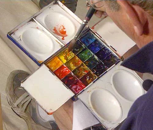
I also noticed how he uses a lot of opaque/ semi-opaque pigments- Cad Yellow and Cad Red Light, Cerulean Blue and Yellow Ochre, even Viridian occasionally (which is mildly opaque), plus Chinese White for highlights, but also Holbein’s Lavender (which I own from his workshop), which is a new addition to his palette that he didn’t seem to use as much before. More than once, I saw him mixing one of these colors with something else to gently increase the opacity of the paint mix. I thought that intriguing. For example, one time he mixes Cadmium Yellow with Chinese White, to get a pale valued, relatively opaque yellow for foliage. I’m surprised he doesn’t use Indian Red as well, as it’s located on a different part of the color wheel and would provide other opaque wet into wet/ layering options. In a gist, though, the combination of the “goopiness”/ freshness of his paints and the opacity of the pigments he chooses allows him to cover with his very dark darks and push his values around while still working wet into wet, and not really needing to glaze.
The truth is that this time, a year later, what I really took away from watching him paint is how much he paints like an acrylic painter in certain ways. Yes, he’s very wet and loose and drippy. 100%. But he also paints with such thick, fresh, opaque paints that, in essence, he’s often building the midtone for an object in the early stages, and then hammering in “the darkest darks” and the very pale, opaque highlights later on- definitely an acrylic or gouache technique. I don’t mean that as a critique either- just an unconventional watercolor technique, that seems very useful if you want to achieve certain results.
So, I really rather liked the video better this time than last time. I don’t think it would be particularly useful for a beginner because I found the DVD most useful for exploring values through specialized, wet into wet techniques and less for understanding planning and composition. Of the 3 DVDs of his I’m reviewing, this was the one I would probably watch 3rd, after you have some paintings under your belt. For less experienced painters, I would recommend the previously reviewed ‘Watercolor Painting With Passion!”, which is perhaps less polished but, in my opinion, more directly “educational.”