Yosemite Renaissance paintings

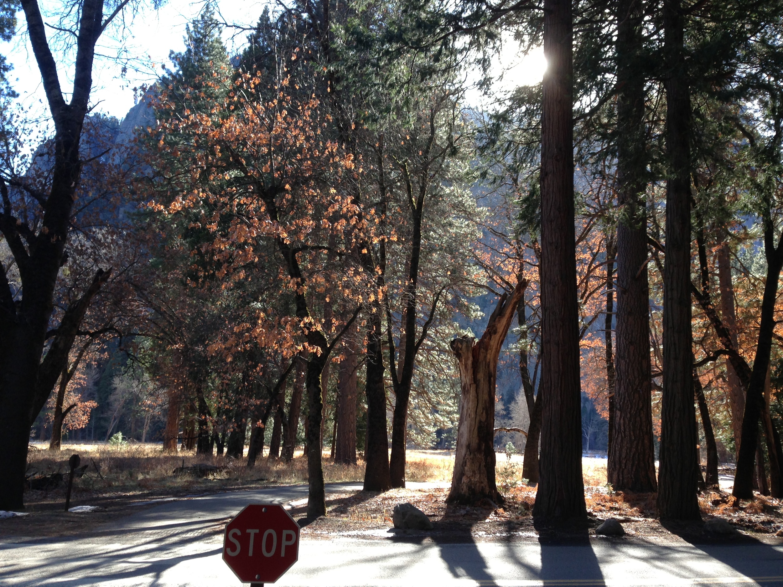
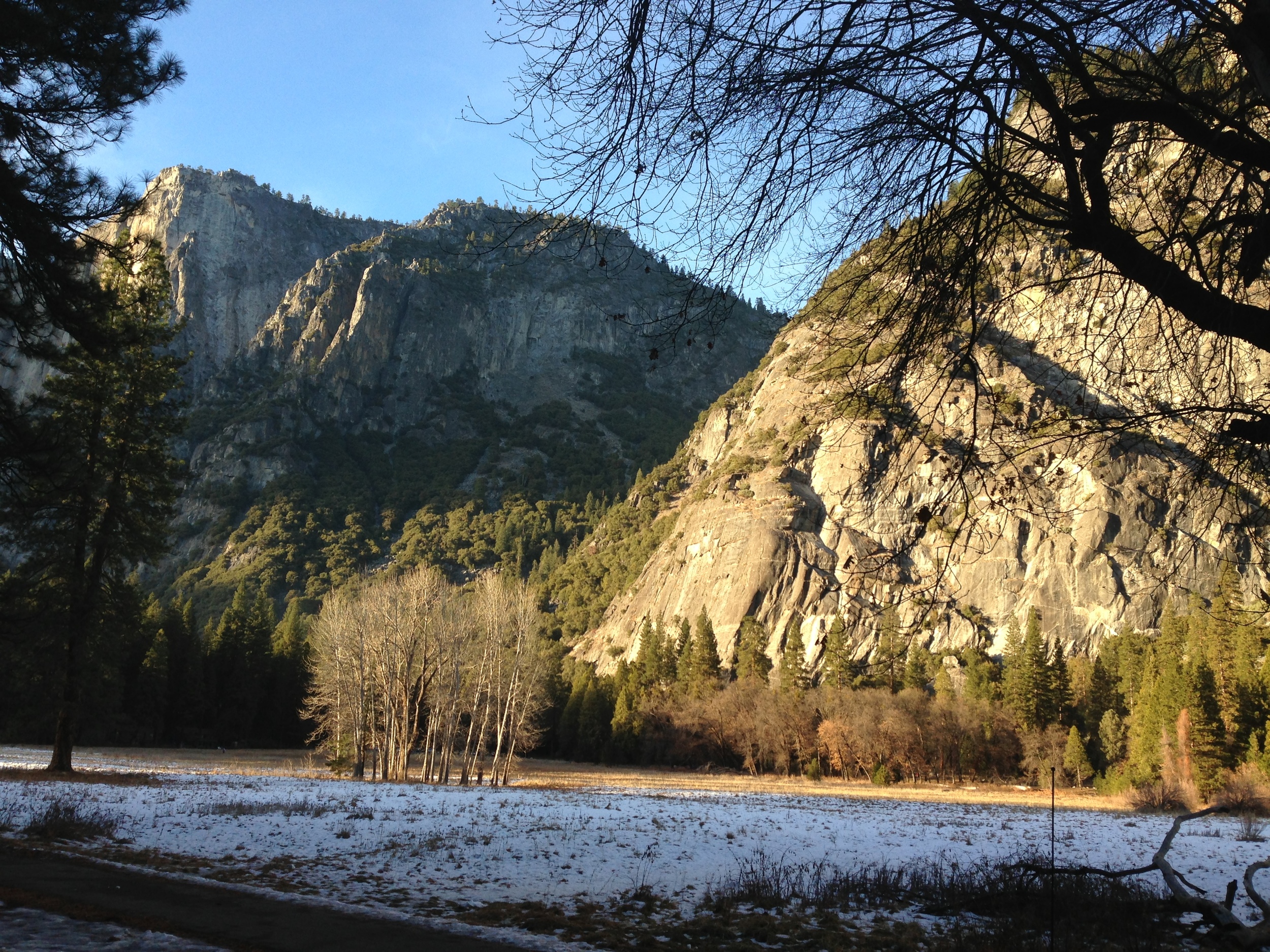
Last week was the deadline for submissions to the Yosemite Renaissance competition. In an effort to have a few pieces to submit, I scrounged 4-5 hours a day and hammered them out over the weekend- Friday, Saturday, Sunday. They’re all taken from various pics I took in Yosemite the winter before last.
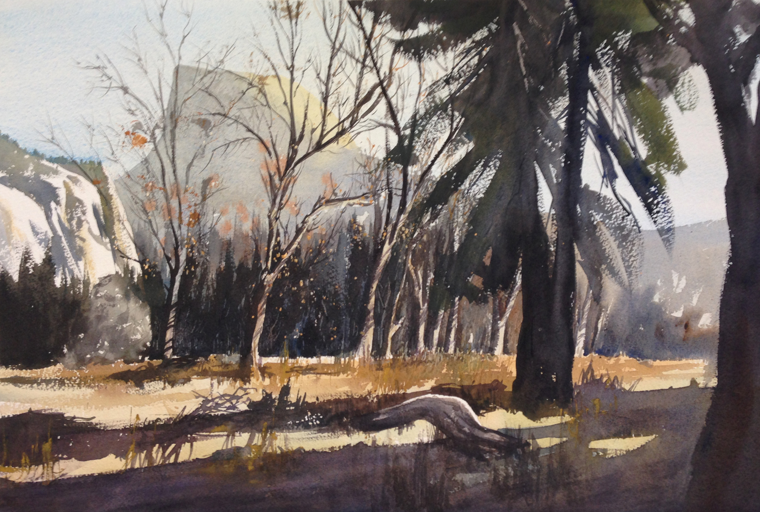
I don’t have any step by steps for this first one, but I wanted to share. In many ways, I got into a certain mindset while working on it- moving from cool to warm as I moved left to right, dropping in opaque highlights at the end for leaves, etc. I applied a lot of this on the second and third paintings right form the get go.

For this second one, you can see from the sketch that I focused primarily on the areas of darkest contrast and hardest lines. Other areas (the upper areas of the trees, the shadows, etc.) I left alone, and would let my brush paint.

My sketch. You can see the wash of water i did down to the horizon.
Some recent paintings have been tighter than I’ve wanted, so I tried a new wet into wet technique. I pre-wet the paper down to the horizon line and let it sink in for 10 minutes. I then did a pale wash for the sky and a soft, slightly darker wash for the distant mountain, gradating it from darker to lighter, left to right. Into that I dropped my greens for the midground trees, wet into wet, also darker to lighter while moving left to right. I daubed out a bit of the green and the blue with a tissue in the areas where I wanted to push my orange-red shapes. Then, wet into wet I dropped those colors in too, playing with the difference in moisture levels to allow some hard and some soft edges. Finally, as it slowly began to dry off a bit but was still damp, I dropped (wet into wet again) some thicker, darker greens into the red areas, to push the shape of the tree around and poke some holes in the canopy. Here's a pic taken just after this phase was finished.

Next came a pale wash on the foreground, for the path, the lower shrubs, and the grassy bits. I used the seam of white just below the horizon line to help separate things from the earlier wash- no backruns wanted! As that dried, I then went back up and did the trunk and branches of the midground trees, relatively dry. That took a while. I wrapped up that area by putting in their cast shadows, which moved to the left.
Then I moved to the foreground, with the tall vertical trunks and their shadows. I got that fun effect on the trunk on the right, where the light glimpses around it, by dropping water in first, to preserve the pale value, and then working very thick dark paint around it, letting the connection between the two go soft. Then up the trunks came, with heavy, drybrush strokes. Finally, the “sparkly bits” came in last, where the light was glinting sideways off of the leaves of the central tree. For that I used Chinese White, very thick, with Cad Yellow and Orange mixed with it- some of it was done with splatters, and some were placed more deliberately.
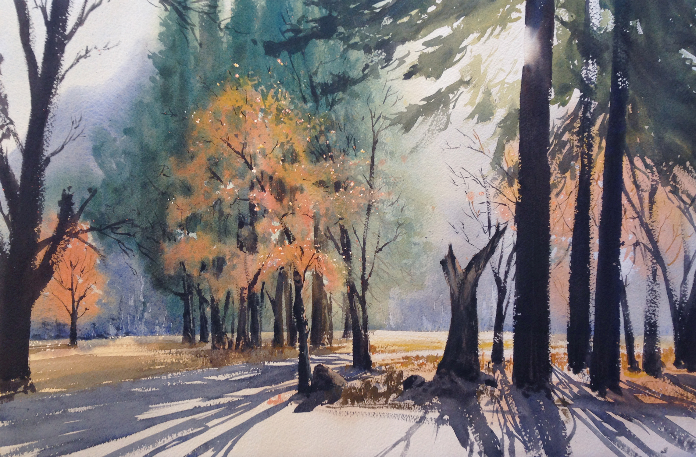
Something worth noting is the movement in color on this one, which was meant to back up and support the shifts in value. The background mountain goes from a dark cool blue on the left to a paler, warmer grey-brown on the right. The trees in the midground go from a darker, cooler blue-green on the left to a warmer, paler yellow-green on the right. The orange fall leaves have soft yellow, wet-into-wet highlights on the top and the right. The foreground trees up top move from a pale yellow green, where it’s very close to the light, and a darker, muted green with more blue in it in the shadows. So, all over, I’m not only working with value, but color too. The goal is to create a kind of harmony and movement outwards from the light source.

This third one followed the same basic process as many of my paintings- 1) pale over all wash, preserving whites when possible, 2) darker values on top, building shapes, 3) thicker paint goes on last, creating silhouettes, negative shapes, and cast shadows. Something that was fun on this one, however, was the very heavy "impasto" application of Chinese White on the focal point- so thick you can feel it with your fingers. The bits were too fine to paint negatively around. I suppose I could have used resist, but I don’t care for it much. Instead, lay down a warm yellow wash on the first pass, and preserved it by panting negatively over the course of the rest of the painting. Later, I lay down drippy, goopy, sinuous lines of white as the paint draped onto the paper. It’s fun! Most importantly, it gave me the result I was looking for- an icy sort of glow, where those early yellow washes became warm, light-filled shadows!
Now I get to wait until the end of December to find out if they've accepted any of my paintings for their show. !!